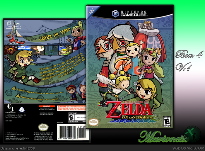
i love the box, but i think it would be good to put the Korok dude on the box, the one with the green leaf that helps you out in one of the later dungeons! ya know which one im talking about? you member, you member?
Real cool box... although I don't like the look of the straight screenshots in a row when you curved everything else on the back. IMO, better if you made the screenshots bigger, so they appear between two green curves. However... nice job apart from that. ;)
#8, yeah I love that guy bu the renders i found of him I didn't really like to much
#9,thanks so much =]
#10,thanks, yeah i see what you mean,thanks i guess i wanted them to be like link and be kinda standing its ground from the curves
I love the background behind the art, back layout is very interesting. Prince Komali, the bird with the pearl only has a minor role so he probably shouldn't be so big and I think you should huddle the characters more. Hyrule is mentioned on the back so much but the great sea is the main setting which isn't the same.
#16, for the characters I usually think more on how the box would look better and not who really is shown more in the game, but thank you and I agree the description was a bit choppy because I really haven't played this game in years =]
#17, I thought link was well placed becuase I noticed him the most when I would look at the box, but I guess that could be because I did make it. Thanks.
I think the box itself looks amazing. However, that's not all I take into account.
I honestly don't really like the way you present your boxes. Presentation is also a big factor when you think about it and the way the box/sig is laid out and the choice for the backdrop color doesn't appeal a whole lot to me. Just something to think about in the future. :)
#21, It's funny you mentioned that because I was just getting a new one =] as well as banner and icon haha =] I thought my old ones were pretty bad and just there when i had time to put good ones =]
 The Legend of Zelda: The Wind Waker Box Cover Comments
I Thought I would make a Zelda box... =]
Enjoy
[ Reply ]
i makes me so...
[ Reply ]
Thease Pices were all true worriors strive for! =P
[ Reply ]
this is freakin awsome! i love this box
[ Reply ]
Really original design, I love it, and a lot's of effort is put into this box I can see.
[ Reply ]
Edited at 1 decade ago
[ Reply ]
Thanks so much everyone for the comments and favs
[ Reply ]
i love the box, but i think it would be good to put the Korok dude on the box, the one with the green leaf that helps you out in one of the later dungeons! ya know which one im talking about? you member, you member?
EDIT: ill just fave the box :D
Edited at 1 decade ago
[ Reply ]
This is georgous. Fave box & artist.
[ Reply ]
Real cool box... although I don't like the look of the straight screenshots in a row when you curved everything else on the back. IMO, better if you made the screenshots bigger, so they appear between two green curves. However... nice job apart from that. ;)
[ Reply ]
#8, yeah I love that guy bu the renders i found of him I didn't really like to much
#9,thanks so much =]
#10,thanks, yeah i see what you mean,thanks i guess i wanted them to be like link and be kinda standing its ground from the curves
Edited at 1 decade ago
[ Reply ]
This is good!
[ Reply ]
Fantastic
[ Reply ]
Cool, but on the front, I think more emphasis needs to be on link. Faved, nonetheless.
[ Reply ]
Thanks so much everyone
[ Reply ]
I love the background behind the art, back layout is very interesting. Prince Komali, the bird with the pearl only has a minor role so he probably shouldn't be so big and I think you should huddle the characters more. Hyrule is mentioned on the back so much but the great sea is the main setting which isn't the same.
[ Reply ]
I do agree with the Link needing more emphasis
[ Reply ]
#16, for the characters I usually think more on how the box would look better and not who really is shown more in the game, but thank you and I agree the description was a bit choppy because I really haven't played this game in years =]
#17, I thought link was well placed becuase I noticed him the most when I would look at the box, but I guess that could be because I did make it. Thanks.
Edited at 1 decade ago
[ Reply ]
Yeah true
[ Reply ]
This box is love.
[ Reply ]
I think the box itself looks amazing. However, that's not all I take into account.
I honestly don't really like the way you present your boxes. Presentation is also a big factor when you think about it and the way the box/sig is laid out and the choice for the backdrop color doesn't appeal a whole lot to me. Just something to think about in the future. :)
+ fav for now.
[ Reply ]
Thanks everyone and thanks for the hall
#21, It's funny you mentioned that because I was just getting a new one =] as well as banner and icon haha =] I thought my old ones were pretty bad and just there when i had time to put good ones =]
Edited at 1 decade ago
[ Reply ]
#22, yay!
[ Reply ]
This box is genius. Classic Celda! XD
[ Reply ]
#24, haha well thank you =]
[ Reply ]
i love it
[ Reply ]