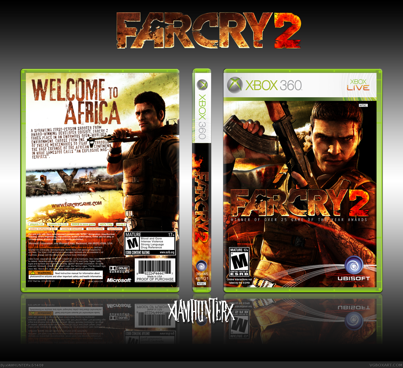
I checked both versions side by side and they are exactly the same. Glitch?
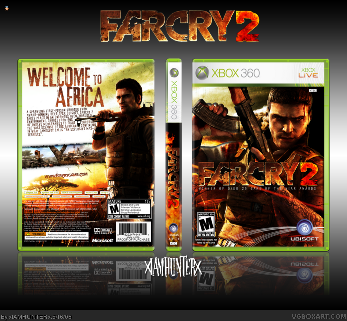
Anyways, I have no problems with the front at all. The spine is nice too. *winks at DMS* The back could be improved a bit. I don't like how the synopsis is kind of crammed in there, give it some breathing room. Also, the screen strip could be a bit larger. Nice job overall.
Real nice. Front is great.. although there's a few things I don't like about the back. I'm a BIG Text person.. I just don't like how the gun goes into the text -- IMO, better if you shifted the AFRICA more to the right, and have the text in a column to the left of it. Screenshots could be bigger. And you used that awful Farcry font for website.. Arrgghghh.. I hate that font - lol - why do people use that font, Farcry 2 logo don't have big F or C. Anyway... I'm hoping for an update... so I'll FAV - lol
argh... change it back, man. it all looks messy now. the text is all unjustified (some lines are a lot longer than others) and the website at the bottom is hard to see (that's only a petty little flaw, but still.)
 FarCry 2 Box Cover Comments
that's pint sized and all kinds of manly. :D
[ Reply ]
I thought we'd make it to the end.
Brick Walker don't leave me stranded.
Yehp... Ross's temp. V1 for the version I like, V2 for (apparently) the better version.
Cheerio, lads.
Oh heyyy, it's my 50th box! =D
Edited at 1 decade ago
[ Reply ]
I pefer version 1...
[ Reply ]
...*walks away*
I like both versions :p
Hey why didn't you ask me, I'm online :p
Edited at 1 decade ago
[ Reply ]
#3, Yeah, so do I, but Deathspawn and Ladykiller both like V2 better...
So check out both before you pass judgment, I guess. =D
Edit'd: Bonus points to whoever catches the tiny (or rather, big XP) joke. Hint: It's in 1337.
Edited at 1 decade ago
[ Reply ]
Welcome to Africa, BECHEZ!
[ Reply ]
noice
[ Reply ]
Awesome box dude!
Much better! :)
Edited at 1 decade ago
[ Reply ]
hey, I was about to pm you about my thoughts...guess I'm too late.
BTW, I also like version 1 better.
[ Reply ]
#9, This is you: link
=P
I'ma probably delete v2 now because it reminds me too much of my first FC2 box.
[ Reply ]
The ID on the spine says "EG HAS A BIG 1."
Bonus points, nao.
[ Reply ]
#11, *gives you bonus points*
[ Reply ]
Love the front. But the back could be better. Like make the screenshots bigger and ill fav it than.
[ Reply ]
Beast!
[ Reply ]
awsome dude, this is fantasicalarific
[ Reply ]
Great success! *thumbs up*
[ Reply ]
Badass. I don't see the differences between the two versions, though.
[ Reply ]
I checked both versions side by side and they are exactly the same. Glitch?
Anyways, I have no problems with the front at all. The spine is nice too. *winks at DMS* The back could be improved a bit. I don't like how the synopsis is kind of crammed in there, give it some breathing room. Also, the screen strip could be a bit larger. Nice job overall.
Edited at 1 decade ago
[ Reply ]
THIS NEEDS MOAR FAV'RITES.
Just plain awesome. Great job.
[ Reply ]
#11, lol
This box is real Badass. i love it. i do perfer v1.
[ Reply ]
#17, #18, Originally V1 was different... I deleted it and re-uploaded the other version because it was tiny at first.
So there should be three versions. Basically the front was an improved version of my previous FC2 box.
#19, Haha, thanks dude. Grats on rank six, it's about time.
[ Reply ]
Ew. Yer a bk.
[ Reply ]
#22, Okay, nub. =P
[ Reply ]
#22, What in the hell is that supposed to mean?
[ Reply ]
Real nice. Front is great.. although there's a few things I don't like about the back. I'm a BIG Text person.. I just don't like how the gun goes into the text -- IMO, better if you shifted the AFRICA more to the right, and have the text in a column to the left of it. Screenshots could be bigger. And you used that awful Farcry font for website.. Arrgghghh.. I hate that font - lol - why do people use that font, Farcry 2 logo don't have big F or C. Anyway... I'm hoping for an update... so I'll FAV - lol
[ Reply ]
#25, Haha, I'll work on an update tomorrow, just for you. =P
EDIT: Yay hooray! Thanks a lot guys. ^.^
Edited at 1 decade ago
[ Reply ]
Congrats on the HOF
[ Reply ]
Congrats, bro! A well earned HoF!
[ Reply ]
Congrats, waiting for the update :)
@22 bk?
Edited at 1 decade ago
[ Reply ]
Update'd.
[ Reply ]
argh... change it back, man. it all looks messy now. the text is all unjustified (some lines are a lot longer than others) and the website at the bottom is hard to see (that's only a petty little flaw, but still.)
[ Reply ]
Comment 2500 and I give it to you good friend =]
I love the box and your one of my favorite artist. I will help you with getting files back if you need man. I want to see more.
[ Reply ]
"EGHASABIGONE"
Bonus points nao
EDIT: Damnit >.<
Edited at 1 decade ago
[ Reply ]