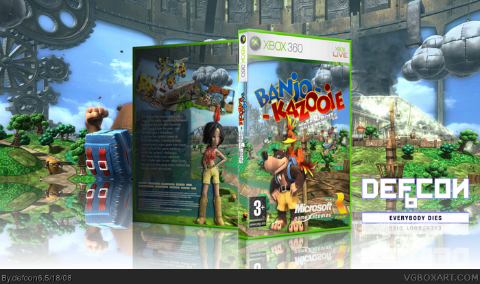
Also, not that it's a big deal or anything, you forgot to horizontally flip the "everybody dies" logo for the reflection. It's not a big deal, or part of the box, just something I noticed. :)
Firstly.. by looks of things.. you're using Imandix Pro to render your box, which I think is flawed in default setting. I have it, and I never use it unless I have to. With lighting on, it's too bright, and without lighting it's too dark... guess you chose the latter.
Anyway... Design is really good... although like above mentioned logos are a bit large and missing some on back. Because of the 3D rendering, it's hard to see the back's images/read text.
 Banjo-Kazooie: Nuts & Bolts Box Cover Comments
I'm finish with my cover and i know it ant so good as "MARKERs"
I hope you like it..
[ Reply ]
O_O
[ Reply ]
lo.0l
[ Reply ]
The developer logos are a bit too big. Other than that it's a good box.
Edited at 1 decade ago
[ Reply ]
The background is a little to big i think and the back is to dark, also what #4 said but other than that its good.
Edited at 1 decade ago
[ Reply ]
I want a banjo.
[ Reply ]
Also, not that it's a big deal or anything, you forgot to horizontally flip the "everybody dies" logo for the reflection. It's not a big deal, or part of the box, just something I noticed. :)
Edited at 1 decade ago
[ Reply ]
Agreed with the crits that's been said so far. That said, it looks good. My only gripe is that the canvas is a bit too wide though.
[ Reply ]
I will like to add that the reflection is too solid and the template is too tall. Overall it's not bad.
[ Reply ]
Firstly.. by looks of things.. you're using Imandix Pro to render your box, which I think is flawed in default setting. I have it, and I never use it unless I have to. With lighting on, it's too bright, and without lighting it's too dark... guess you chose the latter.
Anyway... Design is really good... although like above mentioned logos are a bit large and missing some on back. Because of the 3D rendering, it's hard to see the back's images/read text.
[ Reply ]
very good
[ Reply ]
Very nice cover.
[ Reply ]