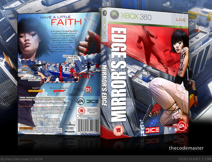
This is my first box for the Xbox 360, and I present to you Mirror's Edge. It's been really hard to make this box - especially since MARKER posted his when I was in the middle of making it. I'm telling you - it's been hard not to steal ideas.
LOL -- that was quick mate! As I said on MSN, I'll FAV this just for the front logo because it's soooo cool. I actually did a double-take on it! ;) I think Faith on the front looks a little odd, but everything looks pretty cool. Like the letters too.. never thought of using Airmail ones since they have the same colour scheme.. good thinking! ;) Nice.
#3, Actually I should really give you credit for that idea. On your box, you've got that Courier envelope and the red/blue colouring on that reminded me of the Airmail envelopes... so there you go :P
#9, Did you download the professional trial? It should be ok when you download just the standard version, if I recall correctly Vengeance uses that version.
This box is cool and I would prefer the description font to be more original and it might be cool if on the front that the red section reached a little more down, that way it would make more sense that the "Edge" part of the logo flips, hopefully you get what I mean.
#11, It downloaded both for me. Maybe you should check whatever Winrar files there may be. Thinking more about this box, it would feel more official with a green outline and without that white stuff around it.
looks great, the game looks pretty good too, but what is it ugly female characters these days? Portal, Heavenly Sword... jeez, you'd think it's become a fad of some sort.
 Mirror's Edge Box Cover Comments
This is my first box for the Xbox 360, and I present to you Mirror's Edge. It's been really hard to make this box - especially since MARKER posted his when I was in the middle of making it. I'm telling you - it's been hard not to steal ideas.
[ Reply ]
looks good
[ Reply ]
LOL -- that was quick mate! As I said on MSN, I'll FAV this just for the front logo because it's soooo cool. I actually did a double-take on it! ;) I think Faith on the front looks a little odd, but everything looks pretty cool. Like the letters too.. never thought of using Airmail ones since they have the same colour scheme.. good thinking! ;) Nice.
[ Reply ]
I realy like this one. It looks awsome.
+ Fav
[ Reply ]
#3, Actually I should really give you credit for that idea. On your box, you've got that Courier envelope and the red/blue colouring on that reminded me of the Airmail envelopes... so there you go :P
[ Reply ]
It looks nice.4.5/5
[ Reply ]
mind I ask how you 3D that?
btw elegant box
Edited at 1 decade ago
[ Reply ]
I used IMANDIX but I regret that because it seems to have removed a lot of the quality.
[ Reply ]
Ive been trying to download imandix but it's always the one with the banner across my box do you have the free one
[ Reply ]
#9, Did you download the professional trial? It should be ok when you download just the standard version, if I recall correctly Vengeance uses that version.
This box is cool and I would prefer the description font to be more original and it might be cool if on the front that the red section reached a little more down, that way it would make more sense that the "Edge" part of the logo flips, hopefully you get what I mean.
[ Reply ]
Yeah I download the standerd but it comes up as pro...
[ Reply ]
It's superb, but Miss. Mirror's Edge's double chin ruins the back. Fav overall.
[ Reply ]
#11, It downloaded both for me. Maybe you should check whatever Winrar files there may be. Thinking more about this box, it would feel more official with a green outline and without that white stuff around it.
[ Reply ]
Very stylish, love it.
[ Reply ]
I freaking love that logo.
[ Reply ]
very cool
[ Reply ]
I agree the logo is pretty cool but the only thing that gets me is the template and its color. Everything else is cool.
[ Reply ]
Awe.................sum
[ Reply ]
AmaZING.
[ Reply ]
looks great, the game looks pretty good too, but what is it ugly female characters these days? Portal, Heavenly Sword... jeez, you'd think it's become a fad of some sort.
[ Reply ]
Best Mirrors Edge box so far.
[ Reply ]
It's very original, "Have a little Faith" and "Edge" mirrored, it's all very well thought through. 92 outta 100
[ Reply ]
Saweet.
[ Reply ]
whoa dude thats heart-attack inducing awesome
[ Reply ]
my favorite sofar - a printable of this would be wicked!!! thanks for the hard work, keep it up
[ Reply ]
decent work...5/5
Edited at 1 decade ago
[ Reply ]
decent work 5/5
[ Reply ]