Well, here it is. Im not sure if it's my best, but I worked pretty hard on it. Some suggestions in the forums could not be completed due to lack of material, such as ground enemies i couldn't find. So, please comment, rate, fave, and critique!
Credits: Koopa for temp
and video game art archive for artwork, and google of course. So, enjoy!
#2 thanks, but could you explain? I know there's not a lot of text and stuff, but it would be nice if you told me what was wrong.
i really don't like the color of the font. it dosn't contridict with the background and makes my eyes hurt. Mabey a little stroke on it would help.
but other than that it's pretty nice.
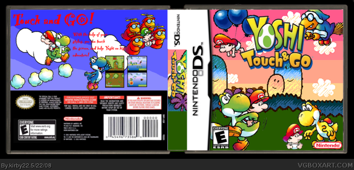
Well the front: it was necesarry to put baby mario 3 times there? I liked you used Kamek. Mario is floating, Kameh is casing and Yoshi is aiming at her. I recommend to delete the mario of the render of the left down corner and remove the yellow one and put something else there.
Back: Use the same background you used on the front so it matches. Also change the font and put the yellow yoshi on the back
 Yoshi Touch and Go Box Cover Comments
Well, here it is. Im not sure if it's my best, but I worked pretty hard on it. Some suggestions in the forums could not be completed due to lack of material, such as ground enemies i couldn't find. So, please comment, rate, fave, and critique!
Credits: Koopa for temp
and video game art archive for artwork, and google of course. So, enjoy!
#2 thanks, but could you explain? I know there's not a lot of text and stuff, but it would be nice if you told me what was wrong.
Edited at 1 decade ago
[ Reply ]
meh, not bad, i'd say a rough 3.5/5
[ Reply ]
i really don't like the color of the font. it dosn't contridict with the background and makes my eyes hurt. Mabey a little stroke on it would help.
but other than that it's pretty nice.
[ Reply ]
#3 i figured it wouldnt do as good as my last boxes, but thanks for commenting anyway!
[ Reply ]
#4, ...aaaaaaaaaaaaaand me?
[ Reply ]
the front 5/5. the back 1/5. :D
Edited at 1 decade ago
[ Reply ]
#5 I edited my post because I didnt want to bump, and #6 thanks but 1/5 geez it's not that bad is it?
[ Reply ]
#7, sorry i was kind of looking at the text on the back. other then the text on the back 4/5.
Edited at 1 decade ago
[ Reply ]
#7, it doesn't say it was edited, now does it?
[ Reply ]
#9 POST #1!
[ Reply ]
hey this is nice but its not your best :/
Well the front: it was necesarry to put baby mario 3 times there? I liked you used Kamek. Mario is floating, Kameh is casing and Yoshi is aiming at her. I recommend to delete the mario of the render of the left down corner and remove the yellow one and put something else there.
Back: Use the same background you used on the front so it matches. Also change the font and put the yellow yoshi on the back
3/5 not bad though!
[ Reply ]
#11 thanks i knew it turned out from the start it wasn't my best...
[ Reply ]
its nice but on the left side of the back its a little plain
[ Reply ]