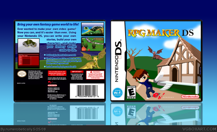
This is my Midas Touch comp box against MARKER (oh no!). I made all the images myself except the screenshots. But I did make the one on the bottom left entirely. So tell me what you think.
I like the template. I think the font on the back is boring, and needs to be a different color. Also, I don't like the stroke. Bad color and way too thick. I think it also needs better screen borders. Good job on the images. Could you PM me the temp? :)
#8, your grammar is the worst on the site. It's insulting. Please fix it.
Oh wait, looks like I'm not...and apparently there is no esrb on the back. Normally, I don't nitpick on small things like those, but this is a competition box for one thing -not to mention you're against marker, so yeah...
Other than that, I actually dig the simplicity of this. I also like how you made most of the box yourself, great job.
P.S. I'm still not very impressed with how you wrapped the text for the back, the words "come to life" should be left-justified not right. And yes, I'll keep on commenting about the element until you get it right. ^^
 RPG Maker DS Box Cover Comments
Very Nice. I like the concept
[ Reply ]
This is my Midas Touch comp box against MARKER (oh no!). I made all the images myself except the screenshots. But I did make the one on the bottom left entirely. So tell me what you think.
Thanks Guitar Man. You're faster than me!
Edited at 1 decade ago
[ Reply ]
Darn - that's cool! Got some competition ;) I wasn't gonna post mine... but what the hell. ;)
Nice one!
[ Reply ]
#2, yes i am
#3, That's the spirit MARKER
[ Reply ]
This is awesome! I like the Wind Waker-like style.
BTW, is that Toon Link?
[ Reply ]
Nice job numero.
[ Reply ]
#5 No it's not. I modeled it after a friend of mine. I did it in the Wind Waker style though.
Who likes the dragon? lol. That was fun to make.
BTW This is my temp, and it took a while. I wanted it to be bigger than the ones out there now so I had to type all the information.
[ Reply ]
lol loox like cel link
[ Reply ]
I like the template. I think the font on the back is boring, and needs to be a different color. Also, I don't like the stroke. Bad color and way too thick. I think it also needs better screen borders. Good job on the images. Could you PM me the temp? :)
#8, your grammar is the worst on the site. It's insulting. Please fix it.
[ Reply ]
#7, yeah the dragon is cool, looks like the dragon from shrek :D
[ Reply ]
I think I'm going blind here....
Oh wait, looks like I'm not...and apparently there is no esrb on the back. Normally, I don't nitpick on small things like those, but this is a competition box for one thing -not to mention you're against marker, so yeah...
Other than that, I actually dig the simplicity of this. I also like how you made most of the box yourself, great job.
P.S. I'm still not very impressed with how you wrapped the text for the back, the words "come to life" should be left-justified not right. And yes, I'll keep on commenting about the element until you get it right. ^^
[ Reply ]
Love it. Except the DS part of the logo doesn't look too good IMO
[ Reply ]
LK.
I DID NOT TEXT WRAP. There. I said it.
And I originally had the ESRB but then I looked on the back of one of my DS games (Pokemon Diamond) and it didn't have one. So I'm confused.
[ Reply ]
#13, Yes...yes you did.
Otherwise, the text would've have overlap the screenshots to the left.
[ Reply ]
Cool, I would've preferred a more professional description font like the Serif font and for it to be smaller. I'm not fond of blue strokes.
[ Reply ]
Fine. Well I didn't consciously do it =P
I'll fix those things (or try to)
[ Reply ]
Realy good! Love the render.
Edited at 1 decade ago
[ Reply ]
omg! love it! im wondering......... can i borrow some of our skill? 5/5 fave!
[ Reply ]
#7, it looks just like the dragon from shrek, xD
is it?....
[ Reply ]
Yes I designed it after her. Thanks for the comments and faves guys :)
[ Reply ]
suprised it didn't make hof....
[ Reply ]
I would like a RPG Maker DS. At least XP was good, and 2003 was good... I like the box.
[ Reply ]
i wanted to get this when it was on PS2 but i never got around to it.
the box is good +fav
[ Reply ]