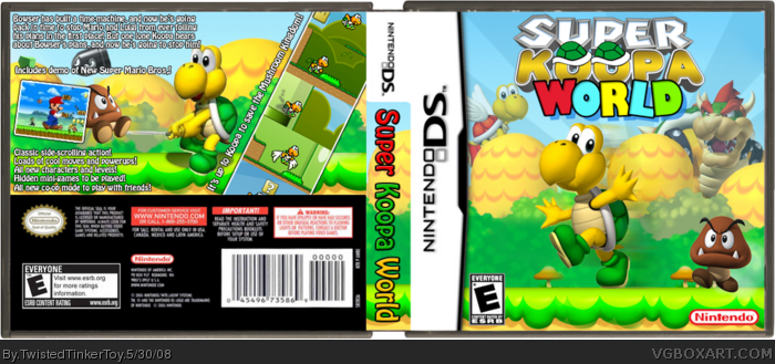
This is the hardest box I've ever done. 3 days of work in here. I had to edit out characters/items in the backgrounds on both the front and back, plus things like the Rising Sun on the front or the Rising Sun on the back behind the Goomba had to be added by putting them over the backgrounds then rendering them out of certain parts. (Did that make sense?) The back was very hard, because I couldn't find a way to remove the Goomba, and I had to work around it. I couldn't have him just jumping for no reason, so I edited Koopa to be hitting him with a golf club. I also had to make the screenshots myself, and I tryed about 4 logos before I finally asked MARKER to design me one, so credit to him for the logo. I hope you guys enjoy. It was fun. And this is my 50th box.
Credit to KoopaDasher for the template.
Oh, and if you're wondering why I deleted it the first time, it's because I noticed some bleeding, and a few problesm here and there.
Epic win. But, i know koopa is the main character and all, but maybe mario should be on the box. Just a suggestion, you dont have too though. And, Koopa sorta seems big. I know he is sorta supposed to be, becuase its his game, but gooma and koopa are like the same size and goomba is much smaller than hikm on the box.
#12, but Koopa is an enemy in that game, so he's on the box to make it seem more chaotic. I tryed really hard to not crowd the box without making it seem boring. I think I achieved just that.
#13 yeah. The front actually seems empty becuase theres a goomba on one side, and on the other there isn't anything. Plus there's two whatevers on the top. But it wont matter, it wont make me any happier if you change it or not, becasue this box will always have me happy. :)
one of your best boxes IMO. What i dont like is the Koopa hiting the Goomba, it doesnt seems that hes fighting with him. It looks like the goomba is part of the golf club
4/5 +fav
 Super Koopa World Box Cover Comments
This is the hardest box I've ever done. 3 days of work in here. I had to edit out characters/items in the backgrounds on both the front and back, plus things like the Rising Sun on the front or the Rising Sun on the back behind the Goomba had to be added by putting them over the backgrounds then rendering them out of certain parts. (Did that make sense?) The back was very hard, because I couldn't find a way to remove the Goomba, and I had to work around it. I couldn't have him just jumping for no reason, so I edited Koopa to be hitting him with a golf club. I also had to make the screenshots myself, and I tryed about 4 logos before I finally asked MARKER to design me one, so credit to him for the logo. I hope you guys enjoy. It was fun. And this is my 50th box.
Credit to KoopaDasher for the template.
Oh, and if you're wondering why I deleted it the first time, it's because I noticed some bleeding, and a few problesm here and there.
[ Reply ]
This Looks awesome,Just like in the forums.
[ Reply ]
Now this is Epic
[ Reply ]
I said I'd fav it in the forums and I will, but I'm not a great fan of the world part of the logo.
[ Reply ]
Noice job. I like it alot. Faved.
[ Reply ]
The text seems a bit cluttered on the top and it's a bit boring although koopa's can be boring
[ Reply ]
#7, What do you mean cluttered in the top? I think it's fine, but if you could explain I might be able to fix it. Also, I don't see how it's boring.
[ Reply ]
gotta say I love the logo. it's not my fav from you but it's great
[ Reply ]
Epic win. But, i know koopa is the main character and all, but maybe mario should be on the box. Just a suggestion, you dont have too though. And, Koopa sorta seems big. I know he is sorta supposed to be, becuase its his game, but gooma and koopa are like the same size and goomba is much smaller than hikm on the box.
+FAV
[ Reply ]
#10, I wanted him to stand out. Also, I didn't wanna add Mario because it's not about Mario.
[ Reply ]
#11 ok i'll give you your props. But still, koopa is on the new super mario bros. box and its not about koopa...
Edited at 1 decade ago
[ Reply ]
#12, but Koopa is an enemy in that game, so he's on the box to make it seem more chaotic. I tryed really hard to not crowd the box without making it seem boring. I think I achieved just that.
[ Reply ]
#13 yeah. The front actually seems empty becuase theres a goomba on one side, and on the other there isn't anything. Plus there's two whatevers on the top. But it wont matter, it wont make me any happier if you change it or not, becasue this box will always have me happy. :)
[ Reply ]
Lulz, pretty nice but the logo's pretty cheesy =P
[ Reply ]
#14, it doesn't need to be so full that every little spot is taken up.
#15, it's not my logo! >_> MARKER made it.
[ Reply ]
Effortless.
Haha, Kidding.
Edited at 1 decade ago
[ Reply ]
#17, lol
Good job, it looks pretty awesome
5/5 +fav
[ Reply ]
Aswome great job tinker! i love that logo?? :)
Edited at 1 decade ago
[ Reply ]
i rally love it!! apecially the koopa part of the logo
[ Reply ]
I can hear koopa's magical human mayonaise flying to this box right now.
[ Reply ]
#17, :(
#18, thanks.
#19, thank you as well.
#20, I didn't make the logo. >_> Thanks, though.
#21, you confuse me. And thanks.
[ Reply ]
#22, want me to say it flat-out?
Koopa's Sperm. there..i said it.
[ Reply ]
#21, Oh God, oh God! I filled my pants with laughter! XD
[ Reply ]
#23, I didn't... exactly... want you to say it flat out... but... umm... thanks anyway... :P
[ Reply ]
one of your best boxes IMO. What i dont like is the Koopa hiting the Goomba, it doesnt seems that hes fighting with him. It looks like the goomba is part of the golf club
4/5 +fav
Edited at 1 decade ago
[ Reply ]
I'm proud of you mate ;)
[ Reply ]
looks again for a laugh and then favourites
[ Reply ]
WOW, realy good box, would be a fun game to :P 5/5
[ Reply ]
Thanks everyone. :)
Edited at 1 decade ago
[ Reply ]
3 cheers for cheesy logos! LOL ;)
Nice one TTT -- not sure what Koopa's hold on the back, but sure long! ;)
[ Reply ]
Colorful and unique :)
[ Reply ]
At first, I thought the title was "super Koopadasher World".
[ Reply ]
i think its really cool. i always thoght they should make a koopa game 5/5
[ Reply ]
This is awsome.
[ Reply ]
The front is very nice, but the back could use some work expecially the screen shots... 4/5 & Favorite
[ Reply ]