I like it. Im gonna fav. :) But on the spine it seems the logo is too far down, maybe move it up a couple drops. The huge amount of text on the back might not have people liking this, but I do. Good job nonetheless, +fav +author fav
#6, Thanks man. Actually, most of the stuff on here is centered, it just looks uncentered because of other elements (i.e. BioWare logo is actually centered). :p Does it seem like a lot of text? I ran into some trouble with that 'cause the font looked retarded any smaller :-\ It's really only 4 sentences and 4 short bullet points. I'll shorten it if people agree it's a major problem
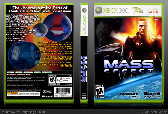
 Mass Effect Box Cover Comments
Had some trouble on the back text :-\
Credit to Techne for the temp, xIAMx and LK for critique among others, and LK for the BioWare logo.
C+C please :D
Edited at 1 decade ago
[ Reply ]
#1 Scared huh? Nice job.
[ Reply ]
#2, No way. :p Thanks
[ Reply ]
Its a lil' plain....But It's aight.
[ Reply ]
#4, Thanks...I think :P
C+C please. If you're going to make a post like Nelkin did, please say what I could do better, I wanna make this great :D
[ Reply ]
I like it. Im gonna fav. :) But on the spine it seems the logo is too far down, maybe move it up a couple drops. The huge amount of text on the back might not have people liking this, but I do. Good job nonetheless, +fav +author fav
[ Reply ]
#6, Thanks man. Actually, most of the stuff on here is centered, it just looks uncentered because of other elements (i.e. BioWare logo is actually centered). :p Does it seem like a lot of text? I ran into some trouble with that 'cause the font looked retarded any smaller :-\ It's really only 4 sentences and 4 short bullet points. I'll shorten it if people agree it's a major problem
[ Reply ]