I've waited TOO long to make this box, and i really, really needed some inspiration for it.
That came whilst looking at both old and recent NMH boxes, and i finally was able to start.
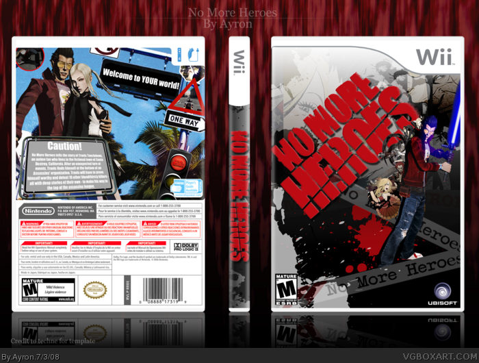
I used different elements of the game in the box in both front and back.
I'm especially fond of the tagline.. don't ask me why---but it resembles suda51's intention with this game so much... and i came up with it xD
Credit to MARKER for the logo ;)
Hope you enjoy looking at the box as much as i did making it :D
it's ok. Your text is still boring as hell and I really hate what you did with the logo on the front. Normally I don't mind logos on their side (i.e. MGS4 box) but it doesn't really look stylish here.
 No More Heroes Box Cover Comments
*faved*
[ Reply ]
Finally.. a NMH box from me >.<"
I've waited TOO long to make this box, and i really, really needed some inspiration for it.
That came whilst looking at both old and recent NMH boxes, and i finally was able to start.
I used different elements of the game in the box in both front and back.
I'm especially fond of the tagline.. don't ask me why---but it resembles suda51's intention with this game so much... and i came up with it xD
Credit to MARKER for the logo ;)
Hope you enjoy looking at the box as much as i did making it :D
-edit-
#1, thanks mate ^^ --- that was quick ;)
Edited at 1 decade ago
[ Reply ]
I don't like that bit of empty space on the back. I also don't like your choice of text on the tagline, it's very plain. Great, though.
[ Reply ]
I saw the thumbnail on the site and said "fav".
[ Reply ]
I don't like how you added the screens, but it's good.
[ Reply ]
Nice, but Travis is really small on the front...maybe upscale him a bit?
[ Reply ]
Pretty Good.
[ Reply ]
Nice!
[ Reply ]
Front is teh win.
[ Reply ]
#6, sory, no can do. that's the original size-- enlarging would make it blurry..
It was hard enough ripping him off the site,already >.<
Thanks ,everyone.
[ Reply ]
#10, Sorry...what was that? You went through the trouble of getting a puny render off the site when you just could have gone to this?
link
There you go, that should simplify things :P It also has many more images where that came from :)
[ Reply ]
I like the front very much, there's lots of work in the front...but the back is too simple for my tastes :P Anyhow good work.
[ Reply ]
Pwnsome!
[ Reply ]
Good Gad.
[ Reply ]
it's ok. Your text is still boring as hell and I really hate what you did with the logo on the front. Normally I don't mind logos on their side (i.e. MGS4 box) but it doesn't really look stylish here.
[ Reply ]
This is a really good box. Well done!
5/5 (+ fav)
[ Reply ]