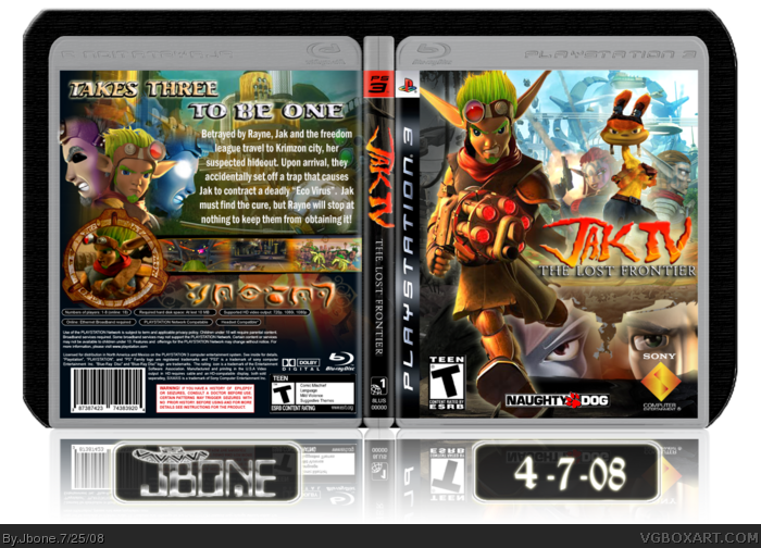
New box. Like the presentation :P
This one was fun to make but also very difficult. There are almost NO renders for Jak in 3-D. I edited Jak's legs on the front and gave Daxter pants. I made the Dark Jak and Light Jak renders on the back. If anyone wants them, I might post a thread. I spent alot of time on this, but still don't be afraid to critique. I'll change to the best of my ability.
This is not a real game, the name was trademarked by NaughtyDog as a working title. I made the logo :)Well after weeks of hard work I present: Jak IV: The Lost Frontier.
{CREDITS}
Techne - temp
RadioactiveBob - original inspiration
Planetrenders/Gamerenders - most renders
Google - screenshots and other info
I don't like it. Jak looks terrible because the legs don't work with the render, plus he's just floating, the presentation just looks "bleh", The text is bland and boring, the whole back just looks messy, especially with the Dark Jak fading into normal Jak fading into Light Jak, you used art from ToD on both the front and back. I don't like the faces at the bottom, the logo doesn't look good where it is and Daxter doesn't look so good over the logo like that. I also don't like the way you presented the screenshots.
Also, that tagline is probably one of the worst I've heard in a while. Don't call me harsh, I'm not changing my opinion because you think I'm being harsh.
#4 didn't I say I WON'T call you harsh? I might change the text, and I used ToD art because there is little Jak material. I think it gives the box a little bit of a futuristic feel. If you don't like Daxter, then tell me another place to put him. Again, if you don't like the tagline/screenshots, then give me another design to work with. And how is he floating?
I agree with Dersnap on that some things don't "blend" too well with other parts of the box, but i think it still looks very nice, and the amount effort that i can see you put into it is just...wow...
so, +fav. :)
#9 Think so? Well thanks :)
#10 well, what should I change the things to? If I change the opacity of Ashelin and Torn on the front (make them clearer), will it look better?
Ok, forgot to mention this. Everyone who posts and says "I don't like it" please tell me what to improve and how. E.g, Daxter doesn't look good. Where to put him? The precursor text is also something so people can't say I made this. (TRANSLATION=JB VGBA
#14, I mean the thing around the box (outside) I don't know what I'm looking at. The gray on the left doesn't touch and it does on the right. Don't get me wrong its not terrible but I was just being honest. I think the name and stuff are a little flashy lol. I noticed the hat on the name. If your going for a spanish??? look then I could help you with some ideas.
Lol the background is still the same but whatever haha. I do like that you moved the name and stuff. I didn't say get rid of the lines or the area that shows where the ground is, just that it wasn't over all the way. I will fav because the box itself is cool. Lol sorry for the trouble.
Again, thanks for the faves MM111 and Venom. I've been thinking for a while about the presentation, and I'm not sure I'm happy with it :\ If anyone could give me some suggestions that might enhance my future boxes I would be most grateful.
#27 I do not wish to bump. If I did, I would've done so a long time ago. While I admit I bumped my previous box, I won't do the same to this one. I also would like help for presentation. If you won't help, hen there is no need to post that comment. If I posted this is the forums, I'm sure I would get nothing. TrevOwnz wanted to help but I haven't been able to get to him. In fact, I'm not expecting this to get HOF. so why would you bring it up?
#26, please shut up. If this box truly deserves the Hall of Fame then it will get in without your constant bumping. Cut the crap. The only reason someone would thank somebody for favoriting is to bump, so don't even try that.
Thanks for the faves and comments everyone. I try my best with every box. Even though you're banned aifan000, it means alot that I'm your favorite author. I should be able to get a new box up soon, so keep a look out for it.
#40 Rayne is from Jak X and Krew's (fat guy from Jak 2) daughter. She appeared to be helping Jak's crew get the antidote for a poison, but betrayed them at the end.
 Jak IV: The Lost Frontier Box Cover Comments
New box. Like the presentation :P
This one was fun to make but also very difficult. There are almost NO renders for Jak in 3-D. I edited Jak's legs on the front and gave Daxter pants. I made the Dark Jak and Light Jak renders on the back. If anyone wants them, I might post a thread. I spent alot of time on this, but still don't be afraid to critique. I'll change to the best of my ability.
This is not a real game, the name was trademarked by NaughtyDog as a working title. I made the logo :)Well after weeks of hard work I present: Jak IV: The Lost Frontier.
{CREDITS}
Techne - temp
RadioactiveBob - original inspiration
Planetrenders/Gamerenders - most renders
Google - screenshots and other info
`-Jbone
Edited at 1 decade ago
[ Reply ]
Nice Box Jbone.
Fav.
[ Reply ]
FINALLY! +fav
[ Reply ]
I don't like it. Jak looks terrible because the legs don't work with the render, plus he's just floating, the presentation just looks "bleh", The text is bland and boring, the whole back just looks messy, especially with the Dark Jak fading into normal Jak fading into Light Jak, you used art from ToD on both the front and back. I don't like the faces at the bottom, the logo doesn't look good where it is and Daxter doesn't look so good over the logo like that. I also don't like the way you presented the screenshots.
Also, that tagline is probably one of the worst I've heard in a while. Don't call me harsh, I'm not changing my opinion because you think I'm being harsh.
Edited at 1 decade ago
[ Reply ]
Wow. You nailed it! You did a fantastic job. I like your style, Jbone.
Edited at 1 decade ago
[ Reply ]
zomg! brilliant jbone! fave! 5/5 author fave!
[ Reply ]
#4 didn't I say I WON'T call you harsh? I might change the text, and I used ToD art because there is little Jak material. I think it gives the box a little bit of a futuristic feel. If you don't like Daxter, then tell me another place to put him. Again, if you don't like the tagline/screenshots, then give me another design to work with. And how is he floating?
Edited at 1 decade ago
[ Reply ]
JB I love it man
Fav+
[ Reply ]
Wow, this box just made me even more excited about Jak 4. I've played the entire Jak & Daxter trilogy and I love it.
Great work man, definitely HoF material.
[ Reply ]
I agree with Dersnap on that some things don't "blend" too well with other parts of the box, but i think it still looks very nice, and the amount effort that i can see you put into it is just...wow...
so, +fav. :)
[ Reply ]
#9 Think so? Well thanks :)
#10 well, what should I change the things to? If I change the opacity of Ashelin and Torn on the front (make them clearer), will it look better?
BTW anyone know how XCore got banned?
[ Reply ]
UPDATE. Changed the screens a little bit. Made Torn and Ashelin clearer.
[ Reply ]
I really like the box a lot but the background doesn't make sense and is kind of weird.
[ Reply ]
#13 do you mean outside of the box? or inside?
[ Reply ]
Ok, forgot to mention this. Everyone who posts and says "I don't like it" please tell me what to improve and how. E.g, Daxter doesn't look good. Where to put him? The precursor text is also something so people can't say I made this. (TRANSLATION=JB VGBA
[ Reply ]
finally you posted it! and its pretty cool! your best yet! +fav
[ Reply ]
#14, I mean the thing around the box (outside) I don't know what I'm looking at. The gray on the left doesn't touch and it does on the right. Don't get me wrong its not terrible but I was just being honest. I think the name and stuff are a little flashy lol. I noticed the hat on the name. If your going for a spanish??? look then I could help you with some ideas.
[ Reply ]
Wow this is amazing! Can you pm me the logo?
[ Reply ]
omg! still not in HoF???? that is wierd... :P super box! i mean omega!
i think its your best so far jbone! :) keep up the good work!
[ Reply ]
#17 ok, thanks TrevOwnz. I'll get rid of the line and yes, I like spanish :)
#18 + #19 Thank you! I'll pm later okay? got to go to church.
Edited at 1 decade ago
[ Reply ]
i like this, it's clean and effective
[ Reply ]
Te Update is 'ere TrevOwnz. Got rid of the line and moved "JBone" and the date up. I'm very proud of this box, it was fun to make... *reminiscing*
#21 thanks MG.
Edited at 1 decade ago
[ Reply ]
Lol the background is still the same but whatever haha. I do like that you moved the name and stuff. I didn't say get rid of the lines or the area that shows where the ground is, just that it wasn't over all the way. I will fav because the box itself is cool. Lol sorry for the trouble.
[ Reply ]
Aw shit :P
[ Reply ]
#23-24 Thanks for your faves. I normally make these when I'm excited about a particular series.
[ Reply ]
Again, thanks for the faves MM111 and Venom. I've been thinking for a while about the presentation, and I'm not sure I'm happy with it :\ If anyone could give me some suggestions that might enhance my future boxes I would be most grateful.
#27 I do not wish to bump. If I did, I would've done so a long time ago. While I admit I bumped my previous box, I won't do the same to this one. I also would like help for presentation. If you won't help, hen there is no need to post that comment. If I posted this is the forums, I'm sure I would get nothing. TrevOwnz wanted to help but I haven't been able to get to him. In fact, I'm not expecting this to get HOF. so why would you bring it up?
Edited at 1 decade ago
[ Reply ]
#26, please shut up. If this box truly deserves the Hall of Fame then it will get in without your constant bumping. Cut the crap. The only reason someone would thank somebody for favoriting is to bump, so don't even try that.
Edited at 1 decade ago
[ Reply ]
Jak's legs are a bit small and short on the front, other than that it seems like a good box, nice job.
[ Reply ]
i really like the box
the front is really nice, and the back is good too, i also like the foreign language on the back
5/5 +fav, the usual for JBone!
[ Reply ]
#29 haha thanks! it's actually the Precursor Language. Thanks for your support!
Edited at 1 decade ago
[ Reply ]
#30, no prb, love your boxes, yur my fav author! keep them coming!!
[ Reply ]
Alright, since everyone hated the legs, UPDATE. Also changed the size of the text.
Edited at 1 decade ago
[ Reply ]
#32, looks even better!
[ Reply ]
Looks great my friend, keep up the good work.
[ Reply ]
Thanks for the faves and comments everyone. I try my best with every box. Even though you're banned aifan000, it means alot that I'm your favorite author. I should be able to get a new box up soon, so keep a look out for it.
[ Reply ]
wohoo!! HoF!!!
[ Reply ]
Congratulations on the Hall of Fame, Jbone!
[ Reply ]
:D Thanks all!
[ Reply ]
congratz!
[ Reply ]
#38, I haven't played the Jak Series in ages can you please remind me who Rayne is
[ Reply ]
#40 Rayne is from Jak X and Krew's (fat guy from Jak 2) daughter. She appeared to be helping Jak's crew get the antidote for a poison, but betrayed them at the end.
#41 thanks sky.
Edited at 1 decade ago
[ Reply ]
Gratz, dude. :D
[ Reply ]
YES!!! this box is finally in hall of fame!!
i knew it would be sooner or later, congrats!!
Edited at 1 decade ago
[ Reply ]
#41, oh i never played Jak X only the first 3 btw nice box 5/5
[ Reply ]
Awesome! 5/5 + favorite
[ Reply ]
5/5 Nice way of putting your name on the box, With Precusor language
[ Reply ]
#46 Yeah, it prevents ripping.
[ Reply ]
hey is there really a part 4
[ Reply ]
#48, there have been rumors, but not an official announcement.
Edited at 1 decade ago
[ Reply ]
#49 Actually that is incorrect. Jak and Daxter The lost Frontier is a real game going to be released at the end of this year on PSP and PS2.
[ Reply ]
The only good Jak and Daxter box i've seen on here! Great job!
[ Reply ]