It's pretty good but I don't like the template or placement of the tagline. I suggest moving the image of the main character at the top to the bottom and putting the tagline in its place. Do that and change the template and I'll favorite.
The front, spine, and back don't match.
The front has a sketchy/artsy drawing, the spine is just out of the blue and doesn't go with anything (I suggest taking it out; it's in the middle so your eyes look at it first, and it really isn't important), and the back is almost cartoony.
Keep a unified style. Always.
Unified color-schemes help, too.
[edit] :( I sound mean.
..I'm just trying to help.
 Jeanne D'Arc Box Cover Comments
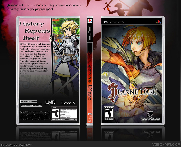
This is my newest box - Jeanne D'arc, the game based off of Joan of Arc. I apologize for the tiny size, but it looks alright in full view.
This is definitely not one of my best, but I enjoyed making it. Isn't that what matters? Haha
Temp belongs to sockeymeow, but I modified it a bit.
[ Reply ]
sweet
[ Reply ]
It's pretty good but I don't like the template or placement of the tagline. I suggest moving the image of the main character at the top to the bottom and putting the tagline in its place. Do that and change the template and I'll favorite.
[ Reply ]
Nicely done. It is indeed a little small, but I think the back works pretty well. #3 makes some good points though too, but it's still a fav for me!
[ Reply ]
Pretty cool but the template isn't very realistic. Update it with a good template without a glow and it will be a good box.
[ Reply ]
I'm working to fix the template now, we'll see how it turns out...
[ Reply ]
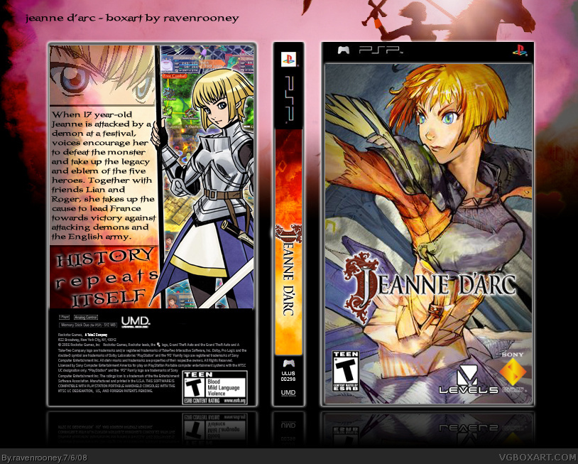
v2 up, and I think it looks tons better. I got myself a new template, thanks to jevangod, and the size is up now.
Better?
[ Reply ]
#7, Much better I think it has a over all better look. Great job.
[ Reply ]
Thanks for the positive input, guys.
[ Reply ]
The front, spine, and back don't match.
The front has a sketchy/artsy drawing, the spine is just out of the blue and doesn't go with anything (I suggest taking it out; it's in the middle so your eyes look at it first, and it really isn't important), and the back is almost cartoony.
Keep a unified style. Always.
Unified color-schemes help, too.
[edit] :( I sound mean.
..I'm just trying to help.
Edited at 1 decade ago
[ Reply ]