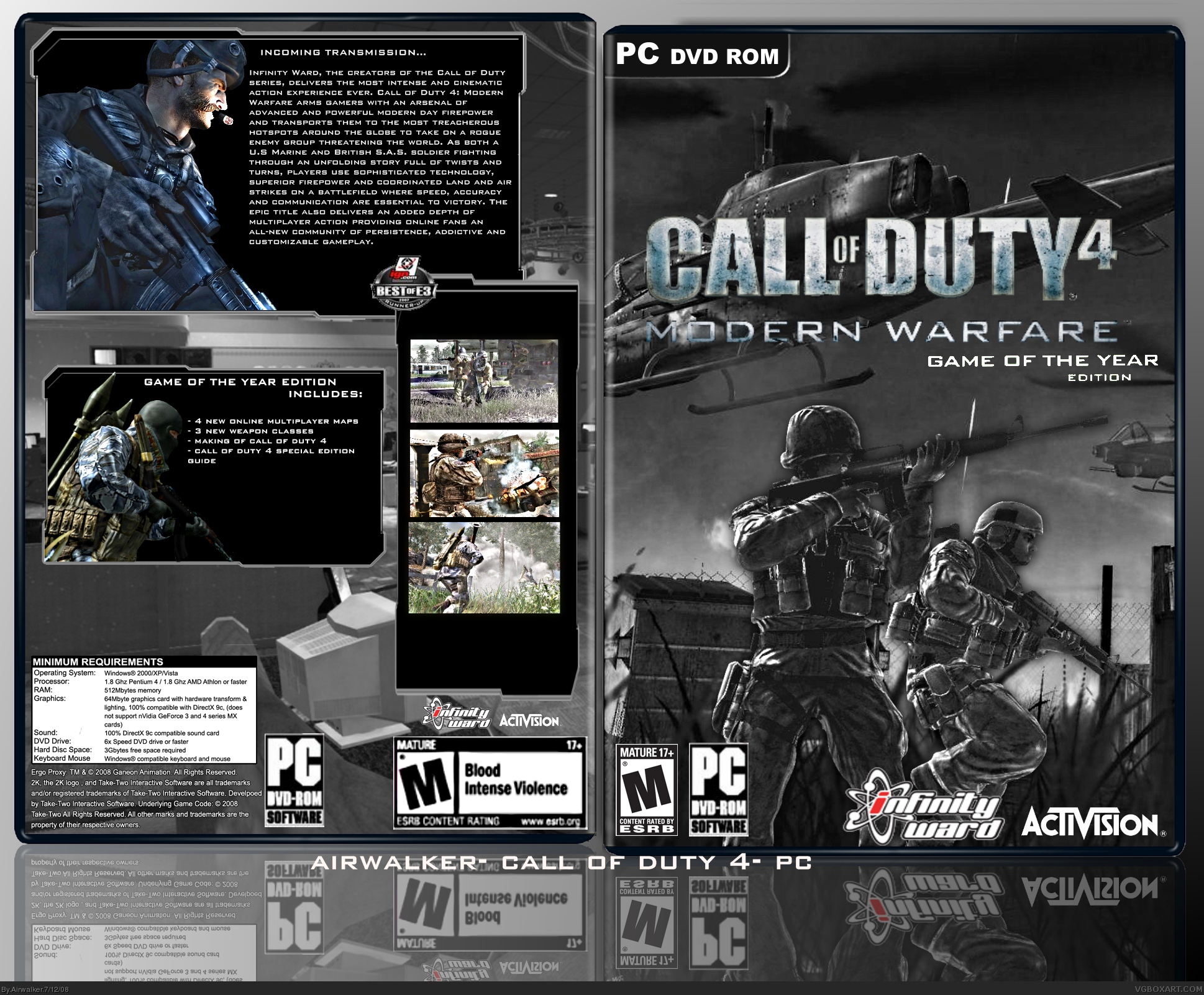
This is pretty sweet man. Although to logo is a bit choppy and the back ESRB is blurry. I don't think the screenborders need that much space. Im liking the presentation and style. +fav
im really liking the layout of the back. but the screenshots would look better without all that space like soundwave said. other than that this is great =)
 Call of Duty 4: Modern Warfare Box Cover Comments
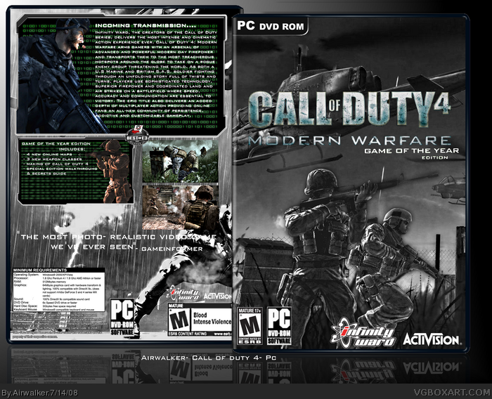
My latest box... took a while to make.. credit to adfd for template.. please comment and rate:)!!
[ Reply ]
This is pretty sweet man. Although to logo is a bit choppy and the back ESRB is blurry. I don't think the screenborders need that much space. Im liking the presentation and style. +fav
[ Reply ]
im really liking the layout of the back. but the screenshots would look better without all that space like soundwave said. other than that this is great =)
Edited at 1 decade ago
[ Reply ]
Good job :)
[ Reply ]
'bout time you made another box :)
[ Reply ]
Thanks everybody.. and ill work on those tips..:)
Edited at 1 decade ago
[ Reply ]
Updated!
[ Reply ]
I actually liked version 1 better. The text on the back is hard to read now and the green doesn't match the greyish-blue color scheme of the box.
[ Reply ]