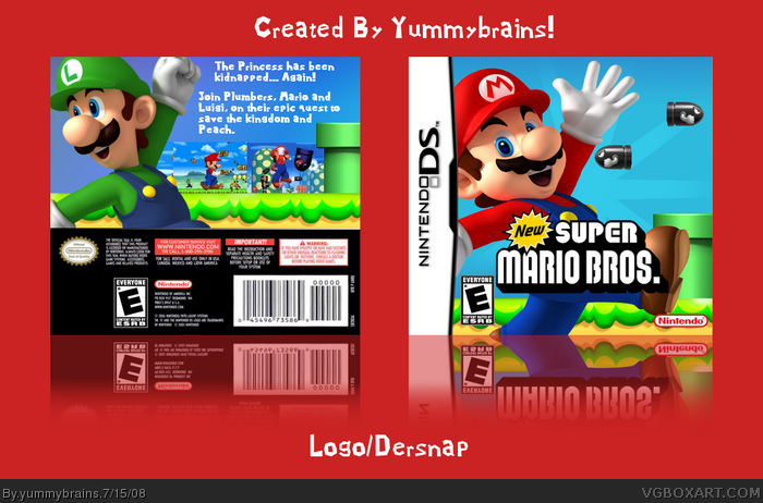
Sweet! The ESRB on the back is wrong though. Fix it. There should be a descriptor. By the way (just an opinion), the box would look nicer with some casing.
You completely ignored my criticism. I said to add something so that the bombs actually looked like they're MOVING and not just sitting there in the sky. On the back, add something to the text and make the text smaller, also change the font on the description, that font is only good for taglines. The screenshots don't have borders, which is bad, the text is just plain white, which is bad, the description is extremely short, has a bad font and is too big, which is bad and the bombs on the front don't even look like they're flying, which is bad.
Please, follow my advice this time and you may get a favorite from me.
#11, Okay, I agree with most of the stuff you stated.
But I still don't see how i'm meant to make it look like they're flying. And, For the Record, could you suggest a font for the text. Also, I don't have a clue how to make the tagline look interesting.
There is also no space for any more space for the text.
 NEW Super Mario Bros. Box Cover Comments
Sweet! The ESRB on the back is wrong though. Fix it. There should be a descriptor. By the way (just an opinion), the box would look nicer with some casing.
EDIT: It should look like this. link
Edited at 1 decade ago
[ Reply ]
nice!
[ Reply ]
Sorry, Late comment.
I'm not really to sure who made the template. Thanks to everyone who helped me whilst making this box.
#1, Thanks, What's wrong with the esrb?
#2, Short but sweet comment. Thanks.
EDIT: Btw, this is my first box in nearly a month.
Edited at 1 decade ago
[ Reply ]
Twenty five views, but no more than two comments? Now that's messed up.
[ Reply ]
You used a front ESRB on the back.
[ Reply ]
#5, I know, i've been informed.
Anything about the design/box?
[ Reply ]
i like it 4.5/5 fav+
[ Reply ]
#7, Thank you, Sir!
[ Reply ]
Great work dude xD
+fav
[ Reply ]
#9, Thanks, Dude!
xD
[ Reply ]
You completely ignored my criticism. I said to add something so that the bombs actually looked like they're MOVING and not just sitting there in the sky. On the back, add something to the text and make the text smaller, also change the font on the description, that font is only good for taglines. The screenshots don't have borders, which is bad, the text is just plain white, which is bad, the description is extremely short, has a bad font and is too big, which is bad and the bombs on the front don't even look like they're flying, which is bad.
Please, follow my advice this time and you may get a favorite from me.
Edited at 1 decade ago
[ Reply ]
#11, Okay, I agree with most of the stuff you stated.
But I still don't see how i'm meant to make it look like they're flying. And, For the Record, could you suggest a font for the text. Also, I don't have a clue how to make the tagline look interesting.
There is also no space for any more space for the text.
That would be all.
Edited at 1 decade ago
[ Reply ]
nice, your best back yet
[ Reply ]
#13, Thanks, I think i'm improving.
[ Reply ]
mostly agreed with #11....
Nice work and effort,though :D
[ Reply ]
#15, Thanks Man.
[ Reply ]
Way Cool!!
[ Reply ]
this is really nice
good work
5/5
+fav
[ Reply ]