First actual part of my 'simplicity is key' series.
That being said, keep that one sentence in mind, as i have tried to make the box outstanding without making it crowded, as i tend to do.
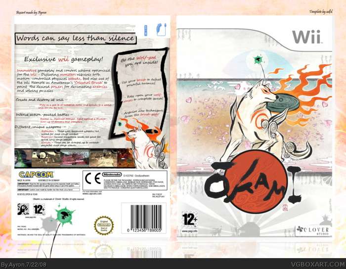
There are some graphical choices i'm not used of making, such as Amaterasu NOT looking at you, and the shit-load of text on the back, but i found out that with the right [ amount ] of tricks and paragraphing of the text, it looks good.
i love the game, and i love how this box came out.
Definetly, one of my best pieces so far , in my opinion.
Enjoy!
-edit- wow,o.o thanks you guys!
Omagah, ryan.. you got your account back?
And already your comment makes no sense xD!
thanks though,everyone ;)
change the PEGI to black, I can barely see it, and make it larger. Clover Studio doesn't really exist anymore, so have a Capcom logo instead. The front looks kinda boring, maybe make Amaterasu a little larger so he takes up some more space. At the moment, it's ok, but it's not really very interesting, and I'd like to see something a little more original for Okami.
It seems everyone these days uses simplicity as an excuse... most of the time, it's ok, for games like Portal and whatnot. but for a very arty game like Okami, it needs to be more vibrant and stylish. The game focuses on an ancient Japanese painting style, so I think you should try and incorporate that into the design, somehow... I like what you did with the blossoms, but for the most part, it's fairly boring. And developers nearly ALWAYS have a conflicting coloured PEGI on the front- if it's a white background, it has a black rating, and vice versa. You can see the actual "12+" but the entire rating has to be seen. You should do the same on the back, too. I can't say "it doesn't live up to my standards" because mine are much different from yours, but it doesn't really live up to the standard one would expect from a Rank 9, or even just someone's who made over 150 boxes in a year and a half, or whatever.
#9, simplicity and minimalistic design is the enemy on this page :)
however... I guess you should try to get the flames on th efront to the left side. looks a bit unbalanced to me (maybe due to the Wii-Logo that´s always taking more space than the left side of the upper part on the front - hope you understand XD)
# 11: agree at the excuse thing, but are we talking about the same anchient japanese art? there`s a lot of such stuff link
besides I think everything can be done in a rather minimalistic/simple way even though this can be a real tightrope walk cause plainness is pretty close
The only thing I dont like is the PEGI should be black (like Vengeance pointed out) and you should of used a Capcom logo instead of Clover. But I like the overall simplistic design of the box so a fav from me ^^
I think the box is really nice, I love the white/grey color scheme and typography. Vekta just made an annoying non-constructive comment and acted as if the Hall of Fame should only suit his taste, whether that is his intention or not.
 Okami Box Cover Comments
Oh dear...
Edited at 1 decade ago
[ Reply ]
!
[ Reply ]
At first I was liek "ghey"
But then I serious'd.
[ Reply ]
Welcome to finally another box from me.
First actual part of my 'simplicity is key' series.
That being said, keep that one sentence in mind, as i have tried to make the box outstanding without making it crowded, as i tend to do.
There are some graphical choices i'm not used of making, such as Amaterasu NOT looking at you, and the shit-load of text on the back, but i found out that with the right [ amount ] of tricks and paragraphing of the text, it looks good.
i love the game, and i love how this box came out.
Definetly, one of my best pieces so far , in my opinion.
Enjoy!
-edit- wow,o.o thanks you guys!
Omagah, ryan.. you got your account back?
And already your comment makes no sense xD!
thanks though,everyone ;)
Edited at 1 decade ago
[ Reply ]
realy good, I traded a lot of stuff to my friend and this is one of the games (ps2 version)i got. And Im glad I did
[ Reply ]
#3, YOUR UN BANNED, awesome! Anyway's nice box I like the subtile simple approach
[ Reply ]
Looking good.
[ Reply ]
change the PEGI to black, I can barely see it, and make it larger. Clover Studio doesn't really exist anymore, so have a Capcom logo instead. The front looks kinda boring, maybe make Amaterasu a little larger so he takes up some more space. At the moment, it's ok, but it's not really very interesting, and I'd like to see something a little more original for Okami.
[ Reply ]
#8, the pegi is visible enough, and i tried making it black, but that just RUINS the entire simple flow of the box.
That being said, i believe you've got something against either simplicity or me, or your opinion just differs too much from mine.
Sorry if my box isn't up to your standards, as i did my best.
Edited at 1 decade ago
[ Reply ]
Nice, but that tagline's gotta be one of the worst I've seen.
[ Reply ]
It seems everyone these days uses simplicity as an excuse... most of the time, it's ok, for games like Portal and whatnot. but for a very arty game like Okami, it needs to be more vibrant and stylish. The game focuses on an ancient Japanese painting style, so I think you should try and incorporate that into the design, somehow... I like what you did with the blossoms, but for the most part, it's fairly boring. And developers nearly ALWAYS have a conflicting coloured PEGI on the front- if it's a white background, it has a black rating, and vice versa. You can see the actual "12+" but the entire rating has to be seen. You should do the same on the back, too. I can't say "it doesn't live up to my standards" because mine are much different from yours, but it doesn't really live up to the standard one would expect from a Rank 9, or even just someone's who made over 150 boxes in a year and a half, or whatever.
[ Reply ]
#9, simplicity and minimalistic design is the enemy on this page :)
however... I guess you should try to get the flames on th efront to the left side. looks a bit unbalanced to me (maybe due to the Wii-Logo that´s always taking more space than the left side of the upper part on the front - hope you understand XD)
# 11: agree at the excuse thing, but are we talking about the same anchient japanese art? there`s a lot of such stuff link
besides I think everything can be done in a rather minimalistic/simple way even though this can be a real tightrope walk cause plainness is pretty close
Amaterasu is female, as far is know ;)
Edited at 1 decade ago
[ Reply ]
The only thing I dont like is the PEGI should be black (like Vengeance pointed out) and you should of used a Capcom logo instead of Clover. But I like the overall simplistic design of the box so a fav from me ^^
[ Reply ]
Tastes like chicken!
[ Reply ]
#3, Kermit serious'd.
[ Reply ]
I'll update tomorrow,Vengeance,Wasa-bi and Cerium ^^!
Thanks everyone. ;)
Allthough i may not /seem/ to like it, thanks a bunch for the crits ^^!
[ Reply ]
#14, please stop.
Looking through your comment history, I see immature fart jokes, comments about sex, and comments like that one.
[ Reply ]
Ouch. sorry about not yet updating it,folks.
I do have the intention to update it, all i need is some time ^^!
My apologies.
[ Reply ]
Ayron, you never cease to amaze me
FAVE, AUTHOR FAVE
[ Reply ]
Ayron, this is real simplicity ;)
[ Reply ]
people that say its bad are crazy this cover is awesome 100/100 aaaaaaaaaaaa
[ Reply ]
Sorry but this box is not pleasing to the eye one little bit. How did this get in the hall?
[ Reply ]
#22, what???
Ok, i understand that you don't like it. but.. don't you agree that was kinda unnessacary?
[ Reply ]
I think the box is really nice, I love the white/grey color scheme and typography. Vekta just made an annoying non-constructive comment and acted as if the Hall of Fame should only suit his taste, whether that is his intention or not.
Edited at 1 decade ago
[ Reply ]