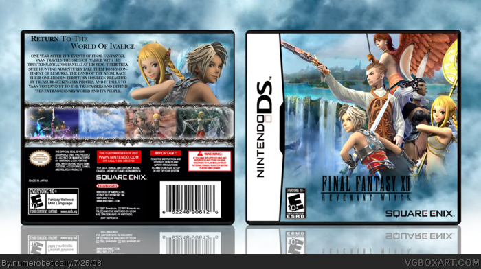
[ Box updated on July 25th, 2008 ] [ original ]
 Final Fantasy XII: Revenant Wings Box Cover Comments
Comment on numerobetically's Final Fantasy XII: Revenant Wings Box Art / Cover.
[ Box updated on July 25th, 2008 ] [ original ]
Comment on numerobetically's Final Fantasy XII: Revenant Wings Box Art / Cover.
This is nice...
[ Reply ]
Oh wow you're fast. Thanks :)
I really wanted to do this, and I think it came out very well. I really like the front :D
[ Reply ]
the text could use an effect. :)
[ Reply ]
Oh yeah, fav'd.
[ Reply ]
OMG you spelled Trusted and Treasure incorrectly!!
*takes back fav*
=P
[ Reply ]
Okay it's fixed :)
*embarrassed*
Edited at 1 decade ago
[ Reply ]
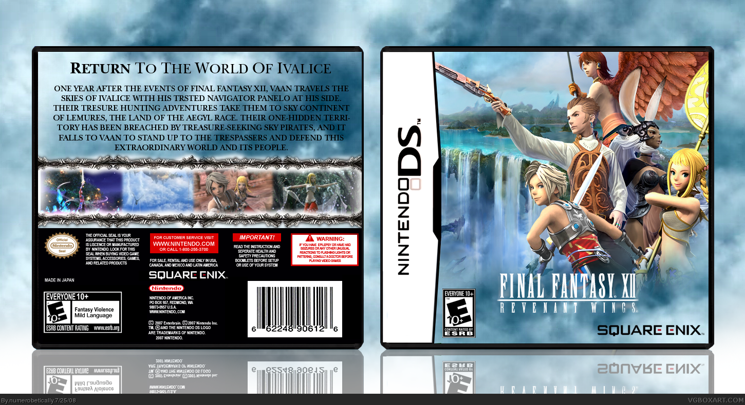
Back needs something more :I
[ Reply ]
.... Love this, agreed the back needs somthing but I love the character placing on the front... Love it though FAV
Edited at 1 decade ago
[ Reply ]
Well, the logo's oddly placed, too small, and could use a black stroke. The front's nice, but the characters would look better centered, and overall it looks too much like the other ones. I agree about the back, it's too plain, and the over glow on the orders are an over kill (i iz heelariush) Altogether, not bad, but you can do much better.
[ Reply ]
Looks great :)
[ Reply ]
#9, I agree, it's not bad, I like the screenshot frames.
[ Reply ]
Okay. How's that? (the update)
Edited at 1 decade ago
[ Reply ]
Suggestions for borders and the front still apply :P
[ Reply ]
Oh yeah I was trying to type a comment earlier but the internet on my phone was too slow. The characters on the front look awful centered because then you can't see the background, which is something I want you to be able to see clearly, as the setting of this game is both important and really in one area. The logo was where the esrb is now, and I had to move it, because obviously people are going to make a big deal of that when the esrb is in the wrong place :P. The logo, also, looks back with a stroke or any effect, as does the back font, and the screenborders look bad without a glow.
I know this looks like I'm totally shutting you down, but I don't mean it to. It's just that all the things you suggested, short of the back needing more, I've already tried :(
BTW I changed the logo to black so it matches the font color on the back.
Edited at 1 decade ago
[ Reply ]
Excellent work Nikki. Again.
[ Reply ]
Thanks :)
[ Reply ]
really nice!
[ Reply ]
Sorry to bump but how this only has 9 favs is a great tragedy of this site.
[ Reply ]