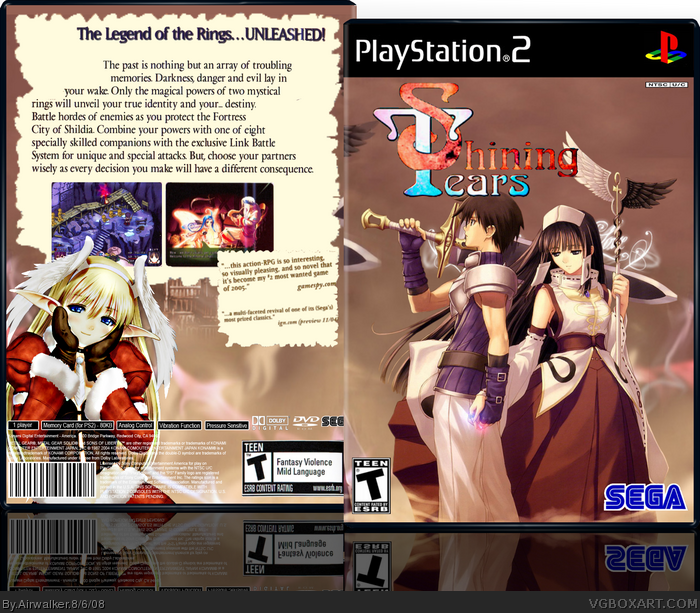
I agree that the logo should be cleaned up, and also the text on your back still has white spaces on it. I think you should make the logo smaller too. Also I don't think the picture of the girl in the christmas outfit really goes well, but I like this cover.
 Shining Tears Box Cover Comments
My latest box.. credit to ADFD for the awesome template... the rest planetrenders... please comment and rate!!:)
[ Reply ]
It looks pretty good, and everything is in place from what I can see.
You might want to clean up the title logo some more though.
Nice job all in all.
[ Reply ]
I agree that the logo should be cleaned up, and also the text on your back still has white spaces on it. I think you should make the logo smaller too. Also I don't think the picture of the girl in the christmas outfit really goes well, but I like this cover.
[ Reply ]
#2 & #3, Thanks.. and ill try working on the faults..
[ Reply ]
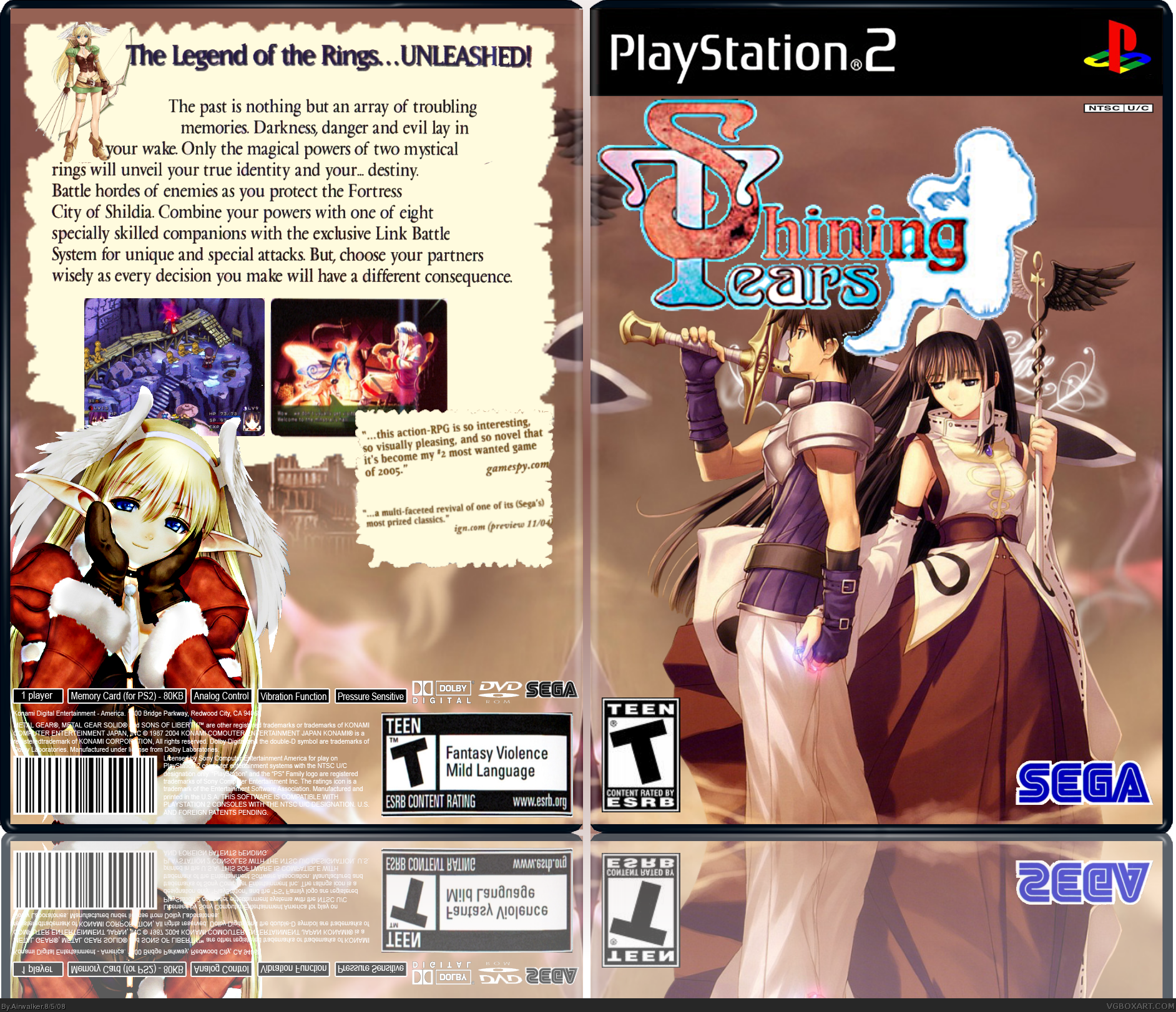
Updated!
[ Reply ]
I like it but the ESRB should be a bit smaller.
[ Reply ]
The logo is looking much better. If possible, try adding an stroke effect on it, or maybe even an outer glow.
[ Reply ]
#7, I couldn't find a good logo in png format... im trying to find on to replace the current
[ Reply ]
Updated!! Changed the logo...
[ Reply ]
i like youu layout your underatted mate.
+fav
[ Reply ]