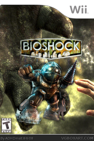
I appreciate the attempt, and can tell you did try to do some actual graphic work on this one, but the composition looks a bit odd.
I can see the background is an image of Big Daddy reaching out to a Little Sister, or vice versa, but it comes of as looking like someone has a Big Daddy pocket monster or something, and is sending it forth to battle. (That actually may be a neat concept...)
But anyway, I'm not trying to make a joke. I doubt that's what you were going for, but that is kinda how it comes across at first glance.
The logo and renders are actually looking pretty good on this, so I might recommend making some adjustments to scale, adding developer logos, maybe changing the ESRB rating to "M" and you'll most likely come out with an acceptable box.
LOL #3, Big Daddy pocket monster! GOTTA CATCH 'EM ALL!!!! Looks like all the artist did was take a bunch of wallpaper art and slop them together.... TO ME it looked like the Big Daddy was fighting Jack and the hand is Jack's and not the little sister, like your are looking at it first person. And the LOGO is SOOOO low. 2/5
OH, and if Bioshock came out for the Wii it would look like garbage. Freaking gamecube graphics with a different controller... makes me so mad. AM I the only PC gamer left?
 Bioshock Box Cover Comments
Ok, Im still new at this so give me a break. I didn't put the 2k logo cuz I couldn't find a render of it so if you could post the logo. thanx.
[ Reply ]
really good but it should be a mature i believe and the 2k logos afent that hard to render good tho
[ Reply ]
I appreciate the attempt, and can tell you did try to do some actual graphic work on this one, but the composition looks a bit odd.
I can see the background is an image of Big Daddy reaching out to a Little Sister, or vice versa, but it comes of as looking like someone has a Big Daddy pocket monster or something, and is sending it forth to battle. (That actually may be a neat concept...)
But anyway, I'm not trying to make a joke. I doubt that's what you were going for, but that is kinda how it comes across at first glance.
The logo and renders are actually looking pretty good on this, so I might recommend making some adjustments to scale, adding developer logos, maybe changing the ESRB rating to "M" and you'll most likely come out with an acceptable box.
Good job.
Edited at 1 decade ago
[ Reply ]
LOL #3, Big Daddy pocket monster! GOTTA CATCH 'EM ALL!!!! Looks like all the artist did was take a bunch of wallpaper art and slop them together.... TO ME it looked like the Big Daddy was fighting Jack and the hand is Jack's and not the little sister, like your are looking at it first person. And the LOGO is SOOOO low. 2/5
OH, and if Bioshock came out for the Wii it would look like garbage. Freaking gamecube graphics with a different controller... makes me so mad. AM I the only PC gamer left?
Edited at 1 decade ago
[ Reply ]