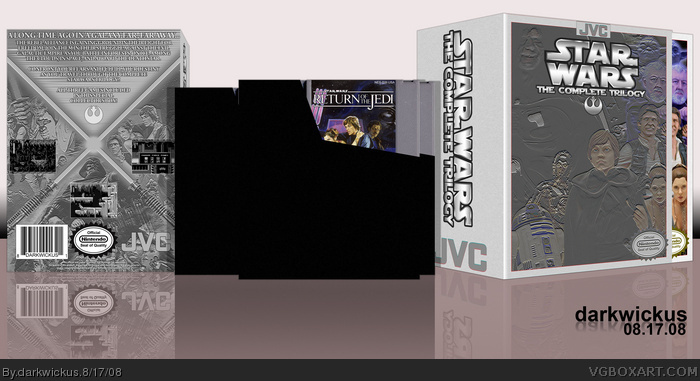
So, I was in the store the other day, and I saw a collection for Metal Gear Solid (1, 2, & 3) and I thought "hey, that's pretty cool." And it got me thinking, they have been doing that with movies for years, but only recently with video games. So, I tried to think of how I could fit something like that into an old school system. This is what I came up with.
Now I know Return of the Jedi was never released on NES... so what?! I decided because of that, that I would feature that game as the cartridge.
it's not horrible
i think the chromey-filter effect works well on the back, but i don't like way it turned out on the front... why is it like that? whats with the weird bit of color? i bet it would look better all b&w... you shouldve used the same filter thingy from the back.
#7: The more I look at this, the more I tend to agree that the front could be stronger, or at least different. I really don't remember why I chose to keep some color on the front. I do remember doing the effect on R2-D2 and liking the blue showing through. The only different between that and the back is just a desaturation if I remember correctly. I may revisit this and change some things around, as it's probably my weakest submission in a while.
it seems to me the inclusion of colour on the front of the box.. ruins it.. maybe if it was desaturated then it would look nice.. Overall the presentation is nice.. and i feel this is a unseen gem of a box!
 Star Wars Trilogy Box Cover Comments
So, I was in the store the other day, and I saw a collection for Metal Gear Solid (1, 2, & 3) and I thought "hey, that's pretty cool." And it got me thinking, they have been doing that with movies for years, but only recently with video games. So, I tried to think of how I could fit something like that into an old school system. This is what I came up with.
Now I know Return of the Jedi was never released on NES... so what?! I decided because of that, that I would feature that game as the cartridge.
Please enjoy! I had a great time making this one!
[ Reply ]
Whoah, sweet!
[ Reply ]
Danggit! I was gonna do this! LOL Well, I'm glad to see that an artist with talent beat me to it. Very very awesome job Darkwickus!
[ Reply ]
Hey thanks guys!
#3: Go ahead and do it up, son! There are so many multiple submissions on this site. I'm sure you'd have an awesome and unique take on the trilogy!
[ Reply ]
Really good effort, I don't like the filter/effect on the front.
[ Reply ]
Ok, normally I don't like trying to give a box attention, but it's been a day and only 5 comments..
[ Reply ]
it's not horrible
i think the chromey-filter effect works well on the back, but i don't like way it turned out on the front... why is it like that? whats with the weird bit of color? i bet it would look better all b&w... you shouldve used the same filter thingy from the back.
Edited at 1 decade ago
[ Reply ]
#7: The more I look at this, the more I tend to agree that the front could be stronger, or at least different. I really don't remember why I chose to keep some color on the front. I do remember doing the effect on R2-D2 and liking the blue showing through. The only different between that and the back is just a desaturation if I remember correctly. I may revisit this and change some things around, as it's probably my weakest submission in a while.
Thanks for the suggestions guys!
[ Reply ]
it seems to me the inclusion of colour on the front of the box.. ruins it.. maybe if it was desaturated then it would look nice.. Overall the presentation is nice.. and i feel this is a unseen gem of a box!
Edited at 1 decade ago
[ Reply ]