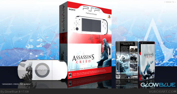
This is my first attempt at a bundle box. I rendered the PSP in 3D and there's obviously some minor issues with it, but I don't have the ambition to go back and fix them now. LOL If you like it, fav it and if not, I hope you like my next box. Thanks!
I'm disappointed. The editing of the PSP could have been a lot better. And while the bundle box looks alright, the main box isn't very good. The 3D looks really bad and the back feels really crammed. The screen borders look bad and I don't like the font, or the way you added the screen descriptions. The Altair on the back seems too bright and I don't like the background behind him. The tagline also doesn't look Assassin's Creed-ish (?). The front looks way too boring and it's sort of unoriginal.
Sorry if I sounded harsh, but this definately could've been better.
#12, Yeah I agree with you on pretty much all of what you said. I got to the end of this and nearly threw away the whole bundle box and kept just the PSP case, but... *shrug*. As I said above, the PSP handheld did not come out as well as I'd hoped. I had a lot of trouble with modeling the buttons and the overall shape of the unit since I'm still VERY new at 3D modeling.
I will, however, defend my choice for the tagline. I didn't want to use the "art of the kill" that everyone does. I suppose it just didn't work out.
I'm not very emotionally attached to this project. I did it on a whim and obviously the art suffered for that.
again. this is awesome, but i cant beleive your only on the site for what 2 months, and your rank 6? i envy you! do u use photoshop?
if so, could you pm me good photoshop tips
 Assassin's Creed Box Cover Comments
This is my first attempt at a bundle box. I rendered the PSP in 3D and there's obviously some minor issues with it, but I don't have the ambition to go back and fix them now. LOL If you like it, fav it and if not, I hope you like my next box. Thanks!
[ Reply ]
Really cool awesome bundle pack. I would buy it. 5/5
[ Reply ]
Cool. They should've made this instead of that shitty DS game.
[ Reply ]
this would rule the gaming industry, an Assasins Creed and a PS3 I would buy 2
[ Reply ]
I like it, nice job +Fav
[ Reply ]
awsome job
[ Reply ]
nice!
[ Reply ]
Very nice bundle, although I might have gone for a blue color scheme on the bundle box. I like the game box, but the bundle box feels a bit empty.
[ Reply ]
DAMN, there are a lot of good boxes on the front page. And a lot of shit ones too, but awesome.
Edited at 1 decade ago
[ Reply ]
Congratulations, you are now rank 6 :)
Edited at 1 decade ago
[ Reply ]
the bundle thing is kewl but not the box. I dont like how it says "there is a killer inside you". I was laughing.
[ Reply ]
I'm disappointed. The editing of the PSP could have been a lot better. And while the bundle box looks alright, the main box isn't very good. The 3D looks really bad and the back feels really crammed. The screen borders look bad and I don't like the font, or the way you added the screen descriptions. The Altair on the back seems too bright and I don't like the background behind him. The tagline also doesn't look Assassin's Creed-ish (?). The front looks way too boring and it's sort of unoriginal.
Sorry if I sounded harsh, but this definately could've been better.
[ Reply ]
#12, Yeah I agree with you on pretty much all of what you said. I got to the end of this and nearly threw away the whole bundle box and kept just the PSP case, but... *shrug*. As I said above, the PSP handheld did not come out as well as I'd hoped. I had a lot of trouble with modeling the buttons and the overall shape of the unit since I'm still VERY new at 3D modeling.
I will, however, defend my choice for the tagline. I didn't want to use the "art of the kill" that everyone does. I suppose it just didn't work out.
I'm not very emotionally attached to this project. I did it on a whim and obviously the art suffered for that.
[ Reply ]
nice man, love the psp
[ Reply ]
again. this is awesome, but i cant beleive your only on the site for what 2 months, and your rank 6? i envy you! do u use photoshop?
if so, could you pm me good photoshop tips
[ Reply ]