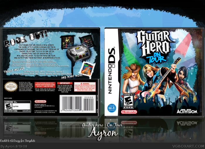
Anyways, as much as this box will get ignored due to the awesomeness of hsoldier's NMH box, i decided to post anyways.
For my own sake.
yes. my own sake! [ not the drink,japan-fetisjists. ]
Anyways, if you didn't see it, Credit to ELCrazy for the template, and people in WIP thread [ and chibi_cloud ;) ] for comments/criticism ]^^:D
This took alot of effort/time, believe it or not.
Plus, i was getting kinda sick of orange/yellow GH:OT boxes :P
Enjoy!
-edit-
Huh, what's wrong with it Jevan :S?
#2, yeah, i know, but i kinda liked it to be a bit more plain-ish, more concentration of the viewer will be attracted to the text.
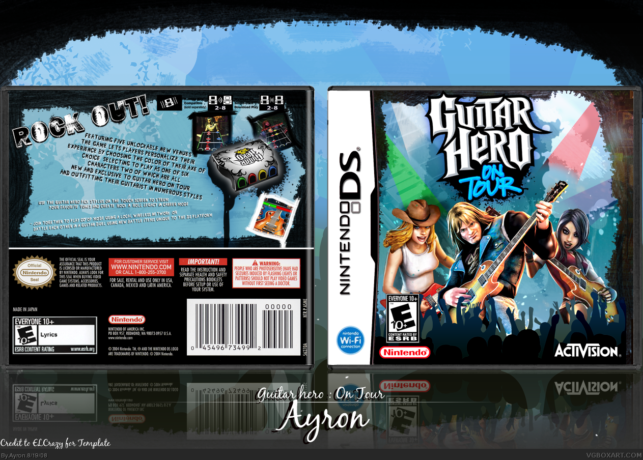
You might want to straighten out the text a little so you have more space to enlarge the screenshots, and GH games pretty much always say some of the tracks on the back of the box.
#5 Ow! what did you just say to hsoilder?! Hi-5! he's been annoying me by pming me awesome box,got the game and i wanted a box for it and guess what got a spare box and printed this out and put it in and now this is the box cover.... thanks for making 5/5!!!!!!!! + Mega fav from me !
Anyway, the front design is stellar. The back looks better now with Greg's suggestions. Try adding some more fitting bullets or incorporate a character render in there somewhere. It would look even more amazing. ;)
It's really nice, thanks for reminding me to check it out ;) Only visible flaw I can see are the different lighting on each render. Try contrast masking them and make the light source or each one the same. Other than that, awesome job, worth a fav :)
Nice. Front is great. I just saw your WIP... and when I first saw the blue... I thought it really should have been the back of a pair of jean's pocket -- you know -- since it's a portable game! :) I actually preferred the bigger and slant version of the logo.
Glad you changed the back text to horizontal.. looks better - although it could do with more colour instead of just the blue, black and white.
 Guitar Hero On Tour Box Cover Comments
Sweet dude! You fixed it! ;) Once again, your work always leaves me speechless. Love the new approach.
Edited at 1 decade ago
[ Reply ]
front is sweet! :D but the back dosent look as good? looks a bit plain compared to the front.
Edited at 1 decade ago
[ Reply ]
Epic.
[ Reply ]
Not bad but whats up with the nintendo logo under the esrb on the front
[ Reply ]
Screw you, Hsoldier.Screw you big-time.
Anyways, as much as this box will get ignored due to the awesomeness of hsoldier's NMH box, i decided to post anyways.
For my own sake.
yes. my own sake! [ not the drink,japan-fetisjists. ]
Anyways, if you didn't see it, Credit to ELCrazy for the template, and people in WIP thread [ and chibi_cloud ;) ] for comments/criticism ]^^:D
This took alot of effort/time, believe it or not.
Plus, i was getting kinda sick of orange/yellow GH:OT boxes :P
Enjoy!
-edit-
Huh, what's wrong with it Jevan :S?
#2, yeah, i know, but i kinda liked it to be a bit more plain-ish, more concentration of the viewer will be attracted to the text.
Edited at 1 decade ago
[ Reply ]
You might want to straighten out the text a little so you have more space to enlarge the screenshots, and GH games pretty much always say some of the tracks on the back of the box.
[ Reply ]
O geez. At least it'll get more attention than my box, and my box had all crap boxes around it!!
edit: Ayron, I think what Jevan's trying to say is the esrb is usually down more and the nintendo logo is off to the right.
Edited at 1 decade ago
[ Reply ]
#6, not always. ;) In my opinion, it isn't necessary.
[ Reply ]
#5 Ow! what did you just say to hsoilder?! Hi-5! he's been annoying me by pming me awesome box,got the game and i wanted a box for it and guess what got a spare box and printed this out and put it in and now this is the box cover.... thanks for making 5/5!!!!!!!! + Mega fav from me !
[ Reply ]
#9, wtf? i dont understand a word of that
[ Reply ]
Nice work. The back I would have liked to have more going on, but the simplicity works for it.
[ Reply ]
#10 he said something like hsoilder has been annoying me or something. Hsoilder what did you do? :p
#13 lol he's as troll he has no idea what he's talking about.
Edited at 1 decade ago
[ Reply ]
lol hes crazy i dont no who the guy is lol and ive never pm'd him what are ya talking about?
Edited at 1 decade ago
[ Reply ]
#13
Oh.....sorry about that theres other hsoldier online on my forums and i thought you were him.... sorry
Cool avatar!
[ Reply ]
#6, i might check that out, thanks ;)
Hmmkay #9, great misunderstanding , haha xD
Thanks everyone :D
[ Reply ]
Why is the Nintendo logo under the ESRB on the front.
[ Reply ]
#16 didn't you say that before? O_O
[ Reply ]
Mah bum hole's still sore.
[ Reply ]
#16, i've seen it in shops on DS boxes before.
Updated to Vengeance's criticism ^^"
[ Reply ]
#19, I havent. Dont know where you be going.
[ Reply ]
#20, to dutch shops,perhaps xD? [ go pegi rating ]
[ Reply ]
nice job, fav!
[ Reply ]
i like how you made it so different than other on tour boxes. i wish this was the real one. fav. could you make a printable?
[ Reply ]
This is really nice.
[ Reply ]
#23, i'm sorry, i don't think i'll be able to do that.
feel free to try it yourself =[
Thanks everyone :D! ^^
[ Reply ]
Sorry that I missed this, Ayron.
Anyway, the front design is stellar. The back looks better now with Greg's suggestions. Try adding some more fitting bullets or incorporate a character render in there somewhere. It would look even more amazing. ;)
[ Reply ]
It's really nice, thanks for reminding me to check it out ;) Only visible flaw I can see are the different lighting on each render. Try contrast masking them and make the light source or each one the same. Other than that, awesome job, worth a fav :)
[ Reply ]
Nice. Front is great. I just saw your WIP... and when I first saw the blue... I thought it really should have been the back of a pair of jean's pocket -- you know -- since it's a portable game! :) I actually preferred the bigger and slant version of the logo.
Glad you changed the back text to horizontal.. looks better - although it could do with more colour instead of just the blue, black and white.
[ Reply ]
Hall of Fame!! W00T!
[ Reply ]
this is awesome
[ Reply ]
#27, i'm sorry, i have NO clue how to do that...
Thanks alot, everyone =D
p.s.
g
Go beyourtrueDesign =D!!
[ Reply ]
i think this is better than the real boxart. needs to be in the hall of fame!
[ Reply ]