Yeah. Sorry about the blurry images. All the logos were small and I had to stretch it out and it became blurry. Same thing with the text. I accidently made it small. When I saved the cover on Paint, it made the text blurry. Sorry. But the good thing is that I'm getting used to making boxes on this site. It's a way to show my creativity that some turns out badly. I'm working on it though.
love calvin and hobbes but this box isn't all that great.
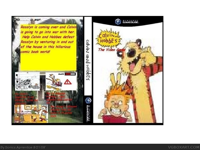
- renders are terrible, over stretched, pixally, blury
- on the back, screen shots are terrible, and don't look like movies, look like pictures.
-text having own box and not being on picture is terrible
-font on the box is illedgible
 Calvin & Hobbes Box Cover Comments
Ok..... well put a front background,better quality renders,do not make screen unless your good and also make just a front and focus on it!
[ Reply ]
it has a good idea but it is really blurry
[ Reply ]
Yeah. Sorry about the blurry images. All the logos were small and I had to stretch it out and it became blurry. Same thing with the text. I accidently made it small. When I saved the cover on Paint, it made the text blurry. Sorry. But the good thing is that I'm getting used to making boxes on this site. It's a way to show my creativity that some turns out badly. I'm working on it though.
[ Reply ]
dont use paint its not good for making boxes on try paint.net or gimp
[ Reply ]
#4, I don't have that program. Well, I'll be sure to get it. Thanks for the comment. I needed advice for the problem.
[ Reply ]
Plus, it doesn't even look like a real box at all.
[ Reply ]
Uuuh...yeah...not too good...
[ Reply ]
Yeah I know.
[ Reply ]
Why is the spine upside-down?
[ Reply ]
i love calvin and hobbes. you kust killed them.
[ Reply ]
love calvin and hobbes but this box isn't all that great.
- renders are terrible, over stretched, pixally, blury
- on the back, screen shots are terrible, and don't look like movies, look like pictures.
-text having own box and not being on picture is terrible
-font on the box is illedgible
1/5
sorry but you need more work
Edited at 1 decade ago
[ Reply ]