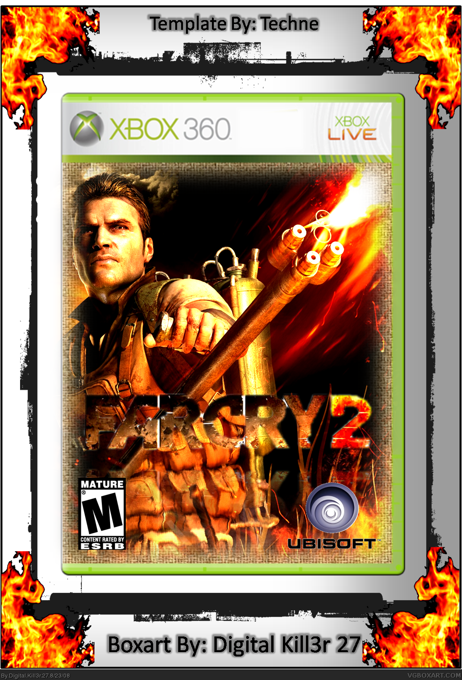
Looks good, some tips:
*Remove the reflection under the logo, I suggest only adding reflections on the actual box to tech-y boxes
*Try a different font choice for the back
*Try making the E3 thing on the front smaller and perhaps move it. Maybe between the ESRB and Ubisoft logos?
 FarCry 2 Box Cover Comments
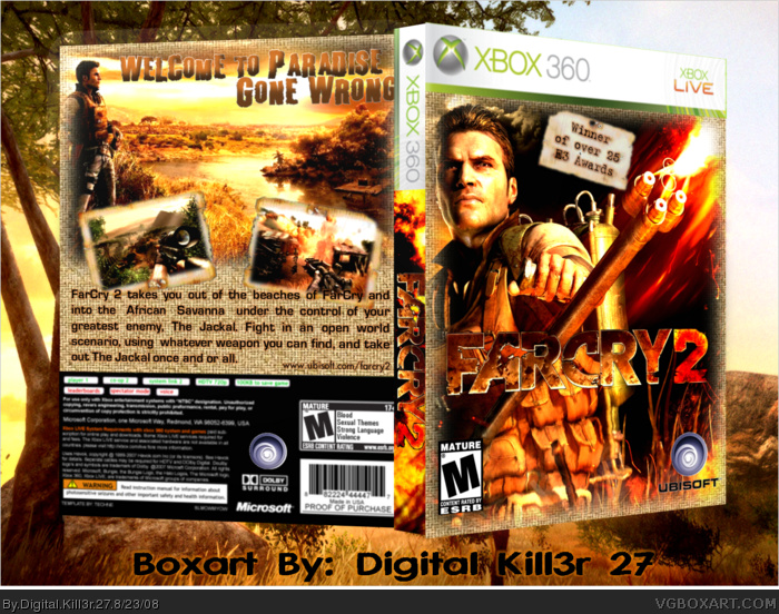
The flames on the edges didnt come out as good as i wished, but i am pleased by the rest, and if requested, I'll add a back.
PS: All of this was made on MS POWERPOINT 2007.
[ Reply ]
I would like to see a back.
And the logo is cutted out poorly
Edited at 1 decade ago
[ Reply ]
better logo and back on the way
[ Reply ]
V2 is up, I added a back and fixed the logo, PLEASE COMMENT!
And before u ask, THIS IS NOT A COPY OF DA BOMB's FARCRY2 BOX.
Edited at 1 decade ago
[ Reply ]
Looks good, some tips:
*Remove the reflection under the logo, I suggest only adding reflections on the actual box to tech-y boxes
*Try a different font choice for the back
*Try making the E3 thing on the front smaller and perhaps move it. Maybe between the ESRB and Ubisoft logos?
[ Reply ]
#5 I made the E3 thing samllr, but I kept its position. I changed the font on the Back. The front logo no longer has a reflection
[ Reply ]
Come on Guys, this took me 5 hours to make in POWERPOINT!!! That takes skill!
[ Reply ]
I really like it, especially the screenshot borders. +fav
[ Reply ]
I updated with 3d look,and this is HARD on POWERPOINT!!! Please leave a comment!!!
If you liked the the version before this, i'll repost it.
Edited at 1 decade ago
[ Reply ]
Whos leg to I have to hump to get some attention around here?
#11, sorry, Im kinda new to this site.
Edited at 1 decade ago
[ Reply ]
#10, don''t beg or bump comments you can get banned for that
Edited at 1 decade ago
[ Reply ]
Thanks for the fav Spiderpig24
[ Reply ]
Looks better, don't believe you made in powerpoint though
[ Reply ]
#13 Why would I lie about that?
Edited at 1 decade ago
[ Reply ]