[ Buy Resistance 2 at Amazon ] By Skyrunner 33 on August 24th, 2008 No Printable Available Resistance 2 Box Cover Comments Comment on Skyrunner's Resistance 2 Box Art / Cover. Cancel Reply Skyrunner 33 [ 1 decade ago ] View full please :) Im pleased with this, and I hope you guys are too. Its my birfdeh box! On aim Dave and Guitarman said to upload, the only major problem was that the temp was blurry. I guess I dont really have much to say, credit to ADFD for temp, and planet renders for renders. So please critique and enjoy, my birfday box. #2 thanks :D Oh, I almost forgot this is my duel box against Gearblaze. Edited at 1 decade ago [ Reply ] Jbone 32 [ 1 decade ago ] I like. [ Reply ] GuitarMan 28 [ 1 decade ago ] the sony logo is a little steched. but it's good [ Reply ] Skyrunner 33 [ 1 decade ago ] #3 Thanks Edited at 1 decade ago [ Reply ] ClonedX 35 [ 1 decade ago ] I know what you wanted to do with the back text, but it seems it didnt work very well. Still this is your best box and i can see the effort you putted in. [ Reply ] Skyrunner 33 [ 1 decade ago ] #5 Thanks man. :D And Travis thanks for the fav too. :) #7 What should I improve on the front? Edited at 1 decade ago [ Reply ] master_general 43 [ 1 decade ago ] though im still not a fan of the font, i still fav it [ Reply ] Skyrunner 33 [ 1 decade ago ] I dont mean to bump but this was my birthday box :( Any more comments? [ Reply ] Pan 48 [ 1 decade ago ] I really think you should change the boarder holding the texy on the back, it would make this a lot better looking. [ Reply ] Skyrunner 33 [ 1 decade ago ] #9 Ok, I'll try that [ Reply ] Outcast of Redemption 23 [ 1 decade ago ] there's room for some improvement, but good job! 3.8/5 Edited at 1 decade ago [ Reply ]
 Resistance 2 Box Cover Comments
View full please :)
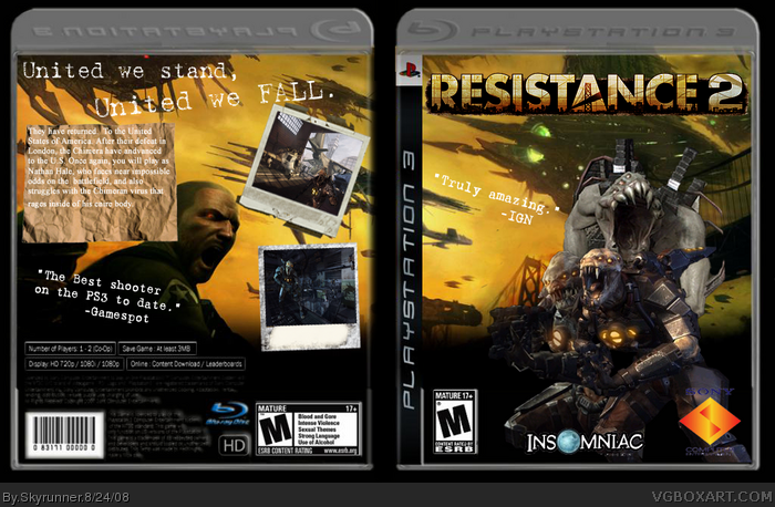
Im pleased with this, and I hope you guys are too. Its my birfdeh box!
On aim Dave and Guitarman said to upload, the only major problem was that the temp was blurry.
I guess I dont really have much to say, credit to ADFD for temp, and planet renders for renders. So please critique and enjoy, my birfday box.
#2 thanks :D
Oh, I almost forgot this is my duel box against Gearblaze.
Edited at 1 decade ago
[ Reply ]
I like.
[ Reply ]
the sony logo is a little steched.
but it's good
[ Reply ]
#3 Thanks
Edited at 1 decade ago
[ Reply ]
I know what you wanted to do with the back text, but it seems it didnt work very well. Still this is your best box and i can see the effort you putted in.
[ Reply ]
#5 Thanks man. :D
And Travis thanks for the fav too. :)
#7 What should I improve on the front?
Edited at 1 decade ago
[ Reply ]
though im still not a fan of the font, i still fav it
[ Reply ]
I dont mean to bump but this was my birthday box :(
Any more comments?
[ Reply ]
I really think you should change the boarder holding the texy on the back, it would make this a lot better looking.
[ Reply ]
#9 Ok, I'll try that
[ Reply ]
there's room for some improvement, but good job!
3.8/5
Edited at 1 decade ago
[ Reply ]