is there is a 2nd Dead Rising game, didn't know about it. i don't think you should've picked wii, because the wii can't pull off the kinda graphics shown by the screens, and Dead Rising was never for wii in the first place. but that's nothing compared to the quality of the box. 4.5/5 +fav
 Dead Rising: Chop Till' You Drop Box Cover Comments
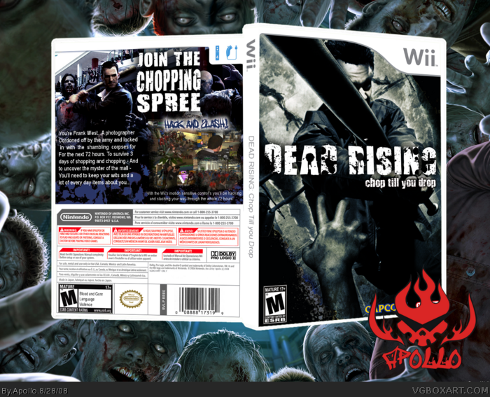
This is kinda a meh box from me. The front was really hard though, so comments appreciated. Enjoy!
Also, I don't care what you say, I think the game looks pretty fun.
Edited at 1 decade ago
[ Reply ]
It looks weird that the zombies are just chasing after Frank...
...and he's just standing there.
But it's amazing.
[ Reply ]
No, its er... one of those badass slow-mo walks
[ Reply ]
is there is a 2nd Dead Rising game, didn't know about it. i don't think you should've picked wii, because the wii can't pull off the kinda graphics shown by the screens, and Dead Rising was never for wii in the first place. but that's nothing compared to the quality of the box. 4.5/5 +fav
Edited at 1 decade ago
[ Reply ]
Sweet box. It does look fun.
[ Reply ]
#4 Its a real game on the Wii so you cant blame Apollo for that.
I really like the back (especially the tagline) but the front does seem just a bit...meh
[ Reply ]
i like it.
[ Reply ]
The backs kool but not so much the front.
[ Reply ]
Good job ;)
[ Reply ]
#6, #8, well then can you tell me what would look better? I did try a lot of things, just nothing worked
[ Reply ]
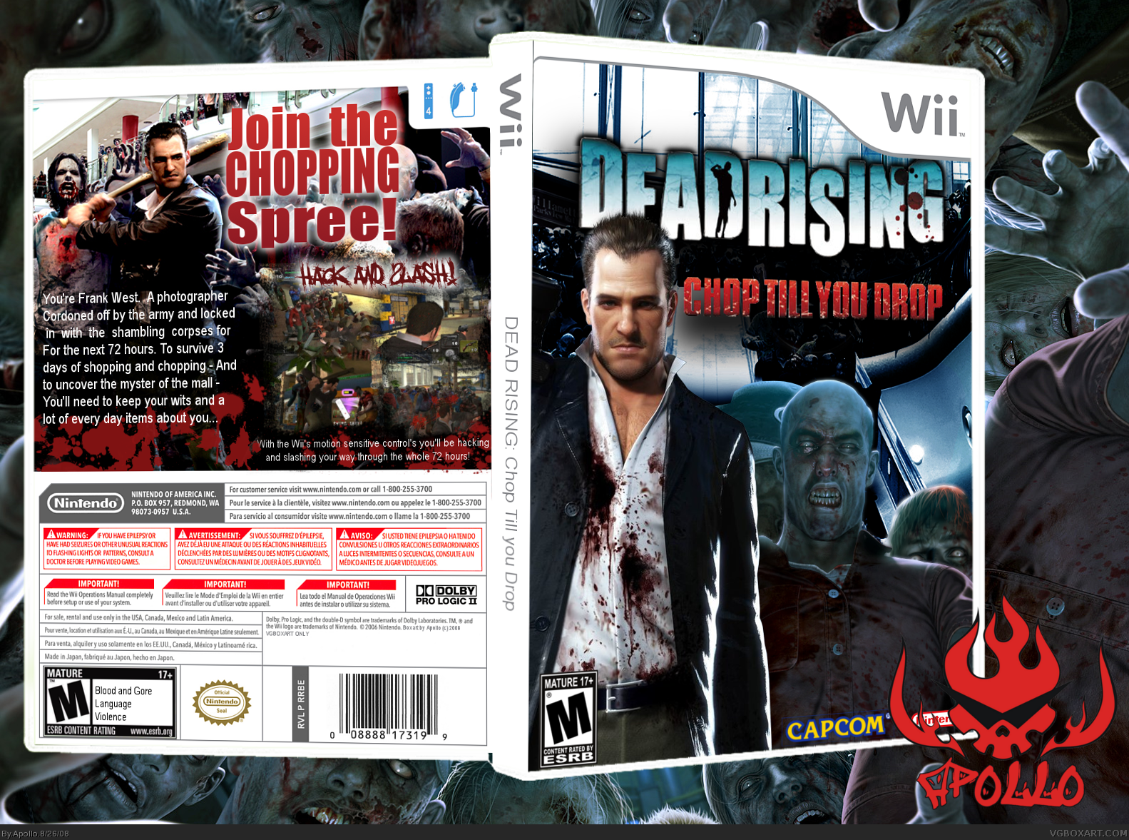
Looks much better with the update great job :D
[ Reply ]
That cover image definitely goes great with the "Chop Till You Drop" subtitle. It's the perfect choice.
Looking very sharp.
[ Reply ]
Why thank-you Drakxxx and hsoldier ;D
I want to update the back now to fit the colour scheme
[ Reply ]
Much better mate!
[ Reply ]
the update makes it way better
[ Reply ]
F~*£ YEAH!
[ Reply ]
Why thank-you ;D
[ Reply ]
big improvement
+fav for update.
[ Reply ]
Eveything looks awesome+fav
[ Reply ]