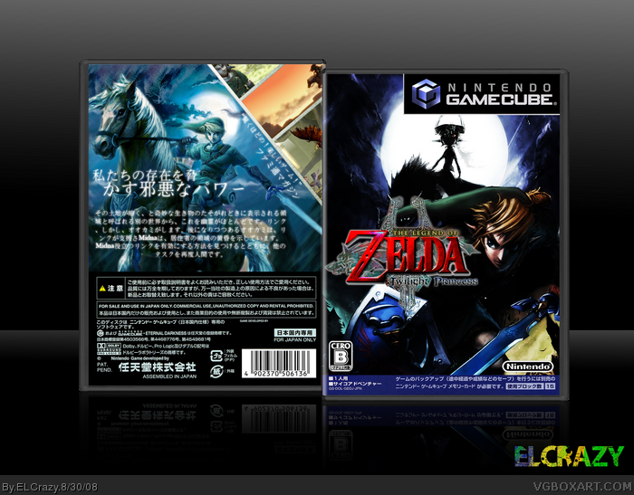
This is just a box I did for fun. I wanted to know what a difference it made when making a Japanese box. So anyway, cred to 19works for the moon artwork at the front and ADFD for the awesome temp.
well... if you make a japanese box you should use the right template. you made it a plastic-box and that`s wrong. japanese gc-packages got a transparent plastic-box and there`s a cardboard slipcase wraped around them, so you see absolutely nothing from the plastic. (link)
besides that the front is pretty dark and the "thumbnails" on the back don`t work very well, ´cause they show almost nothing.
#4, I was thinking the same thing about the plastic box. Cause I dont remember seeing it on any of your boxes so I thought there might be something weird here.
this is different.... it's not bad, but i agree with wasabi, the plastic looks weird on a japanese box, the front IS pretty dark and a little overcontrasty, but i like the blueish back, but the screenshots really dont work too well because you used screenshots where nothing shows up in that area...
but i yeah i totally like the fact that you tried something new, but this isn't your best.
I have to agree with ffseer and wasa-bi, get rid of the plastic and figure and find a way to make the screens more effective. The shadowy feel of the front and most of the back are very stylish though, nice job.
 The Legend of Zelda: Twilight Princess Box Cover Comments
This is just a box I did for fun. I wanted to know what a difference it made when making a Japanese box. So anyway, cred to 19works for the moon artwork at the front and ADFD for the awesome temp.
Enjoy! (:
[ Reply ]
Looks super sir.
I love the shadowy feel of the box.
Also, setting things up with kanji is always great... no potential spelling errors!
[ Reply ]
Damn that is a dark front.
[ Reply ]
well... if you make a japanese box you should use the right template. you made it a plastic-box and that`s wrong. japanese gc-packages got a transparent plastic-box and there`s a cardboard slipcase wraped around them, so you see absolutely nothing from the plastic. (link)
besides that the front is pretty dark and the "thumbnails" on the back don`t work very well, ´cause they show almost nothing.
Edited at 1 decade ago
[ Reply ]
i like the shadiness but whats up with the temp
[ Reply ]
#4, I was thinking the same thing about the plastic box. Cause I dont remember seeing it on any of your boxes so I thought there might be something weird here.
[ Reply ]
Amazing, I love the back!
[ Reply ]
this is different.... it's not bad, but i agree with wasabi, the plastic looks weird on a japanese box, the front IS pretty dark and a little overcontrasty, but i like the blueish back, but the screenshots really dont work too well because you used screenshots where nothing shows up in that area...
but i yeah i totally like the fact that you tried something new, but this isn't your best.
[ Reply ]
Awesome, I agree with the above crits though, that contrast on the front is a little too strong for my tastes. Still, it's very stylish,I like it :)
[ Reply ]
dope
[ Reply ]
I have to agree with ffseer and wasa-bi, get rid of the plastic and figure and find a way to make the screens more effective. The shadowy feel of the front and most of the back are very stylish though, nice job.
[ Reply ]
Thanks for the HoF guys!
#11, I'll try removing the plastic and remaking the back. =D
[ Reply ]