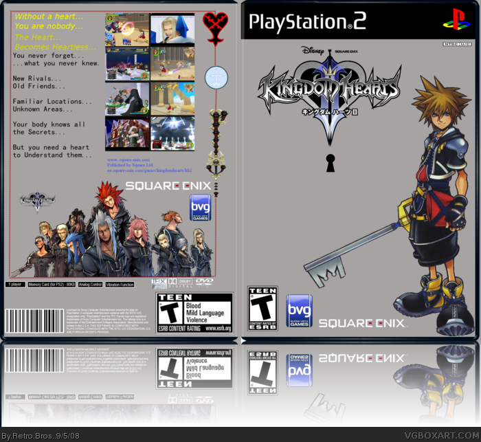
My Second Submission, I'm very happy with the cover, and yes I'm aware that some of the screenshots are from KH not KH2. The text still needs some work, but I'm hoping to fix that with my next submission.
This is looking nice and clean, and the design is certainly decent.
I would choose some different texts / text colors for the back as you've mentioned, and you might want to consider dropping a background of some sort. The flat gray is kind of a drag.
I don't mind the cover being plain gray, but the back definitely needs some texture. It just lays too flat. Also, I'd highly suggest using a different font for the back. Maybe find a script style font for the parts in yellow and a thicker serif typeface for the rest. Honestly, if you did those two things, I think this box would be awesome!
first of all, kingdom hearts 2 isn't Teen, it's E10. second, the backkground is a big turn off, but it's okay. the back looks very generic, this box looks as if it was made in 5 minutes. hopefully, your new Resistance box will be better
Lol, actually over about 5 hours.
The reason I asumed KH2 would be Teen is because I'm not american, but I was using an american template.
HOw bout we consider this, the violent versionn XD
#7, well it's not the worst box, but i doubt this took you 5 hours. even though your not american, you should still use the american ESRB, which is E10. and quite honestly, a disney game will enevr be violent, this game is about as violent as disney gets
 Kingdom Hearts 2 Box Cover Comments
My Second Submission, I'm very happy with the cover, and yes I'm aware that some of the screenshots are from KH not KH2. The text still needs some work, but I'm hoping to fix that with my next submission.
Thanks for the Support,
Andrew.
[ Reply ]
Hey Andrew,
This is looking nice and clean, and the design is certainly decent.
I would choose some different texts / text colors for the back as you've mentioned, and you might want to consider dropping a background of some sort. The flat gray is kind of a drag.
Otherwise it's pretty darn decent. Nice work.
Edited at 1 decade ago
[ Reply ]
I'm working on a Resistance Box for the GBA.
That's really gonna have alot of background detail I hope. =)
[ Reply ]
I don't mind the cover being plain gray, but the back definitely needs some texture. It just lays too flat. Also, I'd highly suggest using a different font for the back. Maybe find a script style font for the parts in yellow and a thicker serif typeface for the rest. Honestly, if you did those two things, I think this box would be awesome!
[ Reply ]
I'll look at it =)
[ Reply ]
first of all, kingdom hearts 2 isn't Teen, it's E10. second, the backkground is a big turn off, but it's okay. the back looks very generic, this box looks as if it was made in 5 minutes. hopefully, your new Resistance box will be better
[ Reply ]
Lol, actually over about 5 hours.
The reason I asumed KH2 would be Teen is because I'm not american, but I was using an american template.
HOw bout we consider this, the violent versionn XD
[ Reply ]
#7, well it's not the worst box, but i doubt this took you 5 hours. even though your not american, you should still use the american ESRB, which is E10. and quite honestly, a disney game will enevr be violent, this game is about as violent as disney gets
[ Reply ]