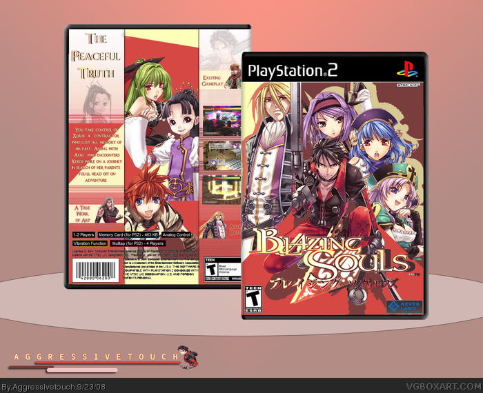
Yikes that is cool! I'm not crazy about how the character in the middle of the back is cutoff at the waist. I think it looks a little unfinished that way. Still, the style is amazing and you really kept a consistent theme throughout, so +FAV!
Thanks I always jump into the box and seem to not notice the temp much and as for the cut offs they are in their own color section like in the front hence the waist cut
I didn't even notice the template to be honest. LOL In general, I think if the artwork stands on it's own, you could paste it on cereal box and it'd still get a fav from me. Actually... that's not a bad idea for a project... hmmmmmm.
I really like the colors! but I have to agree with #2. perhaps some blending on the render in question would make it come out better? Fav either way though. ;)
Like I said before I made the renders cut off at the waist because of them having their open section like the front notice the colors thanks everyone for favs
Very cool layout and design. Agreed with E_G about the temp though. Oh, and the game info has got to go - I can still see some white stuff on the text...
Update
I fixed the temp
There wasn't much I could do with the legal info because I had merged the images already.
I'll make sure to check it when I do my next box =]
Regarding the cut off in the character renders, there's an easy fix to get people off your back-change the color of the color blocks. Not liking the diagonal cuts on the red rectangles, but very nice design overall. 4.75/5 and +Fav!
#15, That's fine, just a suggestion. Regardless of if you decided to do anything to it (can't justify saying "fix" because there's nothing wrong with it ^_^), it's a great design and it was really well thought out.
 Blazing Souls Box Cover Comments
new box =]
[ Reply ]
Yikes that is cool! I'm not crazy about how the character in the middle of the back is cutoff at the waist. I think it looks a little unfinished that way. Still, the style is amazing and you really kept a consistent theme throughout, so +FAV!
[ Reply ]
This has been mentioned a few times before but I will like to see you use a more realistic template. Good box.
[ Reply ]
Odd temp but very nice :)
[ Reply ]
Thanks I always jump into the box and seem to not notice the temp much and as for the cut offs they are in their own color section like in the front hence the waist cut
[ Reply ]
#4, Agreed! very nice box!
[ Reply ]
I didn't even notice the template to be honest. LOL In general, I think if the artwork stands on it's own, you could paste it on cereal box and it'd still get a fav from me. Actually... that's not a bad idea for a project... hmmmmmm.
[ Reply ]
I really like the colors! but I have to agree with #2. perhaps some blending on the render in question would make it come out better? Fav either way though. ;)
[ Reply ]
Like I said before I made the renders cut off at the waist because of them having their open section like the front notice the colors thanks everyone for favs
[ Reply ]
Very cool layout and design. Agreed with E_G about the temp though. Oh, and the game info has got to go - I can still see some white stuff on the text...
[ Reply ]
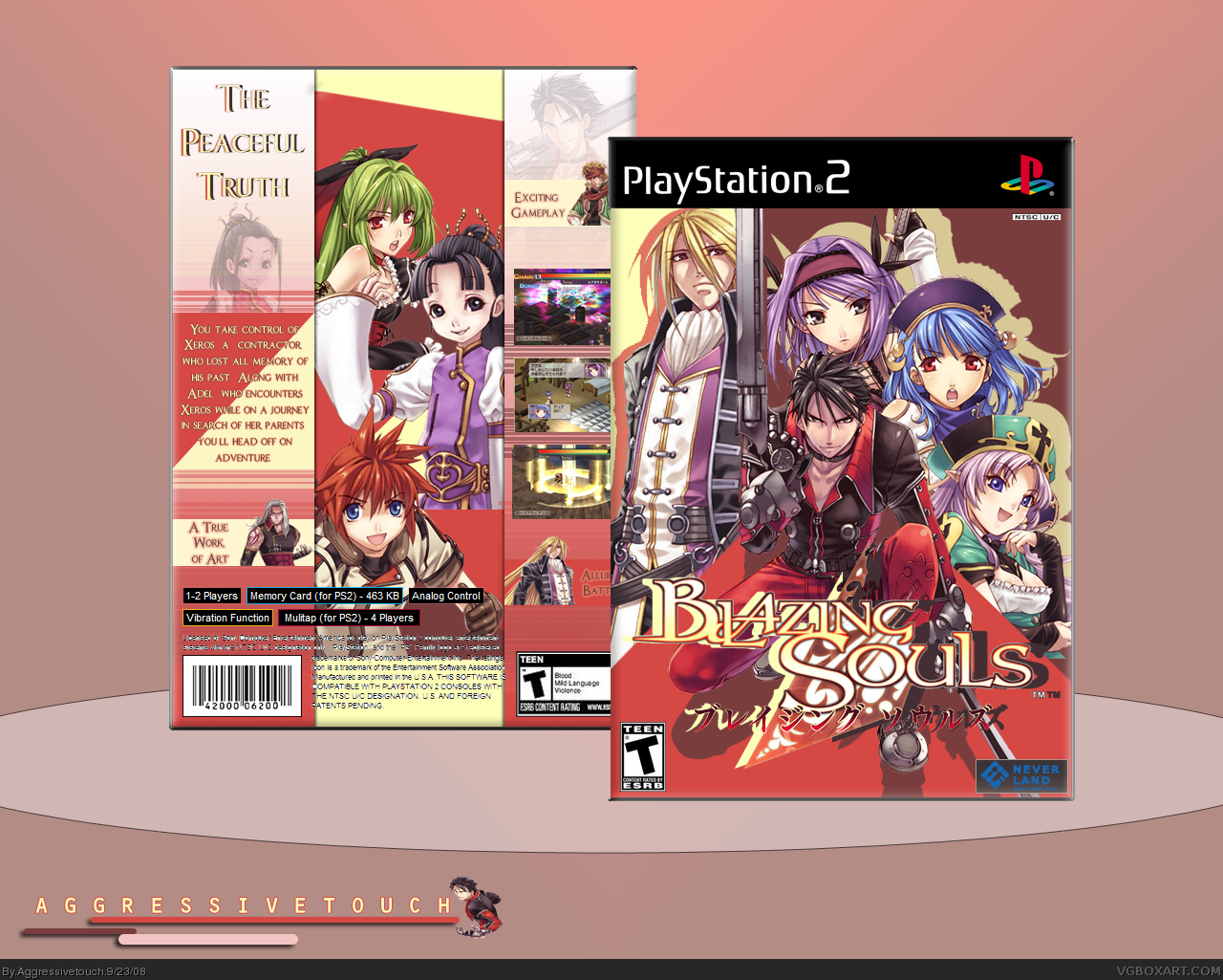
#10,yeah old temp thanks though
[ Reply ]
Update
I fixed the temp
There wasn't much I could do with the legal info because I had merged the images already.
I'll make sure to check it when I do my next box =]
[ Reply ]
Regarding the cut off in the character renders, there's an easy fix to get people off your back-change the color of the color blocks. Not liking the diagonal cuts on the red rectangles, but very nice design overall. 4.75/5 and +Fav!
Edited at 1 decade ago
[ Reply ]
its blazing
[ Reply ]
#13, its my design and people have opinions but I'm not gunna change them because they weren't a mistake thanks everyone :)
[ Reply ]
#15, That's fine, just a suggestion. Regardless of if you decided to do anything to it (can't justify saying "fix" because there's nothing wrong with it ^_^), it's a great design and it was really well thought out.
[ Reply ]
#16, Thanks
No I know you were helping =]
[ Reply ]
Nice!
[ Reply ]
Haha thanks
[ Reply ]
nice i really like it... the box compatible with the Background...(fav)
[ Reply ]
#20, Thanks =]
[ Reply ]
amazing great job
[ Reply ]
Thanks =]
Didn't do as well as I thought it would though
[ Reply ]
love the color scheme!
[ Reply ]
Thanks !! :]
[ Reply ]
Good box, but the NTSC box is overlapping another region box. And you should probably remove the second TM symbol in the logo.
[ Reply ]