#2 Come on it's not that bad at all. I like the design and everything, the presentation and all. I guessed you were going for minamilisim, right? But the nintendo logo's too small and the logo is cut out somewhat badly.
It's got it's issues, sure, but the design shows a lot of creativity, and I'm always going to give artists points for that.
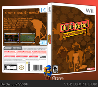
I really like the brown background with the gears, and the silhouettes are a neat touch.
I'd have to agree with #4 on a technical standpoint, but these are things you can fix up easily. Also, maybe some boarders on the screenshots would make them pop out more as well?
 Chibi Robo: Spydorz Revenge Box Cover Comments
First box in a while. Full view please.
Credits:
Template: link
Renders: link
3D: XCore
And credit to Avenger for the awesome logo (link) I slightly tweaked.
[ Reply ]
realy bad, plain and boring, the logo is cut out bad and on the back it says credit to xcore in realy bad font.
[ Reply ]
#2, Don't cuss the Helvetica set, the daddy of all Sans Serif fonts.
[ Reply ]
#2 Come on it's not that bad at all. I like the design and everything, the presentation and all. I guessed you were going for minamilisim, right? But the nintendo logo's too small and the logo is cut out somewhat badly.
[ Reply ]
#2, you can't really criticize me for that credit, he put it there.
[ Reply ]
I love it!
[ Reply ]
It's got it's issues, sure, but the design shows a lot of creativity, and I'm always going to give artists points for that.
I really like the brown background with the gears, and the silhouettes are a neat touch.
I'd have to agree with #4 on a technical standpoint, but these are things you can fix up easily. Also, maybe some boarders on the screenshots would make them pop out more as well?
Good effort my friend, +fav.
Edited at 1 decade ago
[ Reply ]
A bit plain and not the very good quality viewed in full. But I still like it nice work. :)
[ Reply ]