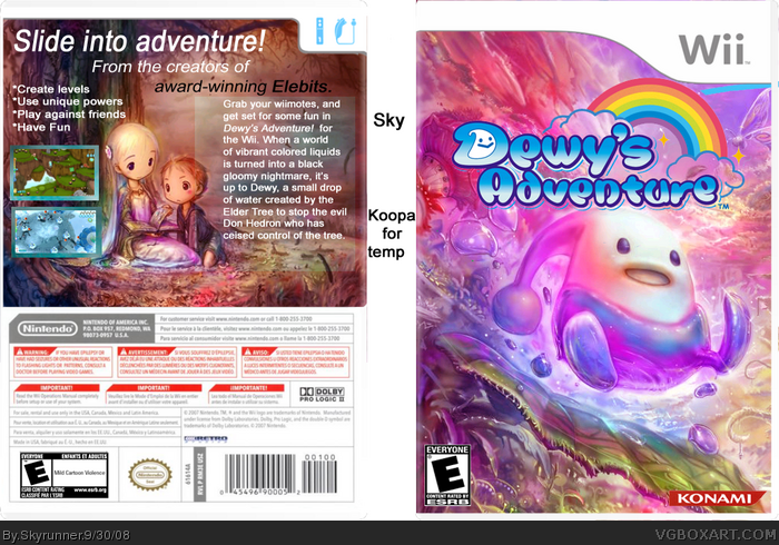
I know, I know. I need better presentations :P I'll be starting on them and making sure I have good presentations in upcoming boxes, sometime sooner or later. I also know that this is a wallpaper. And it's yet that same back and front, like on every Dewy's adventure box. But still, Im pretty happy with the end result. It turned out pretty nicely if you ask me. I got inspired by all the Dewy's Adventure boxes on the site, because they were all so god dman colorful and good.
Credit is on box. Please critique and comment. Enjoi.
Wow! The front is brilliant: it's much better than the original. The colour and composition is lovely!
The text on the back needs some work though, in both font and presentation. You could consider adding a more opaque box under the white text on the right (I know you already have a light one but it doesn't really help with visibility). Also maybe choose a more playful text to suit the text on the front and the emotion the cover image gives off.
The gradient boxes around the two screen shots on the left seem childish compared to the front, maybe a gold frame or something would work better.
 Dewy's Adventure Box Cover Comments
I know, I know. I need better presentations :P I'll be starting on them and making sure I have good presentations in upcoming boxes, sometime sooner or later. I also know that this is a wallpaper. And it's yet that same back and front, like on every Dewy's adventure box. But still, Im pretty happy with the end result. It turned out pretty nicely if you ask me. I got inspired by all the Dewy's Adventure boxes on the site, because they were all so god dman colorful and good.
Credit is on box. Please critique and comment. Enjoi.
[ Reply ]
Looks Nice. 4.5/5
[ Reply ]
#2 Thank you very much Crazy!
[ Reply ]
I...I really like this. Especially the front. faved
[ Reply ]
#4 Well thanks. I liked the color scheme on the front, even though it is just a wallpaper.
That I did edit :p
Edited at 1 decade ago
[ Reply ]
wow, i like this, though the text on the back needs a bit of a fix or something
i know my next box :D
nice job
[ Reply ]
#6 Thanks aswell! (Sorry dont mean to bump)
[ Reply ]
Wow! The front is brilliant: it's much better than the original. The colour and composition is lovely!
The text on the back needs some work though, in both font and presentation. You could consider adding a more opaque box under the white text on the right (I know you already have a light one but it doesn't really help with visibility). Also maybe choose a more playful text to suit the text on the front and the emotion the cover image gives off.
The gradient boxes around the two screen shots on the left seem childish compared to the front, maybe a gold frame or something would work better.
3/5
Edited at 1 decade ago
[ Reply ]