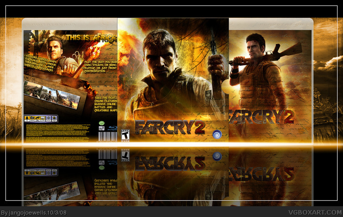
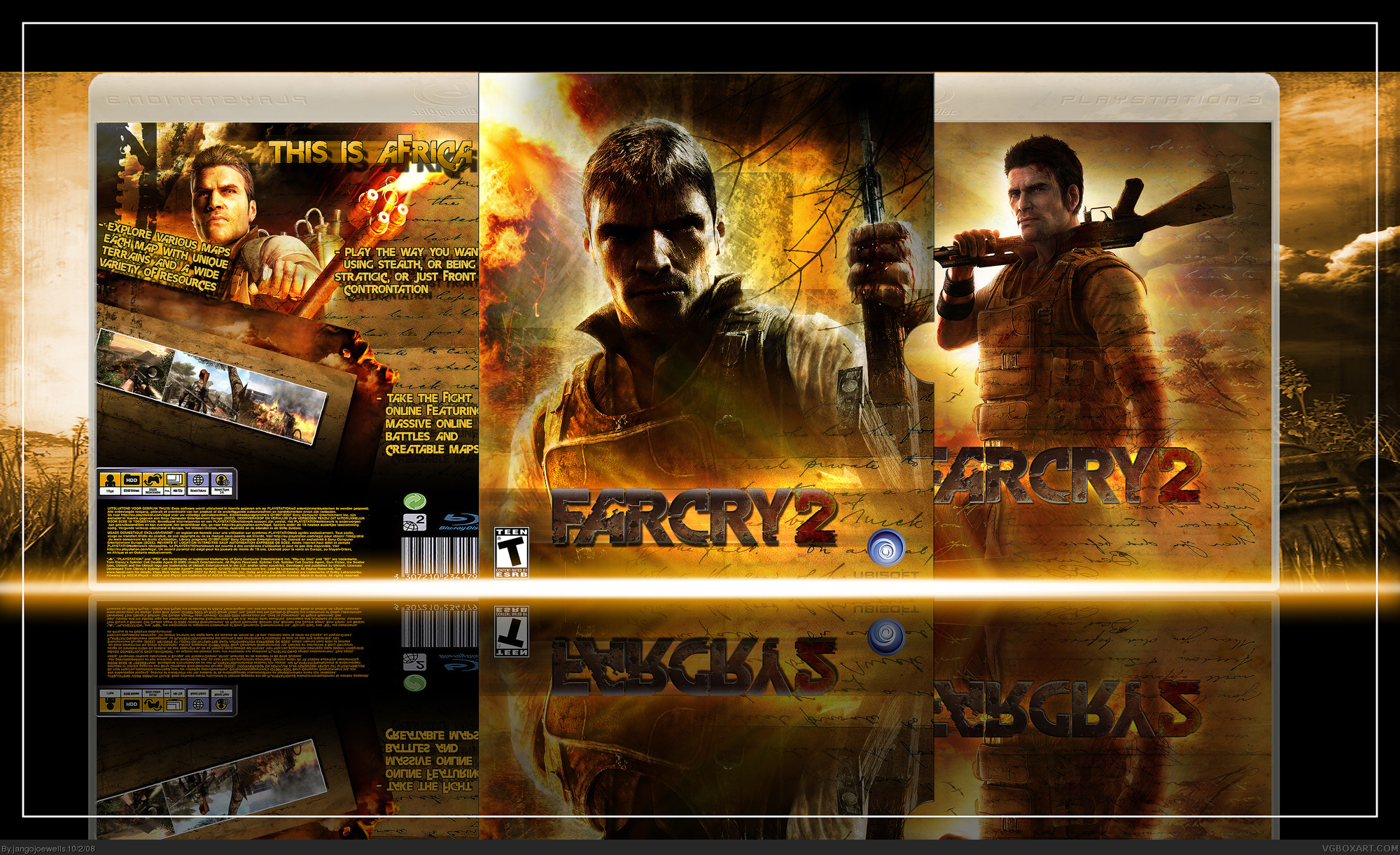
[ Buy Far Cry 2 at Amazon ] By jangojoewells 28 on October 2nd, 2008 No Printable Available [ Box updated on October 3rd, 2008 ] [ original ] Far Cry 2 Box Cover Comments Comment on jangojoewells's Far Cry 2 Box Art / Cover. Cancel Reply jangojoewells 28 [ 1 decade ago ] Farcry 2 Hope you like it Looks sharper in fullview Edited at 1 decade ago [ Reply ] Geno 38 [ 1 decade ago ] link That's awesome. [ Reply ] Drakxxx 46 [ 1 decade ago ] Looks nice man. Theres some grammar issues on the back, and I'm pretty sure this game is going to be rated M for mature. I really like how you blended in a hand written letter into the images. very creative in my opinion. [ Reply ] hsoldier 44 [ 1 decade ago ] #3, i agree..i also dont like the way the screenshots and text are but other than that it looks reall cool [ Reply ] Mad Spike 43 [ 1 decade ago ] Pretty Nice :) [ Reply ] E_G 39 [ 1 decade ago ] Not bad, there are some blending issues like the lines going through the renders' heads. Also "front u controntation" should be fixed. [ Reply ] sven.2007 13 [ 1 decade ago ] I agree with #3 and #4...That hand written letter is a genius idea. [ Reply ] shadysaiyan 42 [ 1 decade ago ] #6, Agreed, i think theres a bit too much glow too and the background on the right still has a website tag on i. very nice box though. [ Reply ] jevangod 50 [ 1 decade ago ] Nice but seriously take the bright light off of it. [ Reply ] The Leo Krupps Project 1 [ 1 decade ago ] it looks like gods game... there are a few errors but other than that its good. fav [ Reply ] master_general 43 [ 1 decade ago ] I think you got it again [ Reply ] Ray Blade 40 [ 1 decade ago ] FAR too good not to be in the HoF. Revival. [ Reply ] MF29 35 [ 1 decade ago ] Miraculous. #12 Agreed, while others should not be Edited at 1 decade ago [ Reply ]
 Far Cry 2 Box Cover Comments
Farcry 2 Hope you like it
Looks sharper in fullview
Edited at 1 decade ago
[ Reply ]
link
That's awesome.
[ Reply ]
Looks nice man. Theres some grammar issues on the back, and I'm pretty sure this game is going to be rated M for mature.
I really like how you blended in a hand written letter into the images. very creative in my opinion.
[ Reply ]
#3, i agree..i also dont like the way the screenshots and text are but other than that it looks reall cool
[ Reply ]
Pretty Nice :)
[ Reply ]
Not bad, there are some blending issues like the lines going through the renders' heads. Also "front u controntation" should be fixed.
[ Reply ]
I agree with #3 and #4...That hand written letter is a genius idea.
[ Reply ]
#6, Agreed, i think theres a bit too much glow too and the background on the right still has a website tag on i. very nice box though.
[ Reply ]
Nice but seriously take the bright light off of it.
[ Reply ]
it looks like gods game...
there are a few errors but other than that its good.
fav
[ Reply ]
I think you got it again
[ Reply ]
FAR too good not to be in the HoF.
Revival.
[ Reply ]
Miraculous.
#12 Agreed, while others should not be
Edited at 1 decade ago
[ Reply ]