[ Buy Assassin's C... at Amazon ] By Cheese 21 on October 7th, 2008 No Printable Available Assassin's Creed Box Cover Comments Comment on Cheese's Assassin's Creed Box Art / Cover. Cancel Reply Cheese 21 [ 1 decade ago ] Quikee. M.E. for temp. [ Reply ] Atives 1 [ 1 decade ago ] you should use assassins creed official logo... [ Reply ] xIAMHUNTERx 43 [ 1 decade ago ] "Rating info on back"? [ Reply ] shadysaiyan 42 [ 1 decade ago ] you didnt make that temp and it looks like you just cropped out that sidebar from one of my boxes., but yeah should have used the official logo. [ Reply ] Cheese 21 [ 1 decade ago ] #4, I was stating the initials for Maurico Estrella >_< #3, ??? Do you mean the fact that I didn't make a back? #2, True, but it looks ugly that way. And plus, no matter what I do to it it doesn't seem to stand out. [ Reply ] ojoe2000 29 [ 1 decade ago ] I actually like it. [ Reply ] oxol 24 [ 1 decade ago ] #5, I think he meen the fact that there is no rating, but there is one on the back, which you didn't make. [ Reply ] TwistedTinkerToy 43 [ 1 decade ago ] What did you do to the image? [ Reply ] gamerking 43 [ 1 decade ago ] i think #3 means that it says rating info on back right by the logo. [ Reply ] The Leo Krupps Project 1 [ 1 decade ago ] the logo looks mobsterish.... 3/5 [ Reply ] mtirkmane 5 [ 1 decade ago ] I don't like the spatter effect. [ Reply ] Skyrunner 33 [ 1 decade ago ] Isn't that the Dark Sector font? [ Reply ] Ray Blade 40 [ 1 decade ago ] #6, I know right! [ Reply ]
 Assassin's Creed Box Cover Comments
Quikee.
M.E. for temp.
[ Reply ]
you should use assassins creed official logo...
[ Reply ]
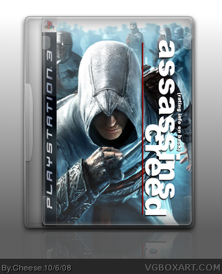
"Rating info on back"?
[ Reply ]
you didnt make that temp and it looks like you just cropped out that sidebar from one of my boxes., but yeah should have used the official logo.
[ Reply ]
#4, I was stating the initials for Maurico Estrella >_<
#3, ??? Do you mean the fact that I didn't make a back?
#2, True, but it looks ugly that way.
And plus, no matter what I do to it it doesn't seem to stand out.
[ Reply ]
I actually like it.
[ Reply ]
#5, I think he meen the fact that there is no rating, but there is one on the back, which you didn't make.
[ Reply ]
What did you do to the image?
[ Reply ]
i think #3 means that it says rating info on back right by the logo.
[ Reply ]
the logo looks mobsterish....
3/5
[ Reply ]
I don't like the spatter effect.
[ Reply ]
Isn't that the Dark Sector font?
[ Reply ]
#6, I know right!
[ Reply ]