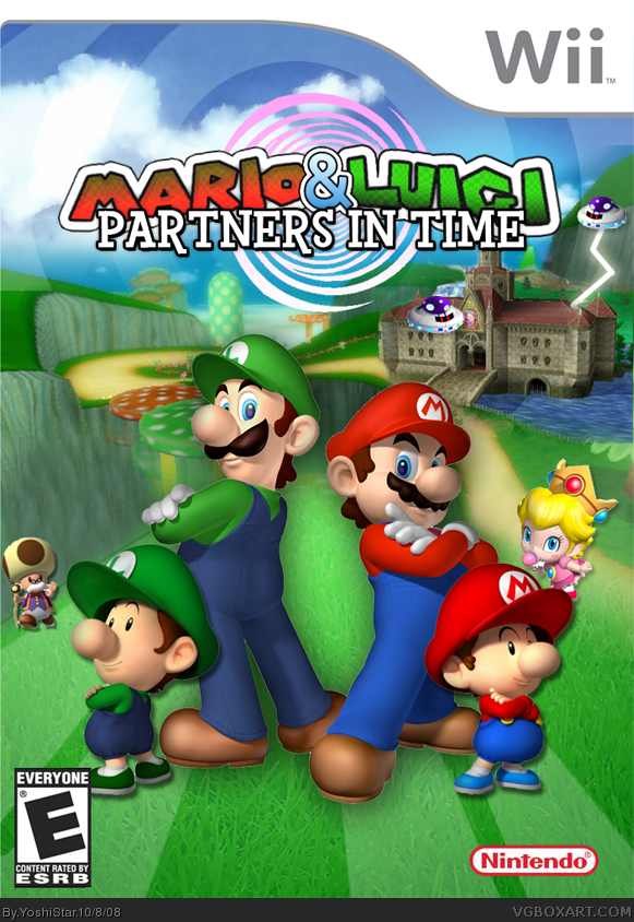
I really thought a fully 3D Mario & Luigi: Partners in Time remake for the Wii would be awesome. This is definitely not the final version! I notice all those little problems scattered around everywhere (roughness on spiral, blurriness of logo, fakeness of lightning, small borders around Mario and Luigi, etc.) and I plan to fix them. I'll do it tomorrow, though, since I'm out of time today.
I'm also gonna make a back side. I decided to submit this super-rough version today to see if you guys have any ideas before I make the final.
Compared to your first, this isnt as good, its well done but you should have used a temp with plastic around and it seems the stripes on the ground stop between mario and luigi
Thanks for the comments, guys. Yeah, I"m gonna edit it majorly. This is just a really rough version, like I mentioned above. I plan to work really hard on this, haha. So far, this much didn't take a lot of effort.
I would suggest that you post an unfinished box like your Ver. 1 to the forums if you just want to get it out to test the waters, so to speak, but this is pretty awesome. Instant 5/5 for me and fav AND Author fav!
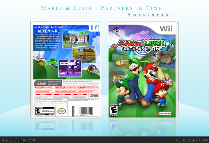
Updated! Not much, just some minor updates on the back. I thought the text was a bit hard on the eyes in the previous version, so I put it behind a little gradient box thingy. I think its better looking ... but I'm not too sure. Is it?
I also added a sentence about Co-op gameplay in the text, and so changed the wii controller number on the top right to 4.
I edited the lowest screenshot and changed the text XD, and made it less readable. Also added stuffwell there to be the one saying it.
#22, It looks even better, my man. The gradient box helps the legibility of the information. Personally, I would have kept the visibility of the "Mario! Green man!" "Come help Toadbert!" line on the last screenshot. I thought that was funny.
LOL. I come from the future !! In a console that will be released in 1 year or 2. will be presented several deliveries of mario and luigi IN TOTAL 3D !! IN ALL ASPECTS. USE ONE OF THE HOLES OF TIME that taught me gadd teacher. X3
 Mario & Luigi: Partners in Time Box Cover Comments
I really thought a fully 3D Mario & Luigi: Partners in Time remake for the Wii would be awesome. This is definitely not the final version! I notice all those little problems scattered around everywhere (roughness on spiral, blurriness of logo, fakeness of lightning, small borders around Mario and Luigi, etc.) and I plan to fix them. I'll do it tomorrow, though, since I'm out of time today.
I'm also gonna make a back side. I decided to submit this super-rough version today to see if you guys have any ideas before I make the final.
[ Reply ]
i actually kinda like it.
[ Reply ]
Compared to your first, this isnt as good, its well done but you should have used a temp with plastic around and it seems the stripes on the ground stop between mario and luigi
[ Reply ]
#3, I second that. Toadworth seems kinda odd standing there, btw...
[ Reply ]
#3, Agreed this box has potential ;) would love to see a back :D nice job but fix up those things mentioned by Vivi
[ Reply ]
i just noticed the BG is Mushroom Gorge from Mario Kart Wii, but you edited it pretty good =D
Edited at 1 decade ago
[ Reply ]
I really like this.
[ Reply ]
Really sweet man. Agreed not as good as your first, but vit's simple and it's not bad.
Edited at 1 decade ago
[ Reply ]
Thanks for the comments, guys. Yeah, I"m gonna edit it majorly. This is just a really rough version, like I mentioned above. I plan to work really hard on this, haha. So far, this much didn't take a lot of effort.
[ Reply ]
Okay, here's version 2, complete with a back and my very own edited screenshots, haha. How's it looking? Any mistake or suggestions?
[ Reply ]
looks sweet!
[ Reply ]
Thats insane
[ Reply ]
It looks awesome.
[ Reply ]
That is seriously beautiful. The screens look fake, but aside from that, I really really like this box.
[ Reply ]
holy crap... this is awsum. fav!
[ Reply ]
I would suggest that you post an unfinished box like your Ver. 1 to the forums if you just want to get it out to test the waters, so to speak, but this is pretty awesome. Instant 5/5 for me and fav AND Author fav!
[ Reply ]
#16, Oh, okay. I'll do that next time if I want to just see what people think, haha. And thanks!!
Thanks everyone else too. Anything I should add to it or fix in it?
[ Reply ]
oh man great
[ Reply ]
Excellent!
[ Reply ]
"Mario! Green man!" "Come help Toadbert!"
XD
[ Reply ]
#20, XD when making that I really thought that It'd be resized down enough to not be readable. Guess I was wrong.
[ Reply ]
Updated! Not much, just some minor updates on the back. I thought the text was a bit hard on the eyes in the previous version, so I put it behind a little gradient box thingy. I think its better looking ... but I'm not too sure. Is it?
I also added a sentence about Co-op gameplay in the text, and so changed the wii controller number on the top right to 4.
I edited the lowest screenshot and changed the text XD, and made it less readable. Also added stuffwell there to be the one saying it.
[ Reply ]
#22, It looks even better, my man. The gradient box helps the legibility of the information. Personally, I would have kept the visibility of the "Mario! Green man!" "Come help Toadbert!" line on the last screenshot. I thought that was funny.
Still awesome work!
[ Reply ]
Wow, much better. Glad I faved it the first time around :p
[ Reply ]
5/5+fav+authorfav... terrific!
[ Reply ]
dude congrats on the HOF
[ Reply ]
This is a very good idea! fav!
[ Reply ]
Lovin it. Nice and smooth. +Fav
[ Reply ]
best boxart i have EVER seen
[ Reply ]
Awwwwwseome, best box ever, faved!
Edited at 1 decade ago
[ Reply ]
Try Makeing The Letters on Mario and Luigis Caps Black
[ Reply ]
This is how i'm making my new mario rpg boxes
[ Reply ]
it's nice. ;)
[ Reply ]
I love it! Favourited!
[ Reply ]
Wow, this is really nice! If it hadn't been for Tarantulakid96 I'd probably never see this. Thanks you Tarantulakid96.
+ Author Fav
[ Reply ]
LOL. I come from the future !! In a console that will be released in 1 year or 2. will be presented several deliveries of mario and luigi IN TOTAL 3D !! IN ALL ASPECTS. USE ONE OF THE HOLES OF TIME that taught me gadd teacher. X3
[ Reply ]