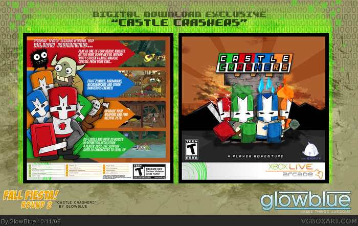
My box for the Fall Fiesta round 2. All of the characters were hand-drawn, scanned and traced in Illustrator. link
Enjoy!
#5, Well, I was experimenting with a drawing style that's not my norm in an attempt to mimic the official art. I'm still very pleased with how it turned out because I can honestly say it is "my own" Castle Crashers box. I was able to try things that I just wouldn't have been able to do with official art, so I fell it's a success.
#4,#6, Thanks!
#2, I placed the white bars on the bottom for symmetry's sake. I wanted to make this NOT look like an Xbox360 box as much as possible... because it's NOT an Xbox360 box.
#7, Well, I wasn't really trying to catch the game's style as much as I was trying to present an impression of who the characters are. The idea that these little knights are sort of epic defenders of the realm is a concept quickly lost as they jog through forests of pooping animals, slashing barbarians with hockey masks. The "style" of the game is goofy, and I think the developers dropped the ball a little when they presented these awesome characters with a fantastic quest... then threw them into a Double Dragon-style cartoon brawl. I wanted to give the knights their due respect and create an image that presented some grandeur and awe.
I...I....Don't like it......I can't believe I'm saying this about a GlowBlue box....It's it's just not good, the character art isn't that good, and It doesn't catch the game's "style"....I'm sorry...
I agree with #2, the template bar on the front should probably be on the top. Regarding the art-not perfect, but still captures the feel somewhat. I give it a 4.75/5, especially since you created the art yourself, that's a bold move.
 Castle Crashers Box Cover Comments
:D
Great job
[ Reply ]
Im not 100% keen on that template (the bar should be at the top) but the box is awesome noneoftheless =D
[ Reply ]
My box for the Fall Fiesta round 2. All of the characters were hand-drawn, scanned and traced in Illustrator. link
Enjoy!
#5, Well, I was experimenting with a drawing style that's not my norm in an attempt to mimic the official art. I'm still very pleased with how it turned out because I can honestly say it is "my own" Castle Crashers box. I was able to try things that I just wouldn't have been able to do with official art, so I fell it's a success.
#4,#6, Thanks!
#2, I placed the white bars on the bottom for symmetry's sake. I wanted to make this NOT look like an Xbox360 box as much as possible... because it's NOT an Xbox360 box.
#7, Well, I wasn't really trying to catch the game's style as much as I was trying to present an impression of who the characters are. The idea that these little knights are sort of epic defenders of the realm is a concept quickly lost as they jog through forests of pooping animals, slashing barbarians with hockey masks. The "style" of the game is goofy, and I think the developers dropped the ball a little when they presented these awesome characters with a fantastic quest... then threw them into a Double Dragon-style cartoon brawl. I wanted to give the knights their due respect and create an image that presented some grandeur and awe.
Edited at 1 decade ago
[ Reply ]
Box is just awesome, and I like the temp.
[ Reply ]
No offense, but I don't think the characters on the back look right. Everything else is good, though.
[ Reply ]
Really cool... extremely sharp! :)
[ Reply ]
I...I....Don't like it......I can't believe I'm saying this about a GlowBlue box....It's it's just not good, the character art isn't that good, and It doesn't catch the game's "style"....I'm sorry...
[ Reply ]
Wow, that's all i can say
[ Reply ]
This is amazing! +Fav
Edited at 1 decade ago
[ Reply ]
Looks sweet dude, great work. ^^
[ Reply ]
Nice!
[ Reply ]
Awesome! I love this drawing style.
[ Reply ]
I agree with #2, the template bar on the front should probably be on the top. Regarding the art-not perfect, but still captures the feel somewhat. I give it a 4.75/5, especially since you created the art yourself, that's a bold move.
[ Reply ]