OMG
two little resource boxes in a row
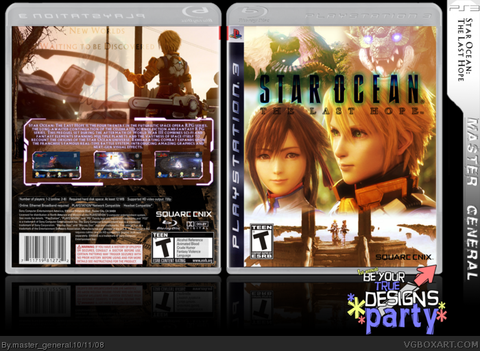
This one took Hours(about 2 hours spent on the temp itself and another 4 on the box to make it perfect) i think i made the game seem apparent in this box
The front has weird blending and a big contrast difference, the back looks pretty good. also if your not looking to had, looks like the guy is fishing on the back :DD
Nice.. although I have to agree with Shady.. the three images on the front don't blend in too well or intersected by anything. Back is really neat, although I don't like the faded girl there... not needed.
 Star Ocean: The Last Hope Box Cover Comments
OMG
two little resource boxes in a row
This one took Hours(about 2 hours spent on the temp itself and another 4 on the box to make it perfect) i think i made the game seem apparent in this box
C&C and Favs please. :)
[ Reply ]
The front has weird blending and a big contrast difference, the back looks pretty good. also if your not looking to had, looks like the guy is fishing on the back :DD
[ Reply ]
#2, i just realized that XD
[ Reply ]
I really dig the warm colors of this one. The colors flow together quite nicely, good job!
Edited at 1 decade ago
[ Reply ]
i love what you did on the back. Which program do you use?
[ Reply ]
Thats kinda like Sens presentation, y'know...
[ Reply ]
Nice.. although I have to agree with Shady.. the three images on the front don't blend in too well or intersected by anything. Back is really neat, although I don't like the faded girl there... not needed.
[ Reply ]
Cloned, Photoshop Elements 5
Xcore, oops, thanks for noticing
Marker, it seemed empty without her, i'll try it though
[ Reply ]