Hmm....well, there are a few problems I'm seeing. First of all, the logo is fairly low quality, making it almost unreadable. Second of all, as IceFox said, NMH was a very colorful game...and even if the main color was red, this is a bit too much. As for the back design, it feels kind of empty. Overall...3.8/5
 No More Heroes 2: Desperate Struggle Box Cover Comments
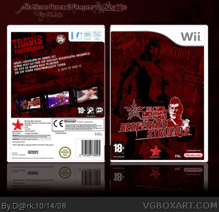
Finaly... i made ît! Puh i workd very hart on it i hope you like it.. and surprise!!! I made a back, for all the guy how want it... enjoy it!
Edit: The Quality i will fix it tomorw!!
Edited at 1 decade ago
[ Reply ]
Not too bad but possibly a little too dark.
[ Reply ]
Hmm....well, there are a few problems I'm seeing. First of all, the logo is fairly low quality, making it almost unreadable. Second of all, as IceFox said, NMH was a very colorful game...and even if the main color was red, this is a bit too much. As for the back design, it feels kind of empty. Overall...3.8/5
[ Reply ]
agreed to Koopa - yeah you can believe it ;)
Guess you should wait till there`s more stuff available to work with
[ Reply ]
good but too dark and the screenshots stick out like a sore thumb because of this
its ok but not enough for a fav sorry
[ Reply ]
#5, No pro... i have learnd of my faut.. i next box i will be better :)
[ Reply ]
nice job 5/5
Edited at 1 decade ago
[ Reply ]