I hate this box completely anyways lol After getting no notice on my Witchblade box im kind not putting much effort in my boxes because no one looks at em anyways.
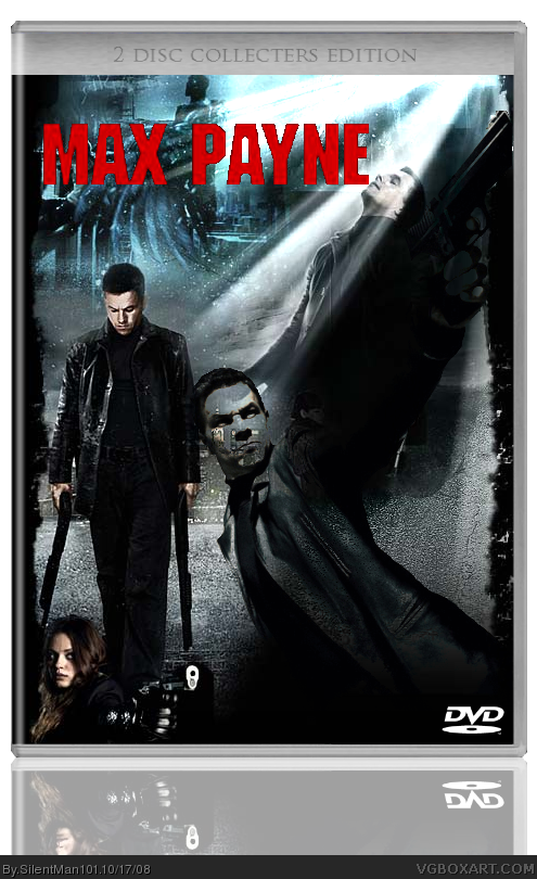
To be honest, I'm not feeling this one. I'm not liking the blended images, and having the lady down in the corner just seems weird.
I do like the shot of Max in the left, if that were the centerpiece, that would be better. The logo is horribly pixelated, it would be better to find the font and reproduce the logo in this case. Also, I'd like to see a different template. Also, I'd make it unrated for scenes they couldn't show in theaters.
#2 is right completely, the blending doesn't hit me right. But that pic of Max with the guns with his head down as a box center would be perfect. Nice, but could use some organizing.
#4, You're good. You're real good. But I don't think that posting something like that for someone who is at least trying isn't alright. I don't want to get into a fight here, but please try to be constructive. People who aren't at the same level as, say, you or some of the others, won't get to a higher point, if people keep knocking them down like that.
About the box, it's improving. You got the logo looking better, and you at least got rid of one of the extra Max Paynes. It's easier to see the images, which is good. Like I said though, I'd get rid of the girl, and you don't need more than one Max. If you want, you could put the max with the shotguns in the center and put some supporting cast portaits around him and I would put major cast members (Milla Kunis, Mark Wallberg(sp?), Ludicris) names at the bottom. At the top, I'd add a block with the text with something like "Unrated Widescreen Edition" or something like that.
#4, Why do you still post?
Seriously if someone has fun making these they shouldnt stop, granted id understand if it was a horrible abomination of a box and my eyes just melted but they didnt.
Its an ok box the blending is a little rough but youll do better next time. 3/5
#7, Nothing wrong with that. Sure, it's not an epic, week long effort, but completely acceptable. Plus the marketing often shares artwork with each other.

 Max Payne Box Cover Comments
*trys to fix logo*
I hate this box completely anyways lol After getting no notice on my Witchblade box im kind not putting much effort in my boxes because no one looks at em anyways.
Edited at 1 decade ago
[ Reply ]
To be honest, I'm not feeling this one. I'm not liking the blended images, and having the lady down in the corner just seems weird.
I do like the shot of Max in the left, if that were the centerpiece, that would be better. The logo is horribly pixelated, it would be better to find the font and reproduce the logo in this case. Also, I'd like to see a different template. Also, I'd make it unrated for scenes they couldn't show in theaters.
[ Reply ]
#2 is right completely, the blending doesn't hit me right. But that pic of Max with the guns with his head down as a box center would be perfect. Nice, but could use some organizing.
[ Reply ]
Why do you even post boxes?
[ Reply ]
#4, You're good. You're real good. But I don't think that posting something like that for someone who is at least trying isn't alright. I don't want to get into a fight here, but please try to be constructive. People who aren't at the same level as, say, you or some of the others, won't get to a higher point, if people keep knocking them down like that.
About the box, it's improving. You got the logo looking better, and you at least got rid of one of the extra Max Paynes. It's easier to see the images, which is good. Like I said though, I'd get rid of the girl, and you don't need more than one Max. If you want, you could put the max with the shotguns in the center and put some supporting cast portaits around him and I would put major cast members (Milla Kunis, Mark Wallberg(sp?), Ludicris) names at the bottom. At the top, I'd add a block with the text with something like "Unrated Widescreen Edition" or something like that.
Edited at 1 decade ago
[ Reply ]
#4, Um because I still like making them. And that of really rude of you.
#5, Thanks. It was kinda late when I made this box so it was more of a "im bored" box because I couldn't go to sleep lol But yeah.
Edited at 1 decade ago
[ Reply ]
Its just the myspace background. He blended two parts of the background together thats all.
[ Reply ]
#7, Yep basically, I though it looked cool lol
[ Reply ]
#4, Why do you still post?
Seriously if someone has fun making these they shouldnt stop, granted id understand if it was a horrible abomination of a box and my eyes just melted but they didnt.
Its an ok box the blending is a little rough but youll do better next time. 3/5
[ Reply ]
#7, Nothing wrong with that. Sure, it's not an epic, week long effort, but completely acceptable. Plus the marketing often shares artwork with each other.
[ Reply ]