Sorry but its not that great!
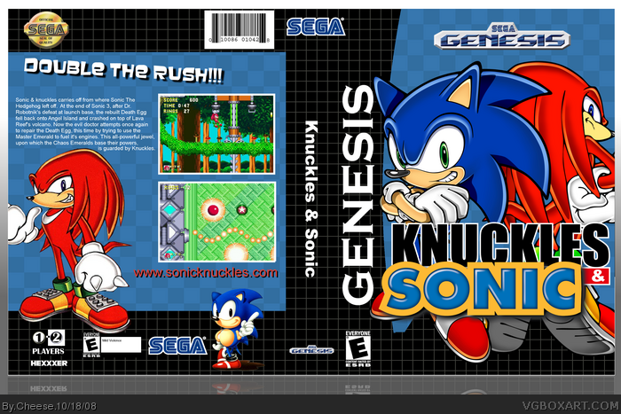
The game is called Sonic & Knuckles so I have no idea why the spine and logo says "Knuckles & Sonic". I dont like the template and the Sega logo is too big to fit on the spine (if you imagine this cover in an actual 3D box, the Sega logo would be coming out to the front.) The Sonic and Knuckles images on the front are covering the template which doesn't look good and you should of used retro renders for a retro game. The background is also boring. Oh and this game is only single player so you should remove the "1 or 2 players" logo. Also what is with that random retro Sonic render you just stuck in on the back? Looks really bad down there. The tagline doesn't make much sense, the screenshot borders look bad, the background on the back is the same boring background you used on the front. The back text has quite a few grammar mistakes too and is poorly written.
I like it but the logo is wrong, the back font is too plain (add a shadow) and the pictures don't have a border. If you fix this I would really like it. 3.8/5 =]
#4, I agree about the title. I like this box, it has the simple old school feeling because a lot of boxes were plain like this then. That small Sonic is out of place.
 Sonic & Knuckles Box Cover Comments
Sorry but its not that great!
The game is called Sonic & Knuckles so I have no idea why the spine and logo says "Knuckles & Sonic". I dont like the template and the Sega logo is too big to fit on the spine (if you imagine this cover in an actual 3D box, the Sega logo would be coming out to the front.) The Sonic and Knuckles images on the front are covering the template which doesn't look good and you should of used retro renders for a retro game. The background is also boring. Oh and this game is only single player so you should remove the "1 or 2 players" logo. Also what is with that random retro Sonic render you just stuck in on the back? Looks really bad down there. The tagline doesn't make much sense, the screenshot borders look bad, the background on the back is the same boring background you used on the front. The back text has quite a few grammar mistakes too and is poorly written.
1/5
[ Reply ]
i like it 4/5+fav
Edited at 1 decade ago
[ Reply ]
I like it but the logo is wrong, the back font is too plain (add a shadow) and the pictures don't have a border. If you fix this I would really like it. 3.8/5 =]
[ Reply ]
OK fave, but you need to change it from "Knuckles & Sonic" to "Sonic & Knuckles"
4/5 anyway
[ Reply ]
#4, I agree about the title. I like this box, it has the simple old school feeling because a lot of boxes were plain like this then. That small Sonic is out of place.
[ Reply ]
#1 Wow, Sonic nerd much :p
Decrease the size of the sega logo, get the Sonic & Knuckles logo and ditch the tiny sonic on the back and this could be worthy of a fave.
[ Reply ]
I thought you said you couldn't finish this, and that's why you had to drop out?
[ Reply ]
Your best by FAR.
[ Reply ]