[ Buy Bully: Schol... at Amazon ] By Apollo 41 on October 20th, 2008 No Printable Available Bully: Scholarship Edition Box Cover Comments Comment on Apollo's Bully: Scholarship Edition Box Art / Cover. Cancel Reply Apollo 41 [ 1 decade ago ] So yeah. You may see that it was suppost to be with the bytD party. ... I kinda didn't get around to posting it. I'm not 100% happy, but yeah. take a look in full. [ Reply ] ELCrazy 50 [ 1 decade ago ] Very nice +fav [ Reply ] Ervo 48 [ 1 decade ago ] Me likes. [ Reply ] p0ker 37 [ 1 decade ago ] awesome. [ Reply ] Indexenos 43 [ 1 decade ago ] Great concept! I love the comic book feel of it. [ Reply ] ELCrazy 50 [ 1 decade ago ] Bumpin' the hos. [ Reply ] Drakxxx 46 [ 1 decade ago ] better late than never man, and this is definitely a kick ass design. I really like the effect on the character on the front. [ Reply ] Maximum 24 [ 1 decade ago ] Heck yes. [ Reply ] Ray Blade 40 [ 1 decade ago ] It's great! But it's a bit plain. -_-' I dunno, the front looks like something is missing. [ Reply ] Skyrunner 33 [ 1 decade ago ] Looks awesome dude. Time for an author fav. [ Reply ] Rossagues 42 [ 1 decade ago ] What template did you use, could i have a link? [ Reply ] E_G 39 [ 1 decade ago ] #9, It's suppose to be plain. What a silly comment. Nicely done, the silhouette works. The pen style text is awesome. Edited at 1 decade ago [ Reply ] tleeart 45 [ 1 decade ago ] Only thing I would change is the font on the back. It looks like you went for notebook paper, so I would make it a handwritten looking font. This is great though, I love the minimalism of the front. [ Reply ] Apollo 41 [ 1 decade ago ] Thanks for the comments all, Might edit it after school today [ Reply ]
 Bully: Scholarship Edition Box Cover Comments
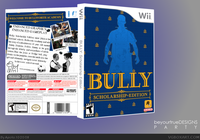
So yeah. You may see that it was suppost to be with the bytD party.
... I kinda didn't get around to posting it.
I'm not 100% happy, but yeah. take a look in full.
[ Reply ]
Very nice +fav
[ Reply ]
Me likes.
[ Reply ]
awesome.
[ Reply ]
Great concept! I love the comic book feel of it.
[ Reply ]
Bumpin' the hos.
[ Reply ]
better late than never man, and this is definitely a kick ass design. I really like the effect on the character on the front.
[ Reply ]
Heck yes.
[ Reply ]
It's great! But it's a bit plain. -_-' I dunno, the front looks like something is missing.
[ Reply ]
Looks awesome dude. Time for an author fav.
[ Reply ]
What template did you use, could i have a link?
[ Reply ]
#9, It's suppose to be plain. What a silly comment.
Nicely done, the silhouette works. The pen style text is awesome.
Edited at 1 decade ago
[ Reply ]
Only thing I would change is the font on the back. It looks like you went for notebook paper, so I would make it a handwritten looking font.
This is great though, I love the minimalism of the front.
[ Reply ]
Thanks for the comments all,
Might edit it after school today
[ Reply ]