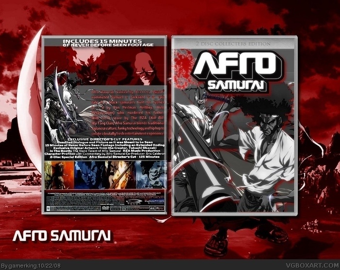
my 60th box!! i worked real hard on this one, so comments are appreciated! :) and sorry about the title being all caps. i didn't realize i had caps lock on. lol.
credit to silentman for the temp. and the back was actually easier to read when in gimp. i don't know what happened now. lol.
Agreed with everybody else, this is at least one of your best, if not your personal best. The back has some pixelated images, but it's really solid design through and through.
It actually is really good man. I like how you composed everything together. Text on back and template need fixing. White around the temp, ad text is a bit fuzzy. 5/5 anyway!
Thanks!! and...UPDATE!! i did my best to enhance things and i fixed the template a bit. but once again, the text on the back came out different then when in gimp. oh well. let me know what you think though!! :)
As others have said, the back has some issues. The text appears to run into the edge of the template and the images look pixelated. Still, I like the mood and colours, so I think you deserve a +FAV.
thanks!! and yeah, i'll see what i can do with the back. the problem might be what spiderpig said, so i'll try tomorrow to fix it. :) oh, and good luck to ya in the competition thing that we're in. i'm already done my box. :P (i started it before yummybrains announced the theme. lol. but it still works out good. :P)
 AFRO SAMURAI Box Cover Comments
my 60th box!! i worked real hard on this one, so comments are appreciated! :) and sorry about the title being all caps. i didn't realize i had caps lock on. lol.
credit to silentman for the temp. and the back was actually easier to read when in gimp. i don't know what happened now. lol.
[ Reply ]
Hmmm, I like it! +fav
[ Reply ]
*Kyle Hates Afro Samurai >.<* But the box is nice!
[ Reply ]
This has to be your best box so far. Great job.
[ Reply ]
thanks guys!!
[ Reply ]
just a genral comment but all your boxes have about 3 faves and if you put some extra time on your next box you could be in the hall of fame.
[ Reply ]
about the box i agree with spiderpig. your best yet.
[ Reply ]
well, thanks i guess? lol. but actually i really tried on this box. notice how there's a back? i NEVER do backs. lol.
_____________________________________________
yes...i know. lol. :P
Edited at 1 decade ago
[ Reply ]
it shows u tried hard on this.
[ Reply ]
Agreed with everybody else, this is at least one of your best, if not your personal best. The back has some pixelated images, but it's really solid design through and through.
[ Reply ]
thanks! and thanks 4 the fav!! :P
[ Reply ]
It actually is really good man. I like how you composed everything together. Text on back and template need fixing. White around the temp, ad text is a bit fuzzy. 5/5 anyway!
Edited at 1 decade ago
[ Reply ]
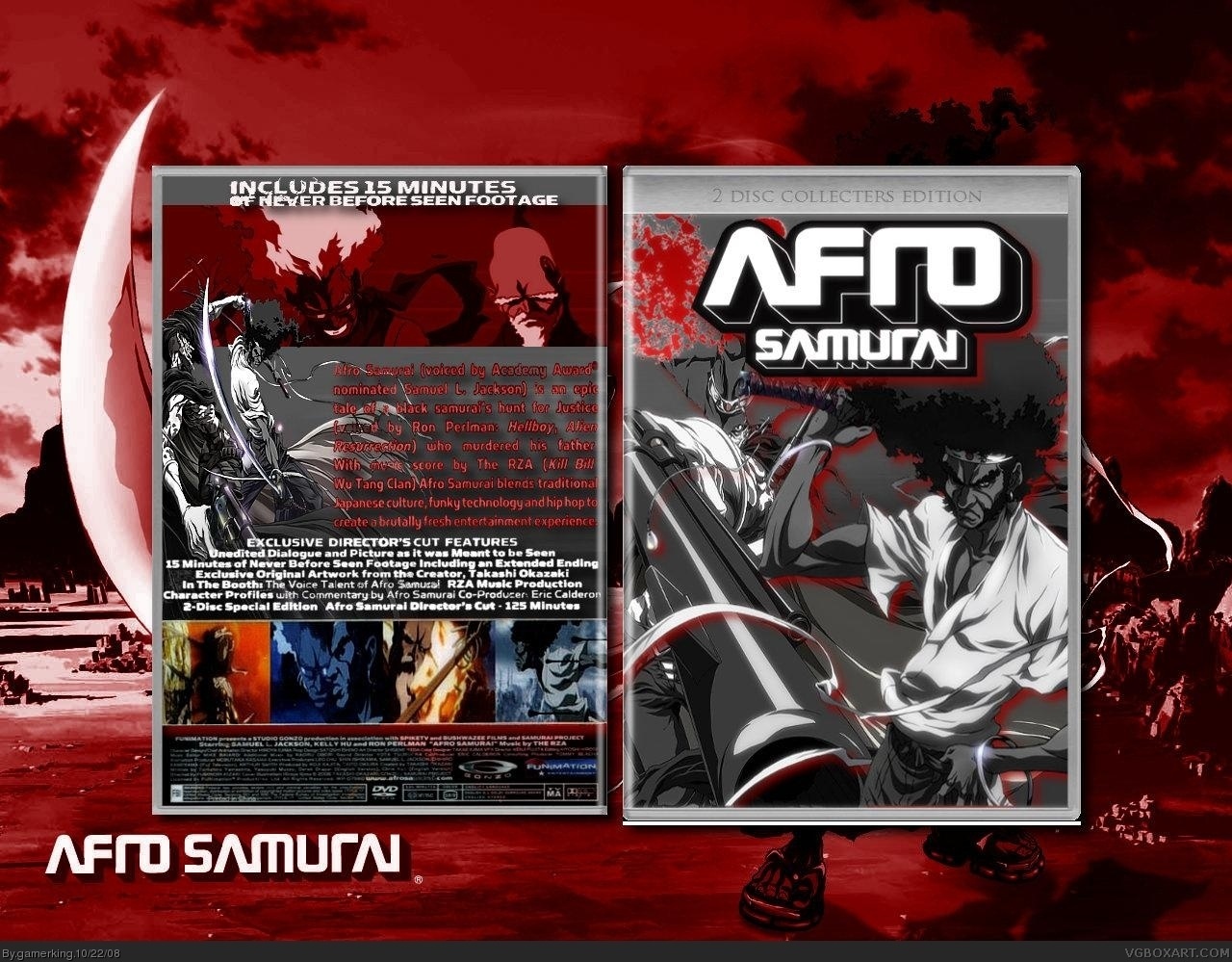
Thanks!! and...UPDATE!! i did my best to enhance things and i fixed the template a bit. but once again, the text on the back came out different then when in gimp. oh well. let me know what you think though!! :)
[ Reply ]
Nice work
Edited at 1 decade ago
[ Reply ]
thanks!! :)
[ Reply ]
As others have said, the back has some issues. The text appears to run into the edge of the template and the images look pixelated. Still, I like the mood and colours, so I think you deserve a +FAV.
[ Reply ]
thanks!!!! whoa ho! this is going great!! lol. :P
[ Reply ]
I think the text is blurry because you saved in JPEG. If you save in PNG the quality will be better.
[ Reply ]
hmmmm...maybe. i'll see what i can do some other time. :) thanks.
[ Reply ]
i see your effort here, so i'll give you a fav
just fix up the back a bit
[ Reply ]
thanks!! and yeah, i'll see what i can do with the back. the problem might be what spiderpig said, so i'll try tomorrow to fix it. :) oh, and good luck to ya in the competition thing that we're in. i'm already done my box. :P (i started it before yummybrains announced the theme. lol. but it still works out good. :P)
[ Reply ]