Awesome job Pan. For a box thats been done so often around here, your manages to have it's own unique feel. I really like the wheel on the back, and the eye icon on it adds to the creepiness.
YES! Finally something NEW for a change from Bioshock! You actually captured the look and feel of the game...I'm not too crazy about the logo without the background, but nice job anyway.
#2, I made sure that I didn't use that tagline again, I wanted to focus on what you do in the game rather than rapture itself.
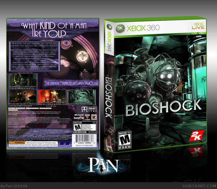
#3 The wheel on the back is actually one of the machines you but upgrades from. I really wanted to use the new Big Daddy artwork but it didn't fit anywhere, so I used it for the shadow.
 BioShock Box Cover Comments
Since my last Bioshock box looked really bad when printed, I had to make a new one. I did these clean cut rather than my normal experimenting.
300 DPI printable will be added in a sec.
[ Reply ]
Oh yes indeed. The tagline doesn't say "Welcom to Rapture". That makes a nice change.
[ Reply ]
Awesome job Pan. For a box thats been done so often around here, your manages to have it's own unique feel. I really like the wheel on the back, and the eye icon on it adds to the creepiness.
[ Reply ]
#2, I agree with adfd nice one pan :D i especially love the back!
[ Reply ]
YES! Finally something NEW for a change from Bioshock! You actually captured the look and feel of the game...I'm not too crazy about the logo without the background, but nice job anyway.
[ Reply ]
#2, I made sure that I didn't use that tagline again, I wanted to focus on what you do in the game rather than rapture itself.
#3 The wheel on the back is actually one of the machines you but upgrades from. I really wanted to use the new Big Daddy artwork but it didn't fit anywhere, so I used it for the shadow.
Thanks people who commented. :3
[ Reply ]
Well done, Pan! I dig it!
[ Reply ]
I like the fresh tagline and the piece as a whole. I don't like how you stretched the "A" from "What" to "Are".
Still very fresh approach.
[ Reply ]
hell yeah with a side of holy shit! fav!
[ Reply ]
its different, and I love it :)
[ Reply ]
Well, I'll be damned! This is spectacular!
[ Reply ]
Only you could make a screenshot look good on a cover.
[ Reply ]
Very good.
[ Reply ]
#12, What part of the box is a screenshot?
[ Reply ]
#14, The front?
[ Reply ]
#15, You mean the background behind Big Daddy? I didn't even know that was a screenshot, I thought it was concept art.
[ Reply ]
Took me a while to notice this.
Very nice.
[ Reply ]
Congrats.
[ Reply ]
#16, Yeah, haha. I think it's from Optimized Eugenics.
[ Reply ]