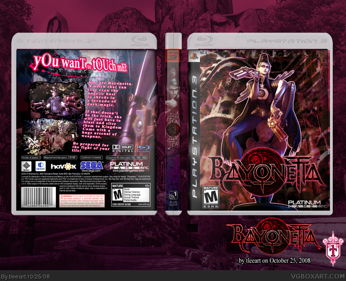
Alright! Here was a little more experimenting than some of my others. This...is Bayonetta. This is one of the games coming out from PlatinumGames, the same people making Mad World.
This game is being directed by the same director of the original Devil May Cry, and features a cheeky British witch named...Bayonetta.
Anyway, Credits:
Techne: Plastic for the PS3 box.
Lumberjack42 from the Cover Project Templates: Layout template.
gamertagradio's and wildgames' Flickr's and the official Bayonetta trailer for Bayonetta art and screens. linklinklink (in respective order)
Been working on this for almost a week now, so yup, had to upload it ASAP, even if it's not the best time, because I won't be home all weekend...
Ya, first on the block with a Bayonetta box! Enjoy!
Been working on this for almost a week now, so yup, had to upload it ASAP, even if it's not the best time, because I won't be home all weekend...
Great, but I would darken or lighten the background a little bit so the focus is on your amazing box :D. Reflections would be cool aswell, you did a very good job. +fav +author fav
I'll have to see about fixing up the background to better showcase the box. As for the reflection, I don't think it works, how I set them up, since I lay a wallpaper like design behind my boxes, but I'll see what I can do there, too.
This will have to wait, however, because I'm going to bed, gonna be outta the house really early.
EDIT: Screw it, it took like a minute to make the background darker, lol. UPDATE!
I like it, a lot. But the stroke on the text on the back looks kind of weird to me. Try making the stroke a little less prominent, down the opacity a bit. Just an idea. Looks good tho.
#15, Like I mentioned in my first post, this was kind of experimental, trying some different ways to get attention to the different aspects of the main subject matter. I'll try some different stuff on the text later possibly.
This one was meant to feel different than my usual. Trying to pick up some more of a grungy style to it. More urban.
Nice nice. Agreed about the stroke, a bit too much there. Nice agreement of colors...I like how you're starting to use more dynamic layout concepts for the back. Just a bit more polishing here and there as well as developing your own distinct style would help your future designs in the long run. But you're certainly making your way up, keep up the great work. :)
#18, Okay, now that's two people. When I get back to my home computer, I'll definitely give the lesser stroke a go. Thank you for the critique, this helps a lot.
Now this is uber. She stands out so much better with out the shadowed splattering, and I adore the pink outline. It's just great! Love the tag line too, bwah!
Wow. Seriously great. I don't know what people mean by the colors. I think they are just fine. Could possibly be monitor differences. If it would be possible, I would try to submit that box art to Sega. Absolutely. Its that symmetrical (aside from the rear title text), balanced and smooth. Excellent.
 Bayonetta Box Cover Comments
I'm not really digging the pickness around the font. Its way too bright. Maybe dim it a little.
Other than that, nice job.
[ Reply ]
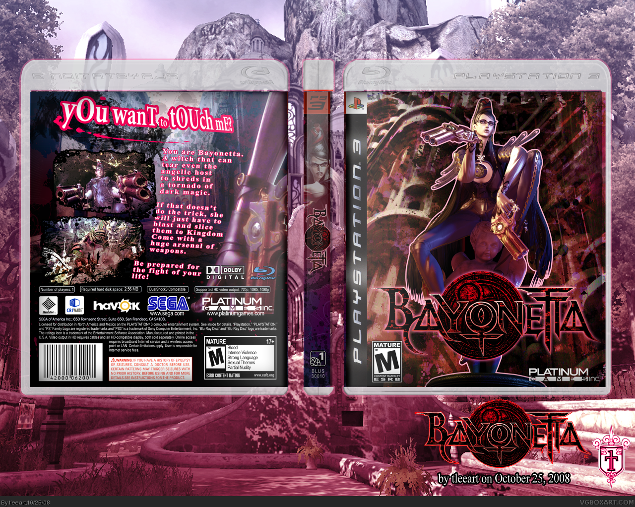
Alright! Here was a little more experimenting than some of my others. This...is Bayonetta. This is one of the games coming out from PlatinumGames, the same people making Mad World.
This game is being directed by the same director of the original Devil May Cry, and features a cheeky British witch named...Bayonetta.
Anyway, Credits:
Techne: Plastic for the PS3 box.
Lumberjack42 from the Cover Project Templates: Layout template.
gamertagradio's and wildgames' Flickr's and the official Bayonetta trailer for Bayonetta art and screens. link link link (in respective order)
Been working on this for almost a week now, so yup, had to upload it ASAP, even if it's not the best time, because I won't be home all weekend...
Ya, first on the block with a Bayonetta box! Enjoy!
Been working on this for almost a week now, so yup, had to upload it ASAP, even if it's not the best time, because I won't be home all weekend...
Edited at 1 decade ago
[ Reply ]
#1, pickness? Oh, you mean pinkness? I'll think about it.
EDIT: Sorry, didn't mean to make this a double post, just forgot that I could edit my post for a second :/
Edited at 1 decade ago
[ Reply ]
Great, but I would darken or lighten the background a little bit so the focus is on your amazing box :D. Reflections would be cool aswell, you did a very good job. +fav +author fav
[ Reply ]
#4, Oh wow, thanks!
I'll have to see about fixing up the background to better showcase the box. As for the reflection, I don't think it works, how I set them up, since I lay a wallpaper like design behind my boxes, but I'll see what I can do there, too.
This will have to wait, however, because I'm going to bed, gonna be outta the house really early.
EDIT: Screw it, it took like a minute to make the background darker, lol. UPDATE!
Edited at 1 decade ago
[ Reply ]
Awesome as always, but the tagline sounds like something a slut would say :p
[ Reply ]
This is beyond awesome it needs its own word, I thinking Smokin' Sick Style.
[ Reply ]
Very nice.
[ Reply ]
this box is awesome!! really nice job tim. :)
and the pic of her on the spine of your box looks like sarah palin. :P
[ Reply ]
About time I author faved you.
[ Reply ]
dang, you beat me to it
[ Reply ]
#6, Bwaaaahahahahaaaa, that's good. Just too good. She says that at the beginning of the trailer! That was the reason I used that.
Thanks for all the other kind comments and especially to XCore for the Author Fav!
[ Reply ]
This is truly awesome, can u PM me the logo?
[ Reply ]
#13, Sure, no problem!
[ Reply ]
I like it, a lot. But the stroke on the text on the back looks kind of weird to me. Try making the stroke a little less prominent, down the opacity a bit. Just an idea. Looks good tho.
[ Reply ]
Wowza!
[ Reply ]
#15, Like I mentioned in my first post, this was kind of experimental, trying some different ways to get attention to the different aspects of the main subject matter. I'll try some different stuff on the text later possibly.
This one was meant to feel different than my usual. Trying to pick up some more of a grungy style to it. More urban.
[ Reply ]
Nice nice. Agreed about the stroke, a bit too much there. Nice agreement of colors...I like how you're starting to use more dynamic layout concepts for the back. Just a bit more polishing here and there as well as developing your own distinct style would help your future designs in the long run. But you're certainly making your way up, keep up the great work. :)
[ Reply ]
#18, Okay, now that's two people. When I get back to my home computer, I'll definitely give the lesser stroke a go. Thank you for the critique, this helps a lot.
[ Reply ]
Now this is uber. She stands out so much better with out the shadowed splattering, and I adore the pink outline. It's just great! Love the tag line too, bwah!
[ Reply ]
#20, I still need to update it (lessen the pink outline on the tagline), but thank you very much!
[ Reply ]
Author Fav
[ Reply ]
This is another amazing box by Tleeart.
Congrats on HOF. fav
[ Reply ]
Another one?! :( I'll never catch up. xP Congrats though.
[ Reply ]
Wow, I just wanted to say thanks for everybody that made this another HoF! I didn't even notice this one!
[ Reply ]
Wow. Seriously great. I don't know what people mean by the colors. I think they are just fine. Could possibly be monitor differences. If it would be possible, I would try to submit that box art to Sega. Absolutely. Its that symmetrical (aside from the rear title text), balanced and smooth. Excellent.
[ Reply ]