I just felt like Koopa was a little overboard on how he rated this. I know it's not the best, but I don't remember saying anything like this on his Dr. Mario box. I put a lot of time into making the art, and I feel it's decent. I know it's not the best, but at least I tried something different this time.
#9, Hey, if you post it, expect me to give you my honest opinion of it. Just because you put a lot of effort into it doesn't mean it looks good. I know my Dr. Mario box sucks... I tried to delete it, but it was too late. It's not so much the art as the design... it doesn't match the feel of the game at all.
I agree with Daniel, I really like the art on the front as well. The fact that you drew it even makes it more impressive. The logo, however, doesn't exactly fit with the background. That one I used on mine which blended nicely with the yellow orange background, but the orange outer glow doesn't quite work here.
The back isn't that good to be honest. I like the nice touches like the borders and the background you used, but the concept is under developed and the overall lack luster composition shows that. Also, the typography needs a lot of work. (the red tagline kinda killed the feel of the box for me)
#10, Fine, just try to be a little more suggestive of what I could do to make it better, instead of "shuddering" next time, please. I do appreciate honesty, though.
I guess I could just delete this and start over from scratch, just do it like everybody else does and grab renders from some website like gamehiker and put something together. I was trying to be a little experiemental and was a little inspired by Drakxxx's stuff.
#11, I appreciate the full critique.
----
I'm kind of disappointed in my results on this. I highly doubt I'll do custom art like this again, unless I go for a more simplistic style of art. I think this was just too ambitious.
EDIT: I won't delete this, but my feelings toward doing something like this still stands. Next time I do something with original art, it will be a Sonic box. Don't worry, I'll be more spot on the Sonic style than I was with this style.
#13, I disagree, I think you should pursue something in this direction, because you clearly have skill when it comes to drawing. And I really like it when people put a lot of effort in their boxes and delve into their more creative side as opposed to just making boxarts as professional looking as possible.
I just felt that by putting alot of effort on the creative aspect like making your own renders, you've neglected having a good sound design. As I've said before, put more thought in your concepts first and foremost and make them more coherent or dynamic; the rest will follow suit.
#15, Again, thanks, but I don't think the art was on par with the subject matter. I will put more focus on my layout next time I do something like this, though. I doubt I'll revisit this one because of my feelings on it.
I totally missed this one, and I've had my eye out for your custom box ever since you mentioned it.
I love how you did your custom renders, regardless of if they totally fit the theme of the game or not. I can see a great amount of skill in the line work, and the color is great.
On a graphic art standpoint, I really like the blending in the front, and the custom boarders on the back are very sharp. I might not all flow together 100%, but I totally appreciate the different direction you took the presentation in.
You have pencil skills sir (as I like to call them) -You can make some great stuff with this. Sometimes it helps to do a rough concept sketch of the front of the package, then from there focus on your custom art one piece at a time. That way, you can manipulate things and get them were you want them.
I'm truly impressed by the effort, and I'm glad to finally get an example of your drawing abilities.
The art on this is mad delicious. Just the fact that you did REAL art, and not just a bunch of slapped together photomanipping junk is fave worthy. I love the wolf on the back, still! He's nomlicious.
 The Legend of Zelda: Twilight Princess Box Cover Comments
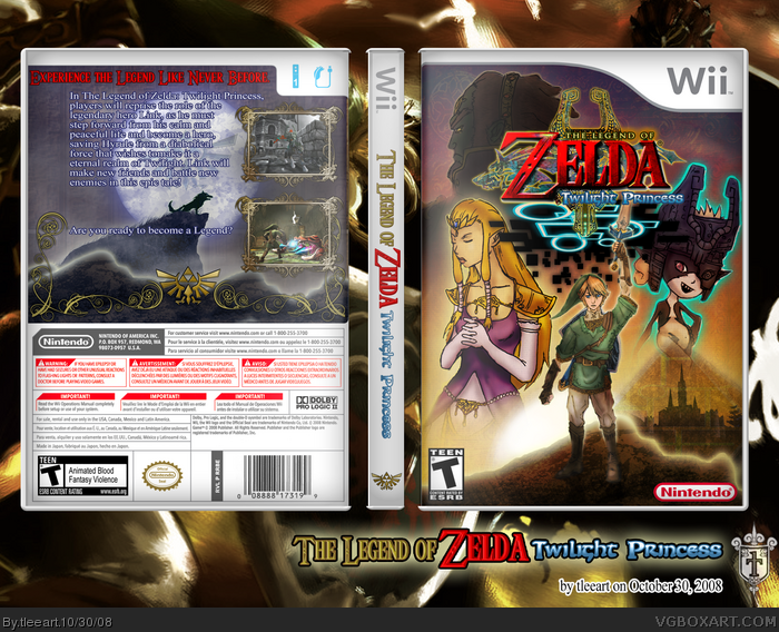
This is my submission for Round 1 of "The Yummy Aspects" contest being put on by yummybrains.
Some credits:
Wii Template: Lumberjack42 on The Cover Project
Twilight Princess logo and original Twilight Princess cover background: LadyKiller
Triforce: Best Brands of the World website
Screens: GameSpot
I wanted to make this as much mine as possible. I made the borders, the Spine logo, and all the renders on this one. Tell me what you guys think!
Edited at 1 decade ago
[ Reply ]
You made the renders, does that mean you drew them or cut out some fan art? It's wonderful nontheless.
[ Reply ]
Epic win, I would've puttet the text a bit more to the left tough! ;)
Anyways, great job, tleeart!
[ Reply ]
#2, Drew them and/or Photoshop (digital painting).
#3 I'll see about adjusting the text.
Edited at 1 decade ago
[ Reply ]
I really, really, don't like the art on the front at all. I don't like the back design either, it's really empty. But the front.... *shivers*
[ Reply ]
you might make it to the second round tim! it's not the best zelda box, but you drew all that so that's alot of effort! :P
[ Reply ]
#5, Is it THAT bad? Geez.
[ Reply ]
really like the art, but art is subjective.
However the art does look familiar. I wonder what it is...
link
Link is doing Saturday night fever.
[ Reply ]
#8, lol.
I just felt like Koopa was a little overboard on how he rated this. I know it's not the best, but I don't remember saying anything like this on his Dr. Mario box. I put a lot of time into making the art, and I feel it's decent. I know it's not the best, but at least I tried something different this time.
[ Reply ]
#9, Hey, if you post it, expect me to give you my honest opinion of it. Just because you put a lot of effort into it doesn't mean it looks good. I know my Dr. Mario box sucks... I tried to delete it, but it was too late. It's not so much the art as the design... it doesn't match the feel of the game at all.
[ Reply ]
I agree with Daniel, I really like the art on the front as well. The fact that you drew it even makes it more impressive. The logo, however, doesn't exactly fit with the background. That one I used on mine which blended nicely with the yellow orange background, but the orange outer glow doesn't quite work here.
The back isn't that good to be honest. I like the nice touches like the borders and the background you used, but the concept is under developed and the overall lack luster composition shows that. Also, the typography needs a lot of work. (the red tagline kinda killed the feel of the box for me)
[ Reply ]
Nice use of your skills
[ Reply ]
#10, Fine, just try to be a little more suggestive of what I could do to make it better, instead of "shuddering" next time, please. I do appreciate honesty, though.
I guess I could just delete this and start over from scratch, just do it like everybody else does and grab renders from some website like gamehiker and put something together. I was trying to be a little experiemental and was a little inspired by Drakxxx's stuff.
#11, I appreciate the full critique.
----
I'm kind of disappointed in my results on this. I highly doubt I'll do custom art like this again, unless I go for a more simplistic style of art. I think this was just too ambitious.
EDIT: I won't delete this, but my feelings toward doing something like this still stands. Next time I do something with original art, it will be a Sonic box. Don't worry, I'll be more spot on the Sonic style than I was with this style.
Edited at 1 decade ago
[ Reply ]
idk. i thought it was good. i like it when drakxxx makes custom boxes so this is a nice touch. but whatever. :P lol.
[ Reply ]
#13, I disagree, I think you should pursue something in this direction, because you clearly have skill when it comes to drawing. And I really like it when people put a lot of effort in their boxes and delve into their more creative side as opposed to just making boxarts as professional looking as possible.
I just felt that by putting alot of effort on the creative aspect like making your own renders, you've neglected having a good sound design. As I've said before, put more thought in your concepts first and foremost and make them more coherent or dynamic; the rest will follow suit.
[ Reply ]
#15, Again, thanks, but I don't think the art was on par with the subject matter. I will put more focus on my layout next time I do something like this, though. I doubt I'll revisit this one because of my feelings on it.
[ Reply ]
i have to say wow, that's some good art
im doing one with art now too XD
[ Reply ]
Outstanding work tleeart. You never cease to amaze me.
[ Reply ]
Well, I'm glad that some people do like it. Thanks guys!
[ Reply ]
Thanks for the fav's I've been getting, please take a second to tell me what you guys like or don't like, okay?
[ Reply ]
I totally missed this one, and I've had my eye out for your custom box ever since you mentioned it.
I love how you did your custom renders, regardless of if they totally fit the theme of the game or not. I can see a great amount of skill in the line work, and the color is great.
On a graphic art standpoint, I really like the blending in the front, and the custom boarders on the back are very sharp. I might not all flow together 100%, but I totally appreciate the different direction you took the presentation in.
You have pencil skills sir (as I like to call them) -You can make some great stuff with this. Sometimes it helps to do a rough concept sketch of the front of the package, then from there focus on your custom art one piece at a time. That way, you can manipulate things and get them were you want them.
I'm truly impressed by the effort, and I'm glad to finally get an example of your drawing abilities.
+fav and author fav
Edited at 1 decade ago
[ Reply ]
#21, If you like my drawing ability, try my deviantart link
Also, I'm about to try something different (again) so heads up on that as well.
As for technique, I did exactly that, it just didn't come together quite as nicely as I wanted.
Regardless, thank you so much for your kind words!
[ Reply ]
I have to agree with Koopa here.
[ Reply ]
#23, That's fine. If you could, give me some ideas to improve this if I were to revisit it.
[ Reply ]
The art on this is mad delicious. Just the fact that you did REAL art, and not just a bunch of slapped together photomanipping junk is fave worthy. I love the wolf on the back, still! He's nomlicious.
[ Reply ]
#25, I'm glad you like this! I think I need to revisit the layout sometime, but I am kinda proud of the art.
[ Reply ]
that is a sweet case man did u draw that
[ Reply ]