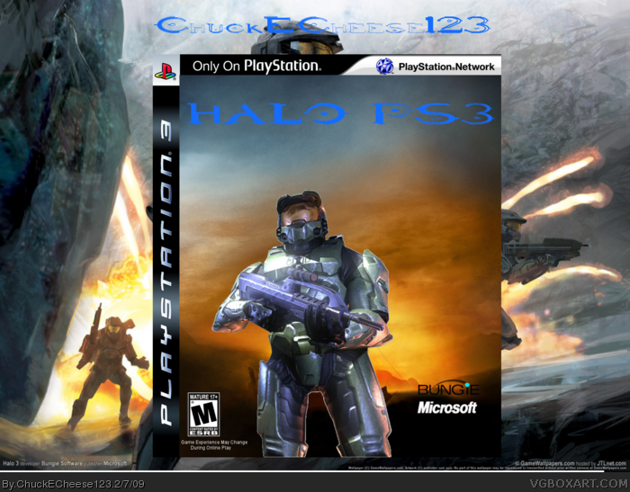
Two renders slapped on a background with half-assed logos added doesn't make a good box. Plus, the Bungie logo should be larger and inverted and a Microsoft logo on a PS3 box is a no-no.
chuckecheese, what happened? your boxes are getting worse in my opinion. they're too plain and uninteresting. and not to mention that the logo is really hard to see.
#3, Crap, I didn't even notice there was a logo...I don't think there's a need to call it "Halo PS3", Just try and use a normal style Halo logo. Then feature one big, prominent Master Chief as the main "feature" of the box.
 Halo PS3 Box Cover Comments
Two renders slapped on a background with half-assed logos added doesn't make a good box. Plus, the Bungie logo should be larger and inverted and a Microsoft logo on a PS3 box is a no-no.
1.5/5 Not your best.
[ Reply ]
go burn yourself....please
-100/5
Edited at 1 decade ago
[ Reply ]
chuckecheese, what happened? your boxes are getting worse in my opinion. they're too plain and uninteresting. and not to mention that the logo is really hard to see.
[ Reply ]
wao... this sux
[ Reply ]
#2 and 4, just shut up.
[ Reply ]
#2, That was a jerk thing to do. No point even commenting if you're going to post like that.
[ Reply ]
#3, Crap, I didn't even notice there was a logo...I don't think there's a need to call it "Halo PS3", Just try and use a normal style Halo logo. Then feature one big, prominent Master Chief as the main "feature" of the box.
[ Reply ]
#7, neaither did i this is really bad!
[ Reply ]
#5, thanks for telling them
[ Reply ]
Way better update!
[ Reply ]
nice update, but i dont like the logo.
[ Reply ]