honestly, i really don't like this box. the following is my opinion, it dosen't really mean anything, IT'S JUST WHAT I THINK, if i say a box is bad, it dosen't mean it's bad, IT'S JUST WHAT I THINK.
PROS:
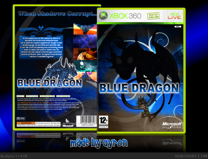
* I like how you used manga art on the front, instead of 3-d renders or anime art
* I like the BG on the front
CONS:
* the dragon on the front is simple black with gray eyes
* the front looks extremely plain, and, kinda depressing
* you didnt use the official logo
* the screenshots look weird without borders
* the tagline is just plain weird
* the back is plain
* not the best template
* you didn't have to put the dragon and the logo on the back, it seems to me that it's just a filler
OVERALL : 2.5 / 5, not your best, since most of your work in my book is 10/5 usually
i really know i'm not the one to be talking, cuz i suck at boxarts, but i tell em' as i see em'.
 Blue Dragon Box Cover Comments
Too epic for words...
[ Reply ]
I've missed you guys.
Yes,yes i have.
Allthough you might not have missed me, i can't do without Vgba, and thus; my Blue Dragon box!
[ Reply ]
I love that front xD
[ Reply ]
is it just me, or is the dragon on the front black and not blue...
but stil, noice!
[ Reply ]
honestly, i really don't like this box. the following is my opinion, it dosen't really mean anything, IT'S JUST WHAT I THINK, if i say a box is bad, it dosen't mean it's bad, IT'S JUST WHAT I THINK.
PROS:
* I like how you used manga art on the front, instead of 3-d renders or anime art
* I like the BG on the front
CONS:
* the dragon on the front is simple black with gray eyes
* the front looks extremely plain, and, kinda depressing
* you didnt use the official logo
* the screenshots look weird without borders
* the tagline is just plain weird
* the back is plain
* not the best template
* you didn't have to put the dragon and the logo on the back, it seems to me that it's just a filler
OVERALL : 2.5 / 5, not your best, since most of your work in my book is 10/5 usually
i really know i'm not the one to be talking, cuz i suck at boxarts, but i tell em' as i see em'.
Edited at 1 decade ago
[ Reply ]
Ayron! Welcome back. Styleish looks, I like. Fave.
#5, Very thorough.
Edited at 1 decade ago
[ Reply ]
I love the sharp bold logo on the front. Great font choice!
[ Reply ]
Thanks guys ;)
Ehmm, #5--ok. your opinion mate =]
[ Reply ]
Very stylish, I would like to suggest to make the eyes red and a bit glowing. Gives the nice spooky effect! ;P
Oh, welcome back, I suppose? =P
[ Reply ]
I dont like the dragons eyes, but otherwise its great.
fav
Edit: Also, I'd like some screen borders, or a kind of better edge on them.
Edited at 1 decade ago
[ Reply ]
damn/
[ Reply ]
#8, thank you for understanding, can't wait to see what you hold for the future Ayron!
[ Reply ]
I just noticed you didnt cut out the PEGI logo ^.^
[ Reply ]
Front concept is very cool and nicely executed. Great job!
[ Reply ]
thanks everyone! xD
#10-- i think it's a hit-or-miss,right xD?
[ Reply ]