well you know the drill
comments and fav's are very much appreciated
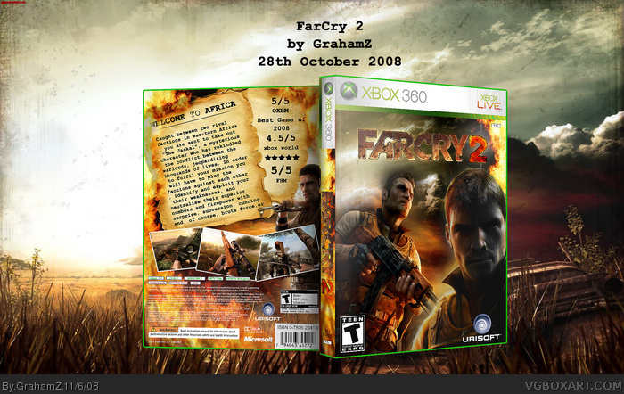
this is for my yummy aspect comp but he's taking his time soo i thought id post it here.
This is quite nice. I love the tattered, burnt paper and the flame effects. I think the logo needs a dark glow/stroke around it, for better impact. But this is good.
Take the guy on the right off the front out and it will look great, on teh back teh script thing takes up a lot of space, images are good, but its a good cover overall 4/5, improving all the time mate, KIU.
 FarCry 2 Box Cover Comments
woo just filled up my first page hehe
well you know the drill
comments and fav's are very much appreciated
this is for my yummy aspect comp but he's taking his time soo i thought id post it here.
:)
[ Reply ]
This is quite nice. I love the tattered, burnt paper and the flame effects. I think the logo needs a dark glow/stroke around it, for better impact. But this is good.
[ Reply ]
that's pretty cool =D
[ Reply ]
back is good. Front should only have one guy on it so I think you should take the guy on the bottom right off
[ Reply ]
About time you posted this... I kept waiting, and waiting, and it's finally here.
[ Reply ]
#4 yeah i see it would be better with one guy ill do it later
[ Reply ]
its good that the higher rank people are faving .
think im finally starting to get recognized :)
and thanks for the fav's
[ Reply ]
Take 1 guy out of the front.
[ Reply ]
Take the guy on the right off the front out and it will look great, on teh back teh script thing takes up a lot of space, images are good, but its a good cover overall 4/5, improving all the time mate, KIU.
[ Reply ]
thanks man :)
[ Reply ]