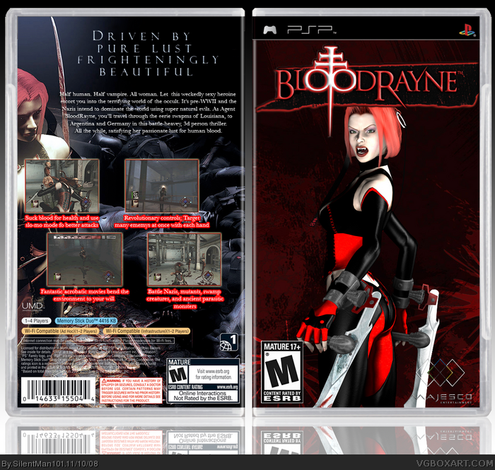
Front is awesome, but I wouldn't have used the yellow outer glow on the logo. And the bright red on the back is a bit off setting, but still. Overall it's about a 4/5.
The front is very nice looking. the back is almost there, I just don't like the red stroke on the letters under the screenshoots. This is some darn good work though.
 BloodRayne Box Cover Comments
Like Zoinks! A New Box! Comment and Criticism would be nice! And hey! Even fav it!! lol
Edited at 1 decade ago
[ Reply ]
nice. this will probably go unnoticed like all of your other boxes though. :P
Edited at 1 decade ago
[ Reply ]
Front is awesome, but I wouldn't have used the yellow outer glow on the logo. And the bright red on the back is a bit off setting, but still. Overall it's about a 4/5.
[ Reply ]
yeah, i don't like the red around the text, you might want to tone that down a bit. :)
[ Reply ]
Thanks Ray Blade. I might just have to fix that!
[ Reply ]
Ahem, It seems all of my boxes get ignored. Now all im asking for is a comment or two.
[ Reply ]
bumper! flame him! flame him! lol. :P in do time, kyle. in do time. lol.
[ Reply ]
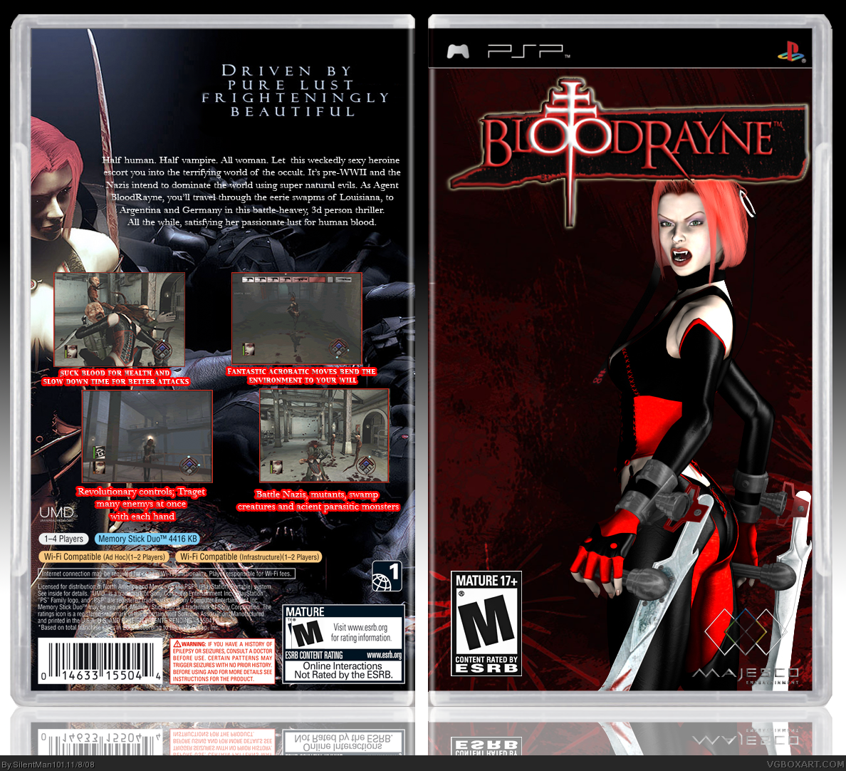
Hello again! Im just here to say I updated it!
[ Reply ]
The front is very nice looking. the back is almost there, I just don't like the red stroke on the letters under the screenshoots. This is some darn good work though.
[ Reply ]
#9, So no one is a fan of that eh, well I wanted it to match the screen shots lol
[ Reply ]
defiantly alot better! and as said, get rid of the red around the text, and you've got something here. ;)
[ Reply ]
#11, Im not getting rid of the red, its the only way you can read the text.
[ Reply ]
Anyone else?
[ Reply ]