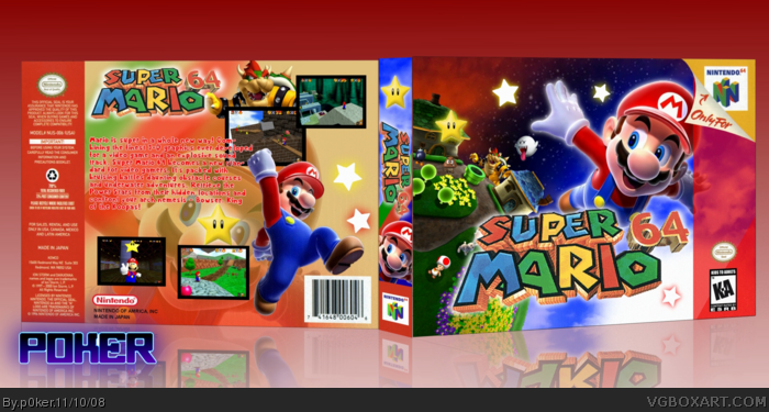
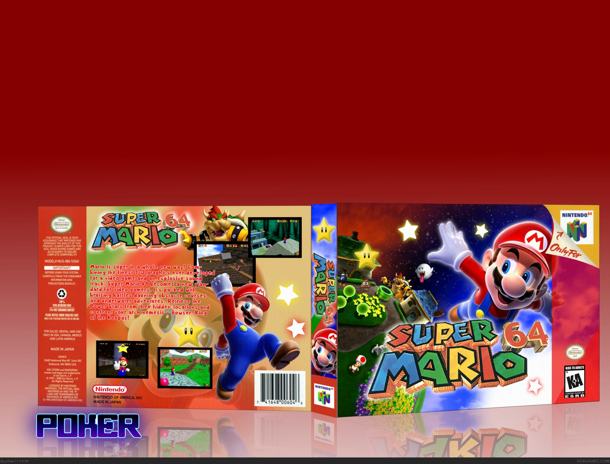
[ Buy Super Mario 64 at Amazon ] By p0ker 37 on November 10th, 2008 No Printable Available [ Box updated on November 10th, 2008 ] [ original ] Super Mario 64 Box Cover Comments Comment on p0ker's Super Mario 64 Box Art / Cover. Cancel Reply Squall234 44 [ 1 decade ago ] Looks good! [ Reply ] jevangod 50 [ 1 decade ago ] Nice! Wish the font could have a better color on the back. [ Reply ] theredlight 20 [ 1 decade ago ] get rid of the top extra spce [ Reply ] Skyrunner 33 [ 1 decade ago ] +fav +author fav You are beginning to be too epic for words. Edited at 1 decade ago [ Reply ] Ray Blade 40 [ 1 decade ago ] #1, Good is an understatement. [ Reply ] ClonedX 35 [ 1 decade ago ] nice use of galaxy renders [ Reply ] p0ker 37 [ 1 decade ago ] thanks for the comments! [ Reply ] tleeart 45 [ 1 decade ago ] #6, Personally I don't like how the background is a planet from Galaxy, though. I'd like to see a background more accurate to the game, as well as make him Wings Mario on the front. [ Reply ] shadysaiyan 42 [ 1 decade ago ] #1, This. [ Reply ] ojoe2000 29 [ 1 decade ago ] This is awesome. +fav Also can you please tell me the name of the font you used on the back? [ Reply ] p0ker 37 [ 1 decade ago ] #10 the font's called. mario & luigi. link [ Reply ] Drakxxx 46 [ 1 decade ago ] Wow, very nice! the galaxy renders worked great with this one! [ Reply ] ojoe2000 29 [ 1 decade ago ] #11 Cool, thanks [ Reply ] oxol 24 [ 1 decade ago ] I dont like the back so mush, but since I don't really know whats missing, I just say, I really like the front. :D [ Reply ] billyman31 40 [ 1 decade ago ] awesome. [ Reply ] suicide_season08 1 [ 1 decade ago ] how are you still a rank 4? lol, i love the box, what's with all these awesome mario boxes today? [ Reply ] YoshiStar 46 [ 1 decade ago ] I really love the colors! Awesome! Logo could be better quality, though. [ Reply ] Arkatox 1 [ 1 decade ago ] Hey, aren't those graphics a little too much for N64? I don't think the 64 has near that much RAM! Well good job anyway! [ Reply ]
 Super Mario 64 Box Cover Comments
Looks good!
[ Reply ]
Nice! Wish the font could have a better color on the back.
[ Reply ]
get rid of the top extra spce
[ Reply ]
+fav +author fav You are beginning to be too epic for words.
Edited at 1 decade ago
[ Reply ]
#1, Good is an understatement.
[ Reply ]
nice use of galaxy renders
[ Reply ]
thanks for the comments!
[ Reply ]
#6, Personally I don't like how the background is a planet from Galaxy, though.
I'd like to see a background more accurate to the game, as well as make him Wings Mario on the front.
[ Reply ]
#1, This.
[ Reply ]
This is awesome. +fav
Also can you please tell me the name of the font you used on the back?
[ Reply ]
#10 the font's called. mario & luigi.
link
[ Reply ]
Wow, very nice! the galaxy renders worked great with this one!
[ Reply ]
#11 Cool, thanks
[ Reply ]
I dont like the back so mush, but since I don't really know whats missing, I just say, I really like the front.
:D
[ Reply ]
awesome.
[ Reply ]
how are you still a rank 4? lol, i love the box, what's with all these awesome mario boxes today?
[ Reply ]
I really love the colors! Awesome! Logo could be better quality, though.
[ Reply ]
Hey, aren't those graphics a little too much for N64?
I don't think the 64 has near that much RAM!
Well good job anyway!
[ Reply ]