[ Box updated on November 12th, 2008 ] [ original ]
 Wii Ware: The Legend of Zelda: OoT Box Cover Comments
Comment on rasengan_boi's Wii Ware: The Legend of Zelda: OoT Box Art / Cover.
[ Box updated on November 12th, 2008 ] [ original ]
Comment on rasengan_boi's Wii Ware: The Legend of Zelda: OoT Box Art / Cover.
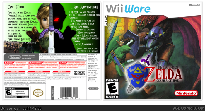
custom logo, custom template, enjoy
[ Reply ]
Just a tad too basic for me. I don't really see anything spectacular going on here. Although that temp is spankin! And the Logo is too!
[ Reply ]
#2 don't say like that. i think it would be OK. but this box will look more interesting if you add back cover .
[ Reply ]
#2, thaanx, just, i made the temp cuz there was no toher temp to fit my style... it's a bit plain, i need something else for the top, it can be used as a PAL, NTSC, or jap box, i made it with just the wii ware logo, and the grey nintendo logo, so people can customize
[ Reply ]
Terrific template, very nice job on that.
The logo looks good as well, but I think the "Zelda" would look better with a stroke around it.
The picture is good, but yeah, theres not a lot happening in it. Also, it's odd looking because there fighting off to the left of the box. Maybe centering it would look better.
[ Reply ]
... or add zelda or something to the other side of the box, instead of having to redo my entire box
[ Reply ]
Hmm.. well done. The logo is nice, but I think the picture should have been a bit more centered..ized. The right looks kind of empty.
[ Reply ]
UPDATED! Now with back-of-box action!
[ Reply ]
i DONT LIKE THE BACKGROUND BUT THE TEMPLATE ARE LOGO ARE GREAR! sorry for caps, I wasnt screaming.5/5.
(five seconds later)EDIT: much better, I like that back but add more screenshots. 5/5+fav
Edited at 1 decade ago
[ Reply ]
it would be awesome playing as dark link, through out the courses of links seven year sleep 0__o o crap, i forgot to erase something, bonus to anyone who spots what i forgot
Edited at 1 decade ago
[ Reply ]
#10 dark links sword case thingy on the back, or else there would be two.
as for the box, the real link and the master sword are sorta choppy. also the real link is not centered which makes that picture off, if you know what i mean. fix these things and give me my bonus now bitch!
EDIT: oh........ anyway the link on the back just looks wrong to me
Edited at 1 decade ago
[ Reply ]
#11, dark link uses the opposite hand as link, also, link isn't supposed to be centerd
[ Reply ]
100000/100000!!!!
[ Reply ]