I see alot of effort gone into this and it looks really good! Great job!
Some improvements could be moving the ESRB logo more into the corner, and making the Activision logo slightly smaller and moving it down.
I will fav though because I'm loving the overall design and style of this box 4.5/5
I like what you have going. Reminds me a bit of GTA. I feel that it lacks effects though. It almost looks thrown together. I would play up the effects so that it looks more sleek. Also, the two logos could be cut better. Decent job overall. It just needs some work, and a back.
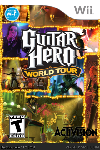
 Guitar Hero: World Tour Box Cover Comments
Okay There is my newest box! I think this is best box from me. Hope you like it!
Edited at 1 decade ago
[ Reply ]
I see alot of effort gone into this and it looks really good! Great job!
Some improvements could be moving the ESRB logo more into the corner, and making the Activision logo slightly smaller and moving it down.
I will fav though because I'm loving the overall design and style of this box 4.5/5
Edited at 1 decade ago
[ Reply ]
wow! this is really good! great job. the only problems are the esrb and activision logos, but other than it's awesome. :)
[ Reply ]
2# 3# thanx
[ Reply ]
ESRB and Activision logos too big..
GHWT logo is choppy..
Box looks bad.. 1.5/5
[ Reply ]
very nice effort, i like the layout, though some pics seem squished
[ Reply ]
I agree with #5, ESRB and Activison logos way to big.
I dont like how some of the pics are sqished and chopped off. 2/5
[ Reply ]
I like what you have going. Reminds me a bit of GTA. I feel that it lacks effects though. It almost looks thrown together. I would play up the effects so that it looks more sleek. Also, the two logos could be cut better. Decent job overall. It just needs some work, and a back.
[ Reply ]
Okay i think there will be come back to this box soon!
[ Reply ]
WHERES BACK !! WHERE! TELL US!!
[ Reply ]
shut up nAAb
[ Reply ]