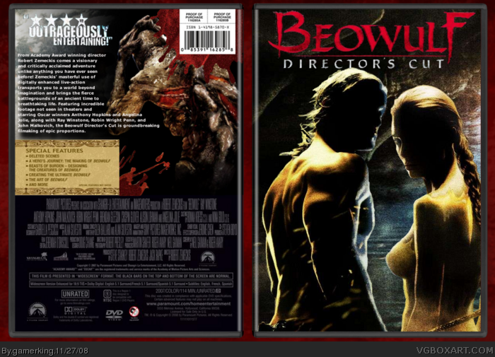
yeah. this one took quit a while trying to get it just right. i might make a back. too tired to make one tonight though. lol. enjoy! and let me know what you think! :)
for some reason it came out blurry. it's nice and clear on my folder, but after i submitted it, it got blurry. lol.
yeah, nothing's stretched. and it's not even that blurry at all. but yeah, for some reason every time i upload a box, the quality is lessened. i don't know why. lol. and i tried a back, but it didn't work out too good. idk, maybe i'll try again later. lol.
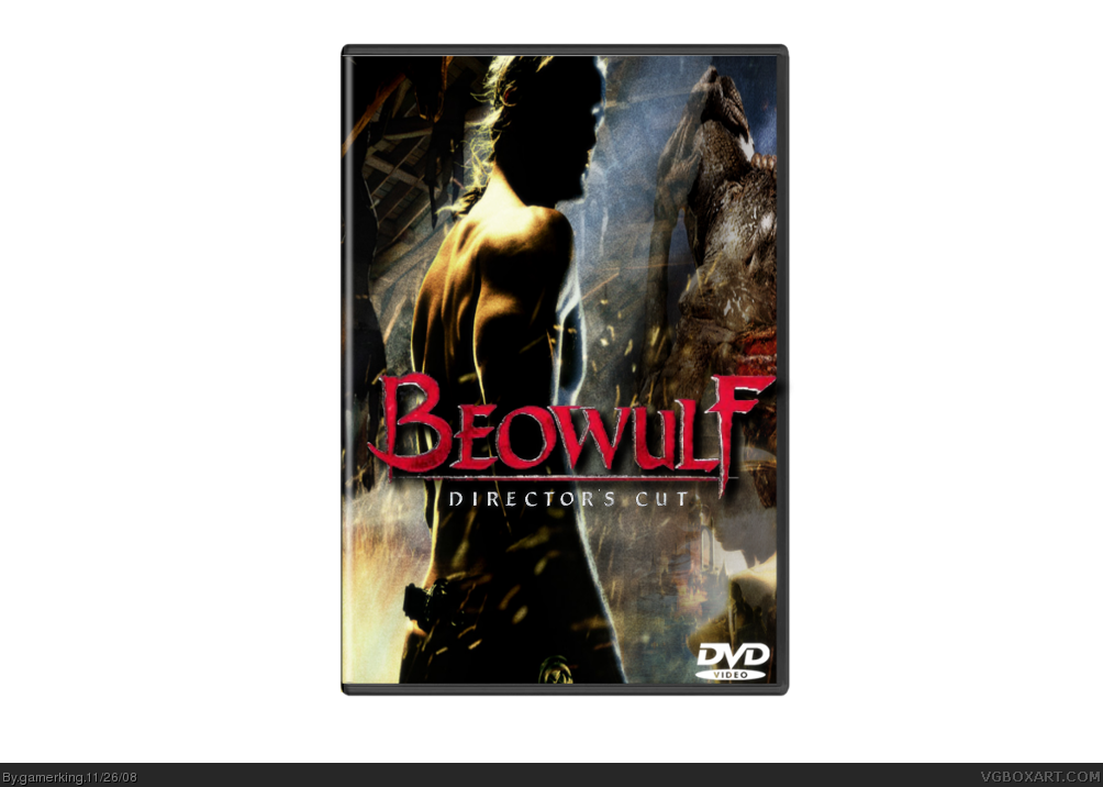
sorry about double post, but here is the redone version. still haven't started the back, but i'm going to! lol. but before i start the back, is this version better?
I like the text set up on the back, that looks very official. The renders are a bit dark on the front and back though. Maybe try adjusting the contrast/saturation a bit on them. Also, slide the 2 characters on the front over to the left a bit, they look slightly off center.
thanks guys! i'll see what i can do to make it better. :)
and i kinda wanted to keep it darker because the real case and other things that i have seen of beowulf were lighter, and i wanted to keep a darker, bloodier style, ala 300. lol.
I like it and all, but I just wish there was some sort of presentation going on. I just can't seem to get excited over a box against a gray background.
 Beowulf: Director's Cut Box Cover Comments
yeah. this one took quit a while trying to get it just right. i might make a back. too tired to make one tonight though. lol. enjoy! and let me know what you think! :)
for some reason it came out blurry. it's nice and clear on my folder, but after i submitted it, it got blurry. lol.
[ Reply ]
Everything is streched and blury
sorry dude :(
[ Reply ]
#2, logo's not stretched lol
but you know what im going to say.
MAKE A BACK!
[ Reply ]
yeah, nothing's stretched. and it's not even that blurry at all. but yeah, for some reason every time i upload a box, the quality is lessened. i don't know why. lol. and i tried a back, but it didn't work out too good. idk, maybe i'll try again later. lol.
Edited at 1 decade ago
[ Reply ]
i dont know why, but i dont really like this one for some reason, sorry :(
[ Reply ]
this realky doesn't look like the work of a rank six artist sorry
[ Reply ]
okay, okay! lol. i actually restarted it. the new version is almost done. hold on. :)
[ Reply ]
sorry about double post, but here is the redone version. still haven't started the back, but i'm going to! lol. but before i start the back, is this version better?
[ Reply ]
Well, at least I can see what's going on. :)
[ Reply ]
Cool
[ Reply ]
Eh, too dark. I would at least want to see Beowulf's face.
[ Reply ]
The second version looks better now. Maybe add a back and a background?
[ Reply ]
okay, i added a back! better now? :)
[ Reply ]
#13, Yes. Still want to see Beowulf's face, though.
#15, It's up to you, you don't have to change something just because I say so.
Edited at 1 decade ago
[ Reply ]
lol. i kind of liked that pic of him. alright, i guess i'll change it then. xP
[ Reply ]
Yay a back!
[ Reply ]
i really like this now! fav!
[ Reply ]
i like it, a lot.....
[ Reply ]
I like the text set up on the back, that looks very official. The renders are a bit dark on the front and back though. Maybe try adjusting the contrast/saturation a bit on them. Also, slide the 2 characters on the front over to the left a bit, they look slightly off center.
it's coming along good though!
[ Reply ]
thanks guys! i'll see what i can do to make it better. :)
and i kinda wanted to keep it darker because the real case and other things that i have seen of beowulf were lighter, and i wanted to keep a darker, bloodier style, ala 300. lol.
Edited at 1 decade ago
[ Reply ]
I like it and all, but I just wish there was some sort of presentation going on. I just can't seem to get excited over a box against a gray background.
[ Reply ]
nice, +fav, and yes, i would like my newest box bumped please xD
[ Reply ]
thanks, and i'll add back ground. hold on. :)
Edited at 1 decade ago
[ Reply ]
Yes! Yes! That's much better!
[ Reply ]
I like it. The front images are a little dark, but the boxs has a dark fealing so thats ok.
Edited at 1 decade ago
[ Reply ]
the darkness can be excused as its a directors edition
and now your showing what you can do i love it
+fav
[ Reply ]
thanks guys...and you forgot to fav, grahamz. xD
[ Reply ]